The fashion for colors in the interior changes as often as the fashion for color combinations in clothing. Moreover, it is changing dramatically. What previously seemed impossible to combine suddenly becomes a current trend that is being adopted by designers all over the world. This was the case with the combination of pink and gray colors in the interior. After all, gray color seems too gloomy and boring, and pale pink seems glamorous and even a little childish. Despite the complete opposite of these colors, they “made friends” perfectly, and their combination became very popular. The fashion for gray-pink interiors appeared in the 80s of the last century, then it was supplanted by other trends, and more recently designers remembered it again.
If you decide to take on creating the interior yourself and want to make it truly comfortable to live in, you need to understand that not all shades of gray and pink combine perfectly. It is very important not to make a mistake with your choice and correctly combine shades with each other.
How to combine pink and gray colors in the interior?
To many, the gray-pink color scheme seems too boring and dull. To avoid such sensations, it is necessary that gray does not predominate in the interior. And most importantly, objects and surfaces in pink and gray tones need to be alternated. These colors are so unique that they can act as a background to one another. If you want to highlight a gray object, such as a chair or a painting, place it against a pink wall. And if you want to draw attention to a designer floor lamp in soft coral or salmon color, place it near a wall painted in a calm gray color. To prevent the interior from being too boring, add a few complex details to it - a carpet or furniture decorated with a pattern.
But the gray-pink color scheme is not suitable for all interiors - it will look good in the living room, kitchen, and bedroom. It is better to choose more saturated colors for the kitchen, and something muted for the bedroom. To decorate the living room, designers advise using floral patterns - then it will look presentable. But it is better to refuse to decorate a nursery in this color - brighter shades are suitable for it.
There is no absolutely correct color combination. The main rule is that the chosen shades should not make you nervous or irritate you. After all, it is very important that you receive energy replenishment at home, and do not waste your energy on coping with the negative emotions that an unloved color causes.
If your room is located on the north side, it is better to use rich pink color in interior design and not overuse gray. After all, it is considered cold and makes the room even more uncomfortable. If your room is constantly flooded with sun, balance the color balance by adding cool metallics to the interior. But this is all very conditional. Don't forget that your own comfort is the only factor you should consider here.
Ideas for using bright details and basic options for finishing walls and floors
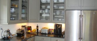
A gray kitchen, even in a monochrome solution, can have many faces, but usually they use accents and full-fledged duets, which also have room for bright and interesting solutions.
The ideas for their implementation are varied:
- The design is harmonious in different shades of gray. Such an interior is interesting both in matte and glossy versions. You can dilute the design with shades interspersed with blue, green, and orange tones. The yellow palette is also applicable for creating individual shades. Noble and refined pearl gray in beige tones. It is the variety of shades that allows you to realize any ideas in one palette.
- The use of black finishing makes the interior more geometric - the edging of the tabletop, the frame for the pattern of the main wall, the facades of the furniture, etc. Such lines will emphasize the character of the solo color, and will also make the details, which in such a trio can be white or beige, red, blue, more contrasting , orange tones. The black-white-gray combination is often used today in modern interiors.
- Blue gloss will be an interesting addition to gray metallic facades. Ideas for using heavenly colors are varied: from a blue ceiling to a gray-sky shade in a stone floor covering. Blue colors in details can serve as accents: vases, paintings, ceramics, handles of utensils can be just like that.
- A kitchen with a combination of a red and black palette in addition to gray will be extravagant. A few minor details are painted red - a couple of pillows on the living room sofa, kitchen appliances, ceramics. Whatever style is chosen, the backsplash tiles may also be red in places, outlined in black. Gray metallic facades are often complemented with black handles and a similar pattern on a red background in interior details.
- The lilac component of the interior can make even the simplest set comfortable and mysterious. Although gray furniture is not primitive. Even the matte ash floor looks luxurious. Ideas using lilac tones are unique, since similar notes can be included in the main color, which will make the composition especially harmonious.
- Red-burgundy threads of expensive wood with an aged touch will organically complement a retro interior in a gray palette. Here, of course, gloss is not appropriate, so the apron is most often covered with classic tiles, which may also have a bright ornament. You can repeat it in the living room: patterned wallpaper, textiles, upholstery, curtains.
Choosing gray walls or a set is always a universal solution, when the floor, wallpaper, and details can be unique: when implementing the same idea, you can include your preferences, be it a blue or turquoise palette, beige or green shades . Then literally all features of the interior will be harmonious - from the decoration of the living room walls to the pattern of the accent wall in the kitchen.
Who should avoid which combination?
Each of these colors has its own special magic, and to make it pleasant for you to be in the room, you need to know how they will affect the psyche.
Gray color causes despondency and apathy in a person, and it also drowns out positive emotions and reduces appetite. A person who is constantly surrounded by walls painted gray begins to feel apathetic and is constantly depressed. But this color also has advantages - it puts you in a working mood, makes you be more careful, attentive and focused.
The color pink also has a very ambiguous effect on us. On the one hand, we associate it with romance and love, but on the other hand, we know that it is chosen by naive and frivolous people. Unlike gray, pink has a positive effect on the psyche. In an interior of this color, a person calms down, relaxes and feels protected. It has a beneficial effect not only on the nervous system, but even helps improve immunity, the condition of the eyes and hearing organs. If you have a headache, spend some time in a pink room and it will feel much better.
If you want your office to always want to work, let there be a sufficient amount of gray in its interior - it will set you in a working mood. The pink and gray color scheme is ideal for rooms where you want to relax - a living room, a bathroom, a bedroom, a massage or beauty parlor. But this is not the best option for the kitchen - after all, in such an interior it is unlikely that you will be able to get rid of morning drowsiness and eat with appetite. Therefore, if there are too many reasons for sadness in your life, it is better to make your interior in a “cheerful” color scheme, choosing orange, green, turquoise. A popular design option for a nursery is a delicate pink color. It really calms the baby and gives him a feeling of security. But you need to be prepared for the fact that the child will quickly “grow out” of this interior, and the walls will have to be repainted in calmer colors.
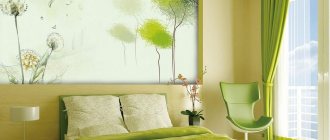
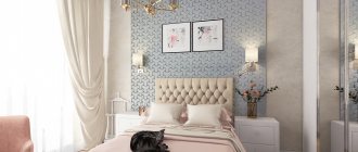
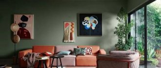
We decorate the bedroom in gray-pink colors
This color combination will be ideal for the bedroom. To make you feel comfortable in it, the gray color should predominate here, but not saturated, but calm and a little pale. Make just one wall pink and paint the other three gray. Also let the furniture, carpet, and curtains be gray.
To add charm to your interior, you can add accents with pink accessories. These can be pillows, flowerpots, frames, paintings, lamps, bedspreads. And for chic and luxury to appear, choose furniture with carved legs, wallpaper decorated with complex floral patterns. Gold will add wealth to any interior. However, this is often unnecessary. After all, the bedroom is a place where strangers rarely visit. And therefore, it is better not to use unnecessary details in the design and not to use pink in excess.
The most delicate pink children's
If you are expecting a little princess to join your family, the best gift for her will be a nursery in soft pink tones. But to prevent the room from turning out literally “sugary,” you need to use this color correctly. If you want to make the interior more calm, you can combine gray, white or peach with pink. But there should be fewer of these colors, because they act as a background. Not only the walls, but also the floor, curtains or furniture can be gray or white.
If you do not want your child to be irritated by the interior, the walls, floor and ceiling should be plain or decorated with a simple geometric pattern. Sometimes colorful wallpaper is used, but it does not always look appropriate. To make your daughter feel like a real princess here, decorate the room with pink textiles, buy a bed with carved legs and a translucent chiffon canopy, and put a soft lilac carpet on the floor. Also in the room there should be photo frames, flower pots, figurines and other interior items in pink shades.
Choosing a headset shape
Modern kitchen furniture differs not only in design and materials, but also in the shape of its arrangement.
Cabinets can be placed in this way:
- Linear option. A classic solution in which floor-standing cabinets are located along one wall.
- Corner layout. This method of arranging the set is ideal for small rooms, since the corner cabinet can accommodate all the kitchen utensils.
- U-shaped layout. The set is installed along 3 adjacent walls. This arrangement is more suitable for spacious rooms, since the optimal distance to the opposite wall is 2.5 m.
- Ostrovnaya. An ultra-modern option in which part of the kitchen unit is moved to the center of the room. An additional work surface, sink or stove can act as an island.
The method of arranging the headset is selected depending on the area of the room.
Stylish and original kitchen
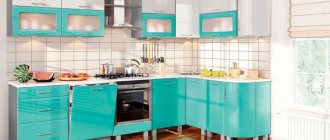
For those who are not afraid of experimenting in the interior, you can try decorating the kitchen in gray and pink tones. It's bold, original and stylish. There are a lot of design options here. You can make a kitchen in a shabby style, then it will turn out very gentle and romantic. In this case, it is better to put light pink, artificially aged furniture, and hang cotton curtains in small rosettes on the windows. The walls should be light and the floor should be dark gray or brown. Vintage dishes and white appliances would look appropriate in such a kitchen.
If you love futurism or hi-tech, make your kitchen in cool colors. Metallic gray should predominate here. You can make the upper or lower facades in a calm pink color, and hang blinds on the windows. A floor laid with gray and pink tiles will look original.
A kitchen in this color scheme will not appeal to lovers of classic interiors. If you doubt that you will be comfortable in a gray-pink kitchen, it is better to abandon such an interior idea completely.
Choosing the right shades
There are a huge number of interior design options, but there are still the most popular combinations of shades of these colors.
If you want your interior to be cozy and homely, combine light gray and rich pink. In this case, gray will act as a background and calm the psyche. Furniture, textiles and accessories in the interior should be a rich pink color. This combination will be an excellent option for a nursery and bedroom.
For south-facing rooms, a combination of pale pink and metallic gray is suitable. Most often it is used to decorate living rooms or kitchens by lovers of futuristic style. It is not recommended to decorate a nursery or bedroom in these shades, because not everyone will feel comfortable in such rooms.
Those who do not like bright and aggressive colors are recommended to decorate the room in light shades of gray and pink. This is considered the most successful combination and is suitable for any room. In such an interior, everyone can relax and unwind.
Gray and pink colors are a popular combination. Moreover, it is used to decorate interiors in many styles, from classic and shabby to modern and high-tech. But when choosing an interior, it is important to listen not only to the advice of designers, but also to your own feelings. After all, you and your loved ones will live in this interior, so it should not only be beautiful, but also comfortable.
Correct selection of wallpaper material
When choosing, you should pay attention not only to the design, but also to the material.
The stores offer wallpaper made from different materials. The choice depends on the room.
For bedrooms, you should choose canvases made of thin material that allows fresh air to pass through, keeping the room cool.
Coatings made from environmentally friendly materials with a water-repellent spray are suitable for children and kitchens.
Thick patterned wallpaper is a good choice for decorating living rooms and offices.
Each type of wallpaper has its own advantages:
- non-woven - does not change shape when moistened and dried, has a slight noise-reducing effect, hides defects and unevenness on the walls;
- vinyl - are not afraid of mechanical stress, do not burn, are easy to wash, as they do not absorb dirt;
- paper ones are the cheapest option, but they are respectful of the environment and allow air to pass through perfectly.