Features of an orange kitchen in the interior
Orange color has a beneficial effect on the human psyche and his condition in general. It has been scientifically proven that it prevents a person from becoming depressed and makes the emotional background more stable. The kitchen in the house is one of the best places to use it.
Color characteristics
When choosing a design with orange color, you should consider its features:
- in any shade it looks sunny and looks best on the north side;
- if you decorate the entire kitchen in this color, it will look overloaded, so it is better to choose one thing (curtains, facades, walls, etc.);
- it visually adjusts the layout, that is, wallpaper in this color, for example, can visually expand the room;
- suitable for people who suffer from indecision and apathy, as it dampens excessive emotionality and indifference;
- the orange tint causes appetite, so it is not suitable for those who are on a diet;
- not suitable for people prone to excessive excitability;
- stimulates intellectual and physical abilities, reveals the spiritual side of a person.
Based on this, it is worth understanding whether this color is suitable or whether it is better to choose another option.
Pros and cons of this color scheme
Classic Color Combination
Orange kitchen is a generally cheerful color that most people associate with warmth and summer. However, it is not suitable for everyone. To better understand this issue, it is worth paying attention to its pros and cons.
The advantage of this solution is, first of all, comfort.
- Even on the coldest and hottest days the apartment will feel warm. Such a kitchen will charge you with energy and vivacity.
- Orange, on the one hand, is very bright, but on the other hand, it does not excite the nervous system as much as, for example, red, and causes a feeling of peace rather than anxiety.
However, this color scheme can quickly get boring and this is its main drawback. It is worth considering this when choosing furniture. Perhaps it needs to be diluted with something calmer and more universal. Also, orange color will be inappropriate in a small Khrushchev-era kitchen, as it visually greatly burdens the room.
If the sun shines through the windows most of the day, then the eyes may hurt from an excess of bright light.
Effectively orange combines with elements made of metal, plastic or glass. This is especially true for minimalism or hi-tech style.
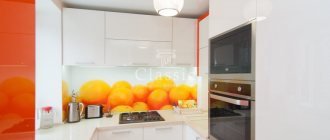
Orange as a main color or just an accent
Orange accent on the apron
If orange tones are chosen as the main color, then when choosing a kitchen, first of all you should pay attention to what atmosphere reigns in the kitchen throughout the day.
- If it’s mostly shadow, then you can safely choose rich tones.
- If the kitchen gets sunlight all day, then soft shades, such as peach, are better.
- When a bright tone is chosen, it is better to dilute it with something calmer, otherwise the kitchen will look aggressive. For example, make a bright apron.
For a small kitchen, it is better to immediately choose softer shades. Moreover, they should be diluted with light walls, curtains or other elements. This combination will look light and at the same time bright.
The refrigerator, stove and other appliances in such an interior can be white, black, or chrome.
For those who like bright details, but at the same time discreet, a suitable option is to simply focus on neutral shades. This could be a tabletop, a chandelier, decorative elements, etc. An interesting solution could be appliances in orange shades.
A universal option would be bright curtains or blinds. It will not look colorful, but will create a certain mood.
Pros and cons of color
#blog.liebherr.com
Juicy orange shades help to radically change your mood - psychologists say that a pessimistic mood instantly evaporates just by looking at them. In such an environment, it is much easier to cope with the blues and feel energetic and cheerful every day.
However, there is a small drawback: orange can greatly improve appetite. Therefore, for those who constantly watch their figure, it is better to choose calmer peach colors.
What color goes with orange in the kitchen interior
Black and orange kitchen
The abundance of orange color is not for everyone. Fortunately, it combines quite well with other cool and warm shades.
The most common combinations:
- With black. This solution is very bold, suitable mainly for spacious rooms. The design looks stylish, in which the furniture facades are made in black, and orange accents are placed on the kitchen apron, dishes, curtains, and dining table.
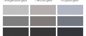
- With gray. One of the most successful combinations due to the fact that the gray color looks soft and neutralizes all the brightness of the orange color. A metallic shade may also be suitable for such a kitchen. Most often it is added to a gray-orange kitchen on household appliances or furniture fittings.
- With white. This choice is considered a classic. Orange against white looks brighter and visually makes the space larger. This combination is well suited for small kitchens.
- With brown. Creates a peaceful and harmonious atmosphere. Dark colors with a woody texture look especially good; they can be combined well with golden, apricot, red or pumpkin shades.
- With green. Orange color goes well with any shade. Both dark green and light green are suitable. This way you can create a sunny summer atmosphere.
Orange is also often combined with beige. However, you should avoid combinations with purple, pink, and red. To make it easier to decide on the selection, it is better to look at the orange kitchen in the interior in the photo.
Choosing the right shade
If we talk about the color orange, different associations may arise. For some it is a rich orange or tangerine, or maybe a calm peach or apricot. These “fruits” have one thing in common: all shades of orange are incredibly beautiful and ideal for interior decoration, be it a kitchen, living room or children’s room. The benefits are obvious: orange improves mood, very successfully treats depression and relieves fatigue, and simply creates a background that is pleasant to the eye.
It’s even easier with a green palette; it’s not for nothing that these colors are considered optimal for the living room. Herbal soothes and insists on relaxation and positivity. Among the preferred colors in the interior palette, it ranks first after classic white and brown shades. Radiating calm, green harmonizes perfectly with the bright cheerfulness of orange, so this combination looks quite organic.
Different shades of orange and green are suitable for different interior styles, so it is better to decide on a suitable color scheme in advance, using the photo in the catalogue.
Kitchen design with orange furniture
Orange set in the shape of the letter P
When creating a design in this color scheme, there are a lot of possibilities. You can play with shades of orange, texture, shape.
Texture and materials of facades
Most often, MDF or chipboard is used as the material for the base of facades. The first option is considered more reliable. The top can be covered with enamel, PVC film, acrylic, HPL plastic.
Acrylic is considered the highest quality coating option, but it is also the most expensive. It has a mirror shine and looks very beautiful. However, more often people choose PVC spitting material. Firstly, this option is budget-friendly, and secondly, it can be easily changed, thereby changing the interior of the kitchen.
The texture can be matte, glossy, wood-like. You should choose it based on the style of the kitchen design as a whole.
Form
For a small kitchen of about 8 sq. m. An L-shaped or linear shape is suitable. The corner option will be more spacious.
Kitchens from 12 sq. m allow themselves not to limit themselves in anything. One of the most popular shapes is U-shaped.
You can make the facades in gray or white, for example, and the work area in the form of an island in the center of the kitchen in orange.
If the room is of very modest dimensions, then you can make the main part linear and combine the working surface with the window sill.
Selecting a shade
The choice of shade directly depends on factors such as the lighting in the kitchen and the size of the room itself.
For a small area, calm shades are well suited: amber, honey, red, peach, terracotta. They are also good indoors with plenty of sunlight.
Owners of a large kitchen can afford orange and carrot colors.
Ethnic directions
Here everything is much more complicated, because we are talking about different traditions and cultures. Expressive orange-green combinations are more characteristic of eastern peoples, so most often such interiors are also found in the style of the mysterious East.
Orange shades for ethnic oriental interiors:
- ocher;
- Red tree;
- rust color;
- salmon;
- amber.
Green shades for ethnic oriental design:
- jade;
- dark green;
- mint color;
- malachite;
- asparagus;
- viridan;
- forest green;
- sea green.
The color palette of these tones has many shades, and in the photo and in reality they can differ significantly. Your own preferences will help you choose your special shade, and design tricks will help you combine them perfectly. Some secrets of a successful combination - read on and look at the photo at the end of the article.
Combination of several shades
Orange wall color in the kitchen: how to get it and what to combine with it
Bright accent on the walls
Orange walls in the kitchen look very unusual. You can make them look nice with the help of wooden accessories or furniture. However, you should not glue wallpaper in rich colors. They will put a lot of pressure on the eyes and visually reduce the space.
Orange walls are most often made using wallpaper or paint. In the first case, the choice should be made of vinyl or non-woven fabric, since these materials are easy to clean, and this is very important for the kitchen. It’s better not to look in the direction of paper wallpaper; they will quickly lose their attractiveness.
Saturated walls should be combined with restrained furniture (white, cream, pastel shades of bright colors). If they are of more delicate colors, then you can choose bright furniture: chocolate, wenge, blue, black, etc.
Accents
The 60/30/10 design rule recommends creating color combinations when creating a kitchen interior, based on the main accent. This focal point could be:
- Furniture;
- Kitchen apron;
- Wall decoration;
- Accessories;
- Appliances.
This main kitchen item should make up the color spot, that is, that same 10%. Based on them, you need to choose the main, background and accent color.
For example, with a bright red apron, gray, snow-white, brown, black decoration and furniture will harmoniously coexist
When choosing an apron in green tones, pay attention to the combination of beige and grass in the kitchen interior
As already mentioned, the color orange lifts your mood and increases your appetite. If there are people in your family who have a poor appetite, create a kitchen with orange notes - an apron, tablecloth, textiles on the windows. When choosing what color orange is combined with in the kitchen interior, you can make the main color light green, the additional color brown, and complete the interior with bright accessories.
Materials and color of an apron for the kitchen in orange tones
An orange apron does not go well with the same set. Therefore, if the goal is to make it in this color, then the furniture should be in neutral shades. If the whole kitchen is orange, then a white glossy apron will look ideal.
The materials for this kitchen object can be:
- wallpaper under glass;
- wooden panels;
- ceramic tile;
- facing stone;
- they threw it off.
The presence of any unobtrusive drawings is also welcome.
Selection of colors for the kitchen
In order to visually expand the walls and raise the ceiling, you need to choose light and cool colors, using warm colors as bright accents. Dark colors make the room smaller, so they are only suitable for large kitchens. If the kitchen is not well lit, then it is better to use rich color shades. But, if the kitchen is small, try to avoid very bright colors that can be tiring and dilute them with pastel colors.
To choose the right color scheme for the kitchen, first, decide on the color of the kitchen furniture, walls and flooring. Do not forget that the color of kitchen accessories must also be selected in appropriate shades.
Red cuisine has a stimulating effect, energizes you and awakens your appetite. For kitchen decoration, soft shades of red such as tomato, coral and cherry are the most acceptable. However, you quickly get tired of the color red, and such a kitchen may begin to repel you. Red color is preferred by active people, with strong energy and a lively worldview.
A blue kitchen will have a calming effect, but will reduce your appetite.
It is better to use blue color only if the kitchen is facing south. Blue shades go well with orange, yellow and coral. A blue kitchen is suitable for a person who cares about his spiritual development, relationships with people and who wants to please people.
The blue color in the kitchen interior symbolizes changes for the better. All shades of blue help you relax, unwind and forget about problems.
Photo of a white and red kitchen.
A brown kitchen encourages open and calm communication. Lighter shades of brown make the kitchen feel cozy and warm. Brown goes well with almost any color.
A green kitchen has a calming effect on the nervous system, improves digestion and lifts your mood. Warm shades of green are better suited for kitchen decoration. The most popular colors are salad and pistachio. The combination of green and yellow will create a cheerful atmosphere in the kitchen. A persistent person who takes everything very seriously will prefer a green kitchen.
Photo of a white and red kitchen.
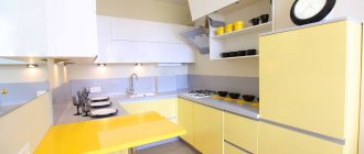
A yellow kitchen is pleasing to the eye, so you can choose shades such as peach, yellow gloss, red copper and pastel shades. Lovers of yellow need wide windows that can be opened, and no room will be too spacious for such people.
White color is used for kitchens in classic and high-tech styles. White color is quite neutral and does not attract the attention of guests. Which is clearly not desirable in the food preparation area.
Beautiful red kitchen.
A kitchen in purple is relaxing and calming. But the appetite in such cuisine is suppressed, so purple cuisine is more suitable for those who often use various diets in an attempt to lose weight.
Often, when choosing colors for the kitchen. It's hard to limit yourself to just one color. I can recommend several color combinations. So blue and green colors are suitable for an idealist who believes in the good and eternal. But the combination of red and green is suitable for a person with inexhaustible potential and numerous opportunities
The combination of yellow and green is suitable for an authoritative person who enjoys the attention of others. The choice of pink indicates frivolity, cheerfulness and a sense of carefreeness.
Red kitchen.
Video on the topic:
Ideal color scheme for the kitchen. Advice from designer Yulia Ivanitsa.
Curtains and textiles
Curtains, like other textiles in an orange kitchen, should look light and airy, since this color itself can look heavy. The optimal material would be tulle or chiffon. Blinds are also suitable; they are easier to maintain.
As with other elements, it is better to choose neutral shades for a rich interior. If curtains and other textiles (tablecloth, upholstery) act as the accent that creates a sunny mood, then you don’t have to be afraid to choose a rich color.
An example of a kitchen with too much orange
The meaning of color, influence on a person
Like other colors, orange affects a person's life. This is a complex color and the predominance of one or another shade in it affects our subconscious, having a different effect. The dominant yellow color has a positive effect on a person’s mood and relieves depression.
Shades of red increase activity and give strength.
Using orange in the interior will help cope with apathy and depression, and will also push you towards new goals. In addition, orange color can help reserved people, eliminating shyness. In psychology, orange is used to work with aggressive clients.
Countertops, furniture, lamps and appliances
It would be a good idea to choose a countertop in a contrasting color in relation to all the furniture. If the entire kitchen is orange, then the countertop can be black, gray, white, etc. Also, the countertop itself can be a bright accent in the design.
Furniture in an orange kitchen looks good in combination with other colors. There can be a hundred possible solutions, so it is better to choose it based on your taste, using the rule - do not overload the room.
For example, if you want to focus on the dining group, then you should choose a white or beige color and orange chairs. If orange furniture is chosen, then it is worth diluting it with a light apron, walls, and textiles.
If you choose an apron with a print, then the tabletop should be made as neutral and monochromatic as possible.
The modern assortment allows you to find even orange equipment. However, a standard black or metallic color will also look good. They will fit into any style.
Unobtrusive combination with bright colors
Modern interiors
In such directions, a bright palette is most often used, both orange and green. The main feature of a successful combination will be approximately the same intensity of these colors. If you take deep orange, then the more faded shade of “marble” will simply be lost against its background, but emerald will help to emphasize the originality of the coral color as best as possible.
Orange shades for modern interiors:
- orange;
- tangerine;
- pumpkin;
- carrot;
- coral.
Green shades for modern design:
- bright green;
- light green;
- herbal;
- emerald;
- lime;
- shamrock;
- green apple.
In photos of modern interiors you can often see the predominance of one color and the use of another in the form of spectacular accents. What you choose is up to you, but in any case, this duo is an excellent combination for any style.
Application of color in the kitchen-living room
Kitchen-living room with orange furniture
In a kitchen-living room, the emphasis is usually on the dining area. Orange color is appropriate on upholstery, pillows, curtains, carpet, lamps. In this case, it should be present in the work area, but in a minimal amount (for example, an apron or tabletop). As a result, the space will be visually unified. The rest is best decorated in light colors.
The opposite is also possible. All furniture in the kitchen is made in orange, and modest accents are made in the dining area. It is also permissible to use different shades of the same color in different areas. The main goal is to create harmony.
What to avoid
Both of these colors are quite difficult to execute: an excess of dark will turn the room into a gloomy closet, and the dominance of orange will make the interior difficult to perceive. Creating a harmonious orange and black kitchen is not easy, but the result will make you take a fresh look at your abilities. However, to do this, you should avoid the most common mistakes when decorating a kitchen space using these colors.
Contrasting combination
Common Mistakes When Using Black and Orange
- A black ceiling has never justified itself; on the contrary, it adds depressive notes to the design. If you want to make a dark top, it is better to use acrylic furniture facades of a suitable color, but not decorate the ceiling. In addition to the visual effect, such a surface literally attracts all kinds of dirt and dust, and maintenance will be difficult due to the height.
- Everyone knows that black color visually compresses space, but orange also has an equally outstanding feature: it stands out as brightly as possible in the interior, causing all other colors to fade. Agree, for small rooms such a neighborhood will be too rich and create certain difficulties. It is best to dilute such a duet with neutral white tones, then you will get a completely cozy and at the same time spectacular interior.
- When making a dark top, you should consider the possibility of creating a slight disproportionate effect. In such interiors, as you can see in some photos of finished design projects, you get the feeling that the bottom of the set is much larger than the top. Using kitchen splashback tiles or acrylic facades arranged in a checkerboard pattern will help smooth out the impression.
- The “classic” combination - dark bottom and bright top - is not very suitable for large spacious kitchens , because it would be much more interesting to experiment a little with various color combinations. Photos of successful design projects (we published the most interesting ones at the end of the article), where wooden and chrome-plated facades are used along with acrylic, can help with this.
Successful companions for orange will be blue shades, and the intensity of the colors should be consistent with each other. Black color is best used as accents, and white or gray colors can be used as a background in such interiors.
The blue here is muted and does not distract attention.
Black and orange kitchens with a white countertop or backsplash tiles look very elegant and solemn.
Which style to choose for an orange kitchen
Modern design in dark orange colors
Orange shades can be used in almost any style:
- minimalism - only some elements should be made in bright colors, for example, decor or an apron;
- hi-tech - the optimal combination of orange furniture and chrome surfaces, looks good in combination with gray;
- modern - orange facades should be diluted with unusual fittings, plastic chairs and a chandelier corresponding to the style are optimal;
- futurism - characterized by a combination of orange and black;
- country - a combination of peach with wood, clay, wicker decor.
Orange color can fit into almost any style. The main thing is to do it with taste. These shades are very finicky and require special attention. However, if you take the issue seriously, you can create a truly unique design.
Decor
Stylish decorations include flower vases, candy bowls, plates, bright dinnerware or other dishes placed on shelves. Paintings, photographs with colorful images of vegetables and fruits, or canvases with abstract designs are also used as decoration.
The interior of a kitchen in orange tones needs a lot of lighting. Thus, the atmosphere becomes even brighter and more cheerful. The optimal solution is to install spotlights in combination with a chandelier. Lighting fixtures in combination with glossy surfaces will maximize the expansion of a small space and fill it with light.
Primary colors
It is important to understand that there are only 5 main, so-called pure ones:
- White;
- Black;
- Red;
- Yellow;
- Blue.
But there are a great many derivatives from them in the color wheel; thanks to mixing, you can get almost any color, cold or, on the contrary, warm. Blue alone gives designers a couple of dozen of its amazing halftones. Color can be explained not only from the physical side, but from the psychological side. Have you ever noticed that one tone or another makes you happy, while another makes you sad?
Color science, the science that studies color and its characteristics, helps to form the necessary relationships and atmosphere at home. All designers know about this and take advantage of it, offering their best work. We will definitely discuss such interesting properties of color schemes, with examples of their combinations, which mixtures are acceptable in the kitchen, and which ones are best avoided.