Purple color in the interior is popular today. It is original, unusual, but it must be used wisely so that the room looks pleasant, and not tacky and depressing.
Purple color is obtained by mixing two colors - blue and red. It has many shades from refined and delicate to rich, intense. There are subtleties of combining purple color with other colors. The right combination makes it possible to create a variety of images in the interior.
Shades of purple
People most often distinguish two shades of this color:
- light purple;
- dark purple.
Every designer knows that purple must be used correctly. This is a bright color, so you will need to choose a suitable color scheme for it, be careful with textures, furniture, and other interior elements.
Depending on the predominance of blue or red in the purple color, you can get a different palette. It can be warm or cold.
If you want the environment to be enjoyable, combine the colors correctly. The basis will be violet and its shades, and the rest can be selected in different variations and combinations, focusing on the chosen style of the room.
In the violet color scheme, the most popular colors are:
| Purple | Lilac | Eggplant | Ripe plum |
| Blackberry wine | Lavender | Amethyst | Fuchsia |
| Magenta | Pink-violet | Pyusovy | Violet |
| Byzantium | Wisteria | Amaranth | Indigo |
It is important that a room made in purple tones will make the interior attractive and alluring, it will be luxurious and elegant.
Making purple the main color is not always a great idea, especially if the furniture is also made in a similar color. If you want the room to be elegant and stylish, it is recommended to use a light purple color scheme, complemented by other shades.
Stylistics
It is considered a complex color: it combines cold and warm palettes. The natural version is rare: fruity-floral colors, precious stones. But even on a plate with plums there are several subtle shades that can create a cozy nest.
All kinds of variations: eggplant; bilberry; grape; violet; amethyst are in demand and are successfully used in a variety of styles:
- Minimalism, hi-tech, techno are based on a contrasting combination of white with bright colors. A cold bluish tone color (for example, indigo), enhanced by the shine of glass, metal, and chrome parts, is suitable.
- Ethnic style. Moroccan and Indian style is actively used (textiles).
- Modern. The unspoken symbol is the soft purple iris.
- Modern. Juicy tones (fuchsia, eggplant), neon are expected.
- Classic. Deep, velvety colors are used (eggplant, dark purple, plum, orchid), complemented by gold and bronze.
- Country. The presence of wood is characteristic - an excellent combination with modifications of the reddish undertone; decor with a characteristic natural floral pattern (violet, heliotrope)
- Vintage, Provence. The pastel base makes the plum and grape accents as saturated as possible.
- Futurism, pop art. All kinds of extravagant combinations.
Color of the year 2022 - Ultraviolet
In 2022, ultraviolet 18-3838 Ultra Violet was recognized as the main color. In history, ultraviolet is associated with mysticism. It symbolizes the galaxy, the future and new technologies, self-expression, creativity.
The new color scheme is based on the fashion collections presented at New York Fashion Week.
The new palette features various shades of this color that can be used for interior design. Among them are:
| Pink Beighton Road 18-2527 TCX | Baysenberry Pink 19-2431 TCX | color crimson glow 19-2432 TCX | magenta festival 19-2434 TCX |
| bright purple 18-3025 TCX | clover flower color 18-2320 TCX | Wine Purple 18-2929 TCX | deep orchid color 18-3022 TCX |
| purple orchid color 18-3027 TCX | lilac meadow color 18-3230 TCX | bright violet color 18-3339 TCX | Byzantine purple 19-3138 TCX |
| Mallow Purple 19-2924 TCX | phlox color 19-2820 TCX | gentle and romantic lavender 14-3207 TCX | grape juice color 19-3230 TCX |
| sparkling grape color 19-3336 TCX | sunset purple 19-3424 TCX | hyacinth violet color 18-3331 TCX | Dahlia Violet 18-3324 TCX |
| amaranth color 19-2410 TCX | magenta purple 19-2428 TCX | potion purple 19-2430 TCX | dark purple 19-2524 TCX |
| purple heart color 18-3520 TCX | royal lilac color 18-3531 TCX | royal purple 19-3620 TCX | passionate violet shade 19-3223 TCX |
Where to use
Purple color looks good in any room. But when using colors of this range, you need to be careful not only in choosing the color, but even the shade. How light or bright it will be.
Texture, texture, shade - everything is important
The shades of all other colors in the interior are just as important. The slightest discrepancy introduces dissonance and “scratches” the eye. Textures are also important. Matte, velvet, glossy, pearl. All these nuances significantly change the perception of any shade of this range. Therefore, it is necessary to select all other colors/textures/shades. That is why designers do not like to tinker with this range - they are too demanding. A lot of time is spent on selecting little things.
Purple color in the bathroom
In the bathroom, purple prevents the formation of a “sterile” interior. Even if the room is tiled from floor to ceiling with a glossy surface. Warm shades do not give warmth and comfort and you want to be in such a room.
Purple, red and pale lilac. With mostly white and beige
Bathroom in lilac color - floral patterns are always in trend A little gloomy, but young people will like it Different shades, different moods
Ideas for a stylish bathroom in lilac color
The combinations are described above: the main colors are white, beige, light shades of the same range, light gray. Accents can be placed using red or small black fragments, other bright or not very compatible colors. If you want more glamor and pomp, you can add gold and copper. Metallized parts will add more technocratism.
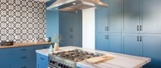
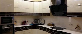
In the kitchen
Another technical room in our apartments and houses is the kitchen. Purple color is not very common in kitchen interiors, although it looks modern and relevant. When using glossy facades and rich colors, this can be a high-tech style or a modern style close to it. Accents in this case are placed either in black or metallic.
Soft lilac shades in matte facades are appropriate in Provence and classics. Here are the classic combinations: with white, yellow, olive. In such interiors you can often see floral patterns and prints. They give the kitchen a cozy feel.
Delicate lilac and white create a very cozy atmosphere in the kitchen. In combination with yellow it turns out very sunny and joyful.
Two fairly bright shades are balanced by a wooden floor and a light beige warm shade of the walls
Glossy facades look stylish Purple and lilac with a black and white kitchen apron And here the silky texture greatly changes the perception For a bright mood Stylized flowers in a lilac kitchen - to create a softer interior
The photos are still too heavy Many pure and beautiful shades in the violet range Beige and “metallic” complement perfectly With black or dark gray it turns out a bit gloomy...
You can use lilac and purple in the kitchen when decorating a backsplash or accent wall. It looks great with panels with plant motifs. The photos load up the kitchen space too much, and the stylized flowers look very stylish.
Combination of purple with other colors
White, black and gray shades will harmonize perfectly with purple. Also very successful combinations include:
- Red, crimson, coral and purple. These shades can be muted or stand out from the main background. Wallpaper, curtains, and furniture elements can be in a similar color scheme.
- Brown color. This is an original choice. A rich chocolate shade will go well with purple color. It is important that the room is well lit so that the brown shades in the furniture create the desired effect.
- Pink color. It looks unobtrusive and unusual. Perfect for decorating a child's room. It will be cozy and very comfortable.
- Green color. A delicate mint shade will go well with purple; olive and malachite will also harmonize. Recommended color: apple green.
- Yellow. The shade of yolk suits purple especially well; it is rich and sophisticated.
- Beige shade. Sand and cream colors will be combined with purple. It makes it possible to tone it down a little so as not to oversaturate the room.
- Grey colour. This is a nice combination for the interior. It is recommended to combine violet and lavender shades with soft gray colors. The emphasis should be on furniture and textiles.
- White color. An ideal combination with a purple shade. It will look perfect in any room. Purple and white will give you luxury, the room will sparkle with new colors and facets.
It is also recommended to combine purple with warm shades of orange and blue. The main thing is that the whole range is not too flashy, but, on the contrary, soothing, making the room cozy, soft, allowing you to relax and unwind.
A little more combination of purple-lilac color with other pastels.
Ideal combinations
The main color of a perfect combination is white, which can eliminate some of the gloominess of dark purple. The interior will lose its gloominess and become calm, relaxing, as stylish as possible, made with simple materials. The tandem with green is suggested by nature. Floral shades (fuchsia, violet), subtle delicacy of greenery guarantee success.
Lovers of calm solutions should avoid combining it with yellow. “Powdery” tones are used (golden, light orange, copper patina). Combinations with light gray and light beige tones are considered neutral. Purple wins against the background of natural wooden surfaces; forged gratings; mirrors framed with gilded frames. The combination with turquoise looks good, but the intensity of the shades is minimal. Maintaining a balance of saturation and proportions will help eliminate the risk of tackiness.
Adherents of bold experiments are given the opportunity to create an interior that does not look bland. The contrast of eggplant, grape, fuchsia with bright open colors (sky blue, cherry), the background of ice blue walls will fill the room with the energy of the Brazilian carnival. Catchy, colorful, harmonious: plum, eggplant with canary lemon yellow, emerald.
Designers do not recommend adding the following colors yourself:
- Blue (too much causes depression);
- Red (wrong shades, proportions - a source of discomfort, excessive drama);
- Gray (incorrectly chosen tones will create the effect of negligence, “dirt”);
- Black. The Gothic style can be made truly pathetic only by a competent selection of accompanying accessories: candles, paintings, crystal.
Purple color in the interior of different rooms in the photo
Let's tell you how the purple shade will look in different rooms. Let's talk about the kitchen, children's room, living room and bedroom.
- Kitchen.
This shade is perfect for a place where food is prepared and where people sit at a cozy table. Many people are convinced that purple color scheme is unacceptable for the kitchen, but if you choose the right combination of colors, it will look stylish.
Plum and eggplant shades look especially piquant on tiles and kitchen units. Facades in soft purple tones give freshness in combination with other delicate colors.
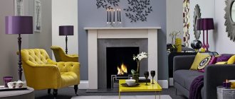
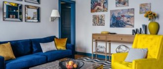
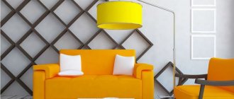
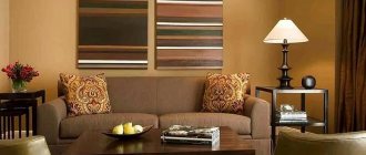
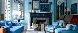
- Living room.
The main goal when decorating a living room is the desire to make a pleasant impression on its inhabitants and guests. The living room should be done in calm purple colors; sometimes rich elements of this shade are acceptable.
Violet will look beneficial in vases, sofas and armchairs, lighting fixtures, pillows and other decorative elements.
It is recommended to use silver and gold colors for decoration. The use of purple colors when decorating the ceiling will give the room a special chic and luxury.
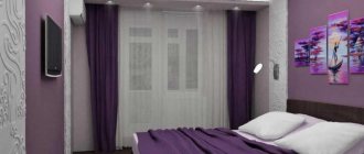
- Bedroom.
This shade makes it possible to relax, so it is often used to decorate a bedroom.
It is recommended to combine it with other colors so that the room is not too dark. The purple palette can be difficult to perceive, but only if used incorrectly.
The shade allows you to make the bedroom sentimental and enchanting, giving it a romantic atmosphere.
The palette is perfect for dreamers and creative individuals who need inspiration.
Lavender and lilac, purple and lilac are great for upholstery; you should also give preference to a chandelier in this color, curtains and other items.
To make the room luxurious, use purple gemstone colors, combine them with other noble shades in the interior.
Delicate purple colors are perfect for a woman’s bedroom, which will add a touch of sentimentality and relaxation.
- Children's room.
Purple color is recommended for developing the creative abilities of children. A violet room in combination with pink or green will look especially beautiful. This type of interior decoration is suitable for girls and boys.
For teenagers, it is worth giving preference to rich tones, but not cloying, but unobtrusive, soft.
Guys will also like this color scheme, the main thing is that purple is combined with more masculine shades.
Also, the shade will harmonize perfectly with silver and orange. In this palette you can choose curtains, furniture elements, bed linen, and other items.
Unusual, mysterious, delightful and sophisticated, all this can be attributed to the color purple. The shade makes it possible to create different images in the interior, emphasizing almost any style for the room. A room with a purple tint allows the room to breathe youth and freshness, to be gentle, but at the same time strict and elegant. Everything will depend on the skillful combination of shades and the combination of color palette.
Terms of use
Purple can be used in the interior of premises for any purpose: in the living room, bedroom (adult and child), in the kitchen, in the bathroom. Generally speaking, it is advisable to complement it with shimmering textures, alternating satin, glossy, matte surfaces. It is shaded very well by metallic shine, mirrors and bright, but “warm” lamp light.
What there should be a lot of in a purple interior is light. Warm lighting benefits deep tones and emphasizes the color of “diluted” shades.
Purple color in a minimalist style bedroom
Art Deco is also friends with this range
Pop art and several shades of purple as complementary colors (in combination with yellow and turquoise)
High-tech bedroom in lilac tones
Gold and purple color - a classic combination in a classic interior
Provence and lilac or lilac tones. This combination can be seen in almost any interior of this style.
This is a very versatile color. It is appropriate in a classic interior (matte surfaces, calm shades), ethnic - such as "Provence" - light, pastel colors, in modern and fashionable interiors such as hi-tech, pop art, art deco, minimalism (bright colors, shiny surfaces ). This is such a universal color. But designers use it carefully: it is too demanding of combinations and materials. It is necessary to accurately and carefully select not only colors, but also the degree of brightness and surface texture.
As the main interior color
If you really love purple and want to use it as your main color, it is better to choose light or pastel shades. Saturated and bright as the main ones are too “heavy”. They are ideal as additional or accent colors, but in large quantities they are too “pressure” and oppressive. Dark shades, of course, can be diluted with yellow and softened with wooden products. The interior will be stable and solid, but will still be somewhat “heavy”.
Even in bright light it looks gloomy... and in cloudy autumn...
Lighter colors - light purple, wisteria, salmon - diluted with white paint - do not give such an effect. Pastels (muted with gray) also do not “load” the space so much. These are good as a base color.
In the living room you can use purple or light pastel shades as the main color (for walls, textiles, etc.)
Depending on the chosen combination, the result may be a design with a different mood: from calm and restrained to mischievous and bright. It depends on the selected color components. If you complement the interior with calm gray, beige, white, you will get a restrained interior. Not cold, but reserved. With bright accents (and there are a lot of such combinations, much more than calm ones) you get a “warm” and active atmosphere. In a nursery or in the kitchen, even in the living room, this is very good, but this option is not suitable for the bedroom. Although, if you need energy, then why not.
As an additional
A popular interior design technique today is an accent wall. For these purposes, purple is what you need. Bright, self-sufficient, it itself does not remain out of attention, and emphasizes the advantages of the main color. This technique is used in bedrooms, living rooms, and kitchens. In almost any residential or technical room of an apartment or house. This design in the hallway and corridor is questionable - they are usually too small in area and “loading” them is not the best solution.
Purple accent wall in the bedroom. There is only one technique, but due to different accompanying colors the “mood” of the interior is different
As an additional color, lilac and its shades can be used in furniture upholstery, curtains, and carpets. This is a great way to liven up a room originally decorated in white, beige or gray.
Add lilac accents to liven things up
Add a couple of bright pillows and other small details in turquoise or not too bright red to a purple, lilac sofa or banquette, and the interior will be aristocratic, stylish, but, at the same time, clearly not boring. If you add yellow, it will turn out even more joyful and bright. There is little resemblance to aristocratic restraint, but the expressiveness and originality of the inhabitants is clearly felt.
More cheerful with yellow details
Moreover, as you can see, this technique works both with rich purple and not too bright, muted lilac. Only the tone of yellow is different. This is also worth taking into account. Also note that the velvety texture wins. This can be seen even in the photo, but “in real life” it is so easy to notice.
Purple Accents
Purple is ideal as accents. It is “friendly” with beautiful shades of red, blue, green, and yellow. If you use them as accent pieces, you can “revive” any decor. Moreover, you can create both a home and salon environment. It all depends on the style of the add-ons.
Additions add “mood” to the interior
Just as velvety surfaces in furniture upholstery look better in lilac or purple, the soft, muted sheen of lye or mother-of-pearl is appropriate in or around complements. The slightly shiny surface of a frame or silk pillow sets off “simple” fabrics and matte surfaces.