Welcome to the most interesting online resource about style design!
Today we will give you some tips on how and with what to fill empty corners of your home.
One of the biggest challenges in creating a design is integrating the corners of the room into the overall concept. In this article we will look at several ideas to solve the problem.
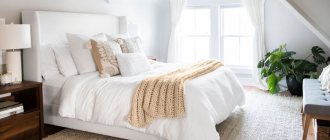
Corner bed in the bedroom
The bed is a key element of bedroom furniture. But this does not mean at all that the only right place for it is the center of the room. Corner models are becoming increasingly popular.
They take up minimal space, saving a significant amount of square meters. In addition, L-shaped furniture opens up the rest of the room, bringing airiness and style to the interior.
Valeria Moskaleva: “No need to litter the space, leave room for air”
Designer Valeria Moskaleva.
Designer Valeria Moskaleva.
“Harmony in space is what a designer should strive for. When planning the interior, I try to think through every detail and every corner. The emptiness in the interior and corners, in my opinion, is even a plus, but such decisions must be justified and supported by the overall aesthetics and style of the interior.
Speaking of “emptiness,” I would like to recall the interior of the Katsura Imperial Villa in Kyoto or the interiors of Carlo Scarpa. In them, emptiness is already art and decoration of life. No need to clog up the space, leave room for air.
But if it so happens that such a corner has appeared and it’s difficult for you to live with it, you can use decorative techniques with mirrors. Be careful what is reflected in them! This technique can give additional depth and deceive the eye, hiding the imperfections of the angle, or work in the opposite direction if you have a lot of unnecessary things and clutter in your home. The effect of sloppiness will increase several times.
Interior fragment.
Author of the project: Valeria Moskaleva. Style: Yulia Chebotar. Photo: Mikhail Loskutov.
Interior fragment.
Author of the project: Valeria Moskaleva. Style: Yulia Chebotar. Photo: Mikhail Loskutov.
Perhaps a free corner is just a reason to buy art, an art object, or a place for a musical instrument. So, in one of my projects a piano appeared, which the owner had long dreamed of.”
Interior fragment.
Author of the project: Valeria Moskaleva. Style: Yulia Chebotar. Photo: Mikhail Loskutov.
Interior fragment.
Author of the project: Valeria Moskaleva. Style: Yulia Chebotar. Photo: Mikhail Loskutov.
Corner bedroom design
In the design of a corner bedroom, items should be combined with each other and complement each other. The room will not seem cluttered if you use the same color for the walls and cabinets. If the room is small, then it is advisable to decorate the interior in contrasting colors.
The material of the facade plays an important role in the appearance of any element of furniture. Cabinet manufacturers use:
- Wood-fiber boards coated with plastic, film or veneer (the most popular option);
- Mirrors (promote visual expansion of space, improve lighting);
- Glass (can be transparent, tinted, frosted);
An interesting and unusual solution is the simultaneous use of several materials. This furniture looks incredibly impressive.
You can choose a design with a straight or radius body. The fittings and decor of corner wardrobes may also differ.
Wardrobe
If you're struggling with a lack of space and always feel cluttered, make a separate boudoir area by organizing a closet structure that can take up an entire niche in the corner, trying to utilize as much space as possible. Whether you're looking to organize your closet or add more space to a tight area, there are many options.
The built-in wardrobe is suitable for additional space to hang clothes . Or go with the now-popular lighter, smaller version of the traditional wardrobe design that fits into tight spaces. Then go for a light wood finish to match the sleeping set.
Built-in dressing room in an asymmetrical bedroom
Or build your wardrobe in a U shape to take up the entire area with extra corners. Then determine how much space you'll need and which sections to install. This is a very convenient shape that can be combined with mirrors on the doors and nearby walls to create an area with a 360-degree view for comfortable changing.
Regarding the cabinet doors, there may not be any at all; this style is called “Boutique” and is also very popular. Or choose convenient designs such as double, hinged or single doors. The latter method is less convenient, but more durable.
Popular “Boutique” style
Don't forget about shelves as a way to declutter your room without spending a lot of money. Wardrobes come in a variety of sizes and styles, customized to suit your space and needs. They can be used to store folded clothes, shoes, and other items that clutter the house.
Corner furniture options
If the purpose of the place is determined, then the next step is to determine what to put in the corner of the living room. The most popular options are:
- sofa;
- closet;
- table;
- couch;
- TV table;
- electric fireplace;
- Sports Equipment.
Below in the article the conditions and tasks to be solved when installing these things are discussed. They solve various problems.
Using compact furniture, you can store everything you need in one place. A narrow corner shelving unit is just the case when you can’t do without furniture.
Sofa
Installing a sofa solves several functions at once. The sofa can become a place to relax and sleep, as well as a meeting place with friends. Corner sofas are currently popular because they have a fairly large number of seats and the resulting empty area can be used to install a coffee table.
An additional seating area, an elegant element of furnishings and a wonderful way to occupy an empty corner.
Closet
Installing a cabinet can be considered the most functional use of space. Visually, the corner cabinet does not look massive, but in practice, much more things fit inside it than in a regular cabinet. The cabinet doors can be made of mirrors, which will significantly visually increase the space, or they can be decorated in a decorative style, which must be combined with the general style in which the apartment is designed.
A good solution for apartments in dire need of additional storage.
Desk
Just like a closet, the interior desk cabinets hold a lot of things. The working surface will be much wider in area, which makes it possible to place on the table the equipment necessary for work: a monitor, a printer. Hanging shelves can also be hung above the table.
Modern furniture manufacturers offer models of tables and shelves that can fit even in a small space.
An installed corner desk can serve as a kind of office. When working behind it, your back is to the rest of the room; this does not distract your attention and allows you to concentrate on your work.
Why not organize a home mini-office or a small workshop in a free corner.
Couch
This option is definitely suitable for the kitchen. It is also used in studio apartments. In any case, the soft corner creates a dining area and a table is installed with it. This solution has several advantages:
- the ability to use the space under the seats for storing things;
- the problem of the need for stools or chairs is solved, which makes the kitchen area less busy.
Perhaps the most obvious and common option is to occupy an empty corner.
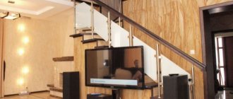
TV table
The most common design option. If you install a game console on the cabinet in addition to the TV, then the place in front of the TV turns into a play area if there are children or if the owner likes computer games. This arrangement of the TV allows you to free up space to recreate other areas.
This is true for one-room apartments, where every meter should be used productively.
Electric fireplace
Currently, there are a wide variety of options, up to complete visual similarity of the electric fireplace flame with a real fire. A fireplace in the corner of the room looks very impressive and realistic, creating the impression of luxury and good life. Using decorative details, you can recreate the feeling of being in a country house.
Soft armchairs opposite will create maximum psychological relaxation for the owner.
Sport equipment
You can fill the space with sports equipment, thereby creating a sports zone. This is a relevant solution for using space not only when the owner is an athlete, but also when there are children for whom playing sports will be very useful.
Another very common way to occupy a free corner in a room.
Natalya Preobrazhenskaya: “A bare corner is not in favor of comfort”
Natalya Preobrazhenskaya, designer, head of the “Cozy Apartment” studio.
Natalya Preobrazhenskaya, designer, head of the “Cozy Apartment” studio.
“The very realization that not all corners are filled psychologically expands the space - it means that the owners have space, and they can afford not to take up every centimeter. But a bare corner, on the contrary, does not speak in favor of comfort. Empty corners cut up space and create a feeling of tension; Even in minimalist interiors, I recommend avoiding empty corners. At the same time, arranging furniture “along the wall”, pushing a sofa or table tightly into a corner is also not an option at all: such an interior takes on a taste of officialdom, as if no particular effort was put into creating it.
Interior fragment. Design: “Cozy apartment”.
Interior fragment. Design: “Cozy apartment”.
Top simplest and most effective solutions for filling an empty corner
- Plant in a large pot.
- Large art ceramics.
- Interior sculpture.
In one of the projects, we softened an empty corner by adding a wide ribbed MDF panel to look like wood - the living room turned out to be visually larger and looks very respectable.
Another solution is to make narrow, illuminated shelves for small pieces of art and a home library. However, it is better to fit them into niches so that the corner itself remains open. This solution is only suitable if the layout allows such recesses to be laid in advance.”
Daria Susekova: “I am very happy about the forced appearance of empty corners”
Designer Daria Susekova.
Designer Daria Susekova.
“An empty corner for me is always an opportunity to add decor, greenery or design collectibles that are impractical but pleasing to the eye. This could be some kind of art object on a pedestal, floor vases or greenery in beautiful flowerpots. Or maybe an “unusual” chair or armchair. There is not always room for these amenities, so I am very happy about the forced appearance of empty corners. When designing, we think in advance about what we will place in these places.
Interior fragment.
Design: Daria Susekova.
Interior fragment.
Design: Daria Susekova.
Of course, a lot depends on the room itself. For example, the compositional arrangement along the central axis implies the presence of empty corners, which is a feature of the interior. Sometimes the style itself suggests pure volumes, a lot of “air” and a minimal number of accessories. In this context, empty corners should remain empty, that's part of the concept. As a rule, in such interiors, one or two objects are dominant.”
Inna Zol
Designer and decorator Inna Zoltmann.
Designer and decorator Inna Zoltmann.
“It seems to me that an empty corner in the interior is a misunderstanding, given the cost per square meter of real estate (especially in Moscow); with proper planning and the designer’s desire to use every millimeter of the area entrusted to him, such a question should not arise at all.
There are well-known professional techniques that prevent the appearance of empty corners: for example, classic axial layout and functional zoning of space.
Interior fragment.
Design: Inna Zoltmann. Photo: Sergey Ananyev. Style: Natalya Onufreychuk.
Interior fragment.
Design: Inna Zoltmann. Photo: Sergey Ananyev. Style: Natalya Onufreychuk.
To create a beautiful classic layout with a pronounced axis of symmetry, the proportion of the golden ratio is very helpful, when each room is conventionally divided into several parts (usually an odd number), and the sizes of these parts are related harmoniously.
With proper zoning of space, each room is assigned a specific function; the main object dedicated to this function is placed in the center of the space, and objects with additional functions can be placed on both sides. This way, there are no empty corners left - they are all occupied by necessary objects and delight a person with their usefulness and beauty.
Interior fragment.
Design: Inna Zoltmann. Photo: Sergey Ananyev. Style: Natalya Onufreychuk.
Interior fragment.
Design: Inna Zoltmann. Photo: Sergey Ananyev. Style: Natalya Onufreychuk.
It is very important to think about the ratio of objects in volume and height; basically, there are two options.
- We place a large (main) low object in the central part of the room, and tall ones at the edges or corners.
- There is a tall, large object in the center (for example, a buffet), and low ones at the edges.
This is always a detailed study of each of the walls in millimeters and constant reflections on the benefits and beauty.
In my project for the beauty salon “Confetti” on Patriki, the main hall serves as a living room; I placed the administrator’s desk in the center of the main hall - this is the main piece of the room, and in the corners there was a waiting chair and a manicure table (and these are additional functions). Opposite the administrator’s desk there is a decorative console for information materials (catalogues, business cards and booklets).”
Interior fragment.
Design: Inna Zoltmann. Photo: Sergey Ananyev. Style: Natalya Onufreychuk.
Interior fragment.
Design: Inna Zoltmann. Photo: Sergey Ananyev. Style: Natalya Onufreychuk.
Corner dressing table for bedroom
A corner-shaped dressing table has a number of advantages, among which the following stand out:
- Large capacity;
- Original appearance;
- Compact sizes.
It is installed complete with a corner mirror in the bedroom and is usually equipped with many convenient drawers and shelves.


