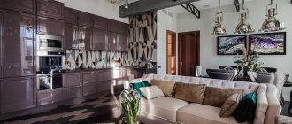
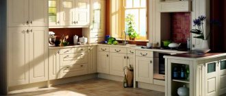
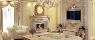
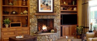
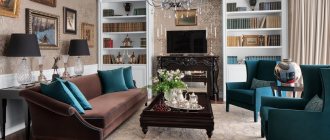
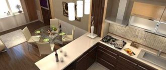
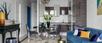
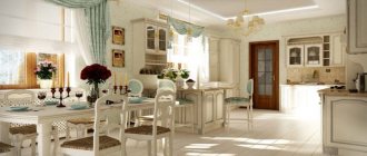
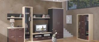
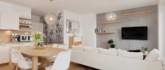
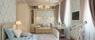
Translated from Latin, classicus means “sample” or “standard”. In the modern sense, this is an example of taste and sense of style in the interior of a room. A house or apartment of any size can be decorated in a classic style without much effort, using the simplest techniques for decorating rooms, zoning space, and choosing furniture. This interior is beyond the boundaries of time and fashion.
Classic style in the design of the kitchen-living room
Main characteristics of the classic style in the interior
The main characteristic of the classic style is not only the correctly selected furniture, but also the principle of its arrangement and decoration:
- Determining focal points for creating a circular composition.
- All details must have straight lines and clear geometry.
- Light sources of different levels should be located around the perimeter of the room.
- Only natural materials should be used for decoration and decoration: wood, granite, marble, metal.
The classic style should contain luxury, compatible with the national flavor.
There are other basic characteristics for an interior in this style - calm colors and a lot of gold and silver in the decoration.
Palette selection
Classic design most often uses a white and gold palette: white is the main one, and gold is used to highlight decorative details. But there is always room for imagination:
- Neutral beige tones will be as attractive and understated as a white palette, especially when combined with golden accents. Gold is usually used to decorate moldings or milling on the facades of furniture, the backs of chairs, and the legs of a dining table.
- Unobtrusive pale pastel shades of blue and green can be used in combination with beige or white.
- Gray color is used quite often. It is applicable for arranging surfaces that can be stone. As a rule, these are floor coverings, a work area with a gray countertop, and an apron. In the living room, to maintain the composition, there will then be a gray sofa with simple upholstery or with a large ornament of a darker palette.
- Shades of brown can be used as a base - in light colors, and as a finishing color - in darker colors. This color sometimes has bronze notes, which further highlights light surfaces. Most often, brown is present in natural wooden surfaces, although there is also imitation stone coverings in the same palette.
The photo shows a brown kitchen in a classic style.
- Black is used in moderation , so it can be present in the facades of household appliances, in floor finishing, and in aprons. The set can be complemented with such a dark countertop.
Pros and cons of combining a kitchen with a living room in a modern classic style
Classics for a modern kitchen-living room are used by many interior designers to expand the space. But before you take such a step, you should understand all the pros and cons of such a design.
Kitchen-living room in a classic style with all the nuances:
| The advantages of such a combination | Disadvantages of Merger |
| The perception of a large space is better than several small separate rooms. This design looks modern and fashionable. | The cleaning area will increase, which needs to be done frequently, since the kitchen is a source of dirt. |
| This layout involves holding events that can easily be combined with cooking (parties, meeting with friends). | It is necessary to pay special attention to the arrangement of ventilation and the installation of powerful hoods, otherwise the smell from food and cooking will penetrate into all rooms |
| Due to the absence of numerous partitions, more natural light penetrates into the room. | The operation of household appliances (refrigerator, mixer, coffee machine, etc.) can increase noise in the living room. |
| By combining diverse zones with each other, you can spend more time with your family while preparing food. | Redevelopment of a premises can take a long time, and the costs of carrying out the work will be high. |
| The space expands if initially the living room and kitchen were too small in area. | Depending on the initial design, there may be problems with relocating supports. |
| You can save some money, since the finishing area is significantly reduced (interior doors, walls). | There is no possibility for privacy - the entire space is constantly open. |
Only after weighing all the pros and cons of this design can you begin to expand the kitchen and living room space.
Kitchen combined with living room - its advantages
Today, more and more owners of 2- and 3-room apartments prefer to combine a kitchen with a living room. This allows you to visually increase the space of the room and make it more exclusive and functional.
- The kitchen, combined with the living room, looks very fashionable and modern. The main advantage of this redevelopment is that as a result you get a spacious, bright room instead of two small ones.
- The kitchen, combined with the living room, is very convenient for parties and get-togethers with friends. Now you won't have to leave your friends to go to the kitchen and cook something, and you won't feel like you're locked in the kitchen while everyone else is having fun. Now you can prepare snacks and communicate with guests at the same time, and it’s easier to attract help.
- There will be no need to run with plates and teapots from the kitchen to the dining room, everything will be greatly simplified.
- Redevelopment will allow you to save on purchasing a second TV; you can buy one large one instead of two small ones. It will also be easier for you to keep an eye on the kids playing in the living room, while you can do your own thing in the kitchen.
Popular types of zoning
Designing the space of combined rooms in a classic style involves several zoning methods:
- With the help of furniture.
- Using surface finishing.
- Thanks to the arches and columns.
Zoning with color in a classic style will be inappropriate, since the palette used is not very contrasting.
Using furniture
A modern zoning option often involves using furniture as a border. This is often how a loft or studio apartment is arranged. You can separate the kitchen from the living room using a bar counter, the bedroom from the living room - with a bulky sofa or armchairs.
Zoning space using furniture
Using wall, floor and ceiling finishes
To get a holistic picture of the delimitation of space, it is advisable to immediately produce zonal finishing of several surfaces - floor, ceiling and walls. Thanks to this technique, the total area will be visually divided into separate rooms without bulky structures.
The simplest option for zoning through the use of finishing materials is wallpapering in accordance with the functionality of the space.
Wallpaper for zoning
In the Art Nouveau style, it is better to separate zones by creating a unique floor finish. The best option would be to build a small platform that will serve as an excellent border between the kitchen and living room.
Platform as a border between zones
Another option for dividing into zones is finishing the ceiling. You can make different colors of the stretch ceiling with a certain distribution of lighting fixtures.
Ceiling as a space delimiter
Zoning by finishing walls, ceilings or floors has the main advantage - space is not “stolen” by erecting arches, columns or installing massive furniture.
Using arches and columns
A country cottage or house can be easily divided into zones using arches and columns. This principle will allow you to further decorate the decoration of the room.
An additional advantage will be the preservation of the authenticity of the classic style, which involves the use of decorative buildings of this type, compensating for the simplicity of decorating the rest of the space through furniture and decorative elements.
Arches and columns for zoning
Kitchen-living room layout. Zoning methods
All photos In the photo: Design of a kitchen-living room in the residential complex "Donskoy Olympus"
Among modern methods of zoning the studio space of a kitchen-living room, the most popular are those in which the room remains quite open and free. Various partitions and shelving are increasingly becoming a thing of the past, giving way to more functional and aesthetic techniques.
Peninsula bar counter
All photos In the photo: Bar counter in the design of a modern kitchen-living room
The optimal option for separating the kitchen from the living room is a bar counter, which can be used as an additional work surface on the kitchen side, and a comfortable bar counter on the living room side.
Functional kitchen island
All photos In the photo: Kitchen island in the interior of a kitchen-living room in a private country house
Free space in the kitchen-living room will make a comfortable kitchen island more functional. Such a piece of furniture can include both a hob and a sink, which significantly saves space in the kitchen. In addition, spacious drawers will allow you to place kitchen utensils, and bar stools will allow you to use the table as a bar counter and a small dining table for light snacks.
Sofa as a zone divider
All photos In the photo: The interior of a living room combined with a kitchen in the art deco style.
Apartment in Malta Often the kitchen-living room space is zoned using furniture. It is important to arrange the furniture in such a way that it can perform several functions - a competent designer will cope with this task. One of the common techniques is a sofa located between the kitchen and living room, which also serves as a separator of functional areas.
Two in one: bar counter + kitchen island
All photos In the photo: A functional bar counter in the interior of a kitchen-living room of a country house.
A stylish solution in kitchen design in the Art Deco style: a kitchen island with classic half-columns and moldings is combined with a stylish minimalist bar counter, which helps to zone the interior visually as well.
Sliding glass partitions between zones
All photos In the photo: Interior of a studio apartment in the loft style
Interiors in the loft style, as a rule, tend to be studio-like. A low bar counter separates the kitchen area from the living-dining room. In addition, the kitchen is separated by a transparent glass partition, which is almost invisible and creates the feeling of a single space. Green plants and an emphasis on shades of natural wood are harmoniously combined in the loft interior of a studio apartment.
Bar counter with chairs
All photos In the photo: Design of a living room in a loft-style house with a minibar Brickwork
in the TV area, dark Voltaire armchairs, “simple” wooden shelves, a bar counter with a silver-metallic shiny body in the minibar - an idea for the interior of a loft living room makes the home design laconic and a little brutal.
Partition with TV
All photos In the photo: Partition in the studio space of a small apartment
Sometimes a partition in the studio space is still necessary. Especially in such cases when it becomes a truly functional part of the interior. A partition with a TV area and a music center in the interior of this “male” apartment of a small area is truly irreplaceable.
Tinted glass sliding doors
All photos In the photo: Sliding doors in the interior of the kitchen-living room
Of course, in modern interior design no one has canceled traditional sliding doors. The advantage of this method is that with their help you can create a single kitchen-living room space, and, if necessary, easily separate the rooms from each other.
Wide portal connecting the kitchen and living room
All photos In the photo: Interior of a kitchen-living room with a wide portal
Mirrors with bevels, sculptures in antique style, marble and glossy surfaces, gold trim and furniture from the Visionnaire factory decorate the interior of the kitchen-living room in the art deco style. From the living room you can enter the kitchen through an open wide portal.
Aquarium as a space divider
All photos In the photo: Aquarium in the design of a living room combined with a kitchen
The interior design of this living room with an aquarium reflects the modern trend of conventional visual division into functional zones. The aquarium acts here as a transparent partition. Blue neon lighting emphasizes the “water motifs”.
Interior color scheme
The color scheme of a classic interior is determined by several basic rules:
- The main color is white and all its shades.
- Pastel colors of all colors are used.
- Classic beige.
- Universal gray color of all shades.
- Dense colors that are considered noble at the same time: burgundy, brown, salmon, olive.
It is best to use light colors when decorating surfaces, but dark, deep colors and shades are suitable for highlighting details.
Example of color scheme
Decorating a kitchen studio using decorative and finishing materials
In apartments and houses, finishing materials such as ceramic tiles or wallpaper are very popular, including for decorating a kitchen-studio. In order for the functional areas of the room to be distinguished by visual contact, materials of various colors and shades are used. However, the classical method is considered to be one in which the colors of finishing products differ by one or two tones. The boundary between the zones of the room, highlighted in this way, will be difficult to miss. If the room uses wallpaper of the same color and pattern, then moldings and special borders can be used as a dividing element. Such techniques are most relevant when designing a large area. When choosing finishing materials, pay attention to their components. It is not allowed to use materials containing toxic substances to decorate the kitchen area.
Using laminate as flooring in a classic kitchen-living room
Zoning using floor coverings: laminate and tiles
The division of the studio-kitchen into functional zones occurs with the help of flooring. For example, there are floors decorated with multi-colored ceramic tiles; areas highlighted in this way are very noticeable. In addition, interior stylists recommend using tiles that have different designs. For example, tiles with a pattern are used to decorate the living room, and single-color material is used to decorate the work area. In addition, laminate flooring, a design that differs in color, texture or pattern, can be used to define the boundaries of the functional segments of the kitchen-living room by zone. Sometimes the kitchen is raised onto a low podium, in which case a small step will act as a border.
Zoning with dark tiles in the kitchen area and light laminate in the living room area
Highlight the kitchen using the design of the ceiling surfaces. For these purposes, multi-tiered ceilings can be used, and if the height of the room does not allow this, then various decorative materials can be used. For example, the ceiling above the kitchen area can be decorated in accordance with a strict classic design, and a variety of decorative elements can be added above the living room.
Subtleties of decorating a combined kitchen-hall in a classic style
The interior of a kitchen-living room in a classic style should be harmonious and favorably emphasize the dignity of the home. When designing such a zone, the following features should be taken into account:
- Correct lighting.
- High quality textiles.
- Thoughtful decor.
If all these subtleties are taken into account in the process of arranging the living-kitchen area, then the interior concept will be holistic and harmonious.
Lighting
Much in any interior depends on the play of light. In a classic style, it is important to properly organize different levels of lighting. Therefore, when distributing lighting fixtures, the following features must be taken into account:
- There should be a lot of lighting fixtures that will illuminate all corners and areas of the kitchen-living room.
- Lamps in the living room itself and along the kitchen working surface should be located so that there is no glare or obstruction to the view.
- In the dining area, lamps should be placed clearly above the table and chairs to provide soft lighting without interference.
Natural lighting also needs to be planned. It is advisable to make a large panoramic window that will illuminate the room well and visually expand the space.
If you plan to install a large number of diverse lamps, the power of each instance should not be too high. Otherwise, the effect of “surface reflection” will occur.
Organizing proper lighting
Textile
Luxury must be present within the classic style, so furniture and textiles for decoration and furnishings are of high quality and only made from natural materials. At the same time, textiles should look expensive, so velvet, brocade, satin, and velor should be used mainly.
Textile design
Important! In order for the combination of textile elements to be harmonious, it is worth choosing furniture with good and expensive upholstery.
Decorative elements
In order not to disturb the perception of a classic space, you should very carefully select decorative details - everything should fit into a single picture without rejection. Therefore, it is worth abandoning too bright colors and vulgarly pompous interior items. Everything should be restrained and harmoniously combined within the premises.
Design principles
Decorating a kitchen in a classic style is not an easy task, since the design makes many demands on almost any detail of the interior. We list the main features that you should focus on:
- Only high quality materials. A classic interior is only interested in natural textures and high-quality materials, for which you have to pay well. Plastic, laminate, linoleum should be avoided, and natural stone, wood (for example, ash, walnut, oak, alder), metal and luxurious fabrics should be preferred. You should not try to save on materials, because in a classic interior this will immediately become noticeable, and the whole atmosphere of elegance and aristocracy will disappear.
- Symmetry and proportionality. A classic kitchen is not the place to experiment with furniture with unusual asymmetrical shapes or original layouts. Abstractions and chaos are unacceptable here: every part of the decor must be in harmony and combined with each other. The basis of symmetry is usually the slab.
- Lighting. A necessary attribute of a kitchen in a classic style is a chic chandelier in the center of the room. There simply cannot be any other lamp on the ceiling. If additional light is needed, then sconces and floor lamps are purchased. LED strip or point lighting sources are undesirable, but acceptable if they are well hidden.
- Beautiful facades. We’ll talk about facade materials a little later, but now we should note another necessary attribute of a kitchen in a classic style - panels. Flat doors are prohibited because they do not reveal all the luxury of the interior. In addition to panels, the facades may contain stucco and other decorations.
- Hidden household appliances. A classic interior is not at all a reason to give up the last blessings of civilization and heat food on the stove instead of a microwave oven. But this technique needs to be hidden, so most often they choose built-in instances.
These simple tips will help you create exactly the atmosphere of elegant and cozy luxury that is expected from a classic style.
Furniture for kitchen
A white kitchen in a modern classic style has closed facades, inexpressive but high-quality fittings, and painted surfaces. Often, facades are artificially aged using facade patination technology, since vintage furniture is very expensive. In photos of such kitchens you can often see a stone countertop made of natural marble or granite or an acrylic countertop (both options are shown in the photo below).
Household appliances fit harmoniously into the overall interior
Dinner Zone
In a classic kitchen there is always a dining area - it is always noticeable and separated from the work area. The main element, without a doubt, is the large table made of thick wood. The form can be any:
- round;
- oval;
- rectangular;
- square.
The table is complemented with chic chairs with seats upholstered in luxurious fabric. These can be ordinary chairs with a high back or armchairs with armrests. If the seat of the chairs is not soft, then you need to put pillows. The color of the chairs should match the table or kitchen set.
If the kitchen is small, but you really want to decorate it in a classic style, then it’s better to get by with a round glass table. It will not “eat up” the space so much, and will even fill the room with additional air.
Work zone
The most important part of the work area is the tabletop, since the hostess is most often located next to it. Due to practicality, in the case of an apron, it is better to opt for a very high-quality imitation than a natural material: for example, artificial stone or an MDF panel with a film depicting wood.
It is advisable to choose a set made of natural wood, but veneered facades and MDF can be used. The main thing is that the furniture looks beautiful and of high quality. There are practically no restrictions regarding decoration. Acceptable:
- patina;
- thread;
- gold plated inserts;
- stained glass doors;
- original handles.
The main thing is not to combine all the decor in one set. Interestingly, the outer cabinets are usually rounded, making the set visually smoother and neater.
Array
Advantages:
- Environmentally friendly.
- Never goes out of style.
- Real tree structure.
- Looks respectable and expensive.
Flaws:
- High price
- Sensitive to changes in humidity and temperature. Requires complex care.
- Absorbs odors and water.
- With central heating they can become deformed due to dry air.
MDF
Advantages:
- A large number of finishing options (film, enamel, veneer).
- Durability.
- Environmental friendliness and safety.
- Can be milled.
- Affordable.
- Not afraid of changes in temperature and humidity.
Flaws:
- Veneer or PVC film can peel off from hot steam - for example, from a kettle or stove.
- It is difficult to veneer a relief façade.
Antique household appliances and plumbing fixtures
In a classic kitchen, it is advisable to integrate all the appliances that can be built in, so that nothing disturbs the unity of the facades. The appliances that remain in sight (hood, oven, toaster, electric kettle, etc.) should be chosen in a retro style as in the photo below.
Plumbing fixtures should also be classic. For example, a white ceramic or stone sink works well, as does a two-valve faucet in bronze, old gold or silver.
Hood
This necessary functional detail should be truly effective when it comes to a spacious room, the features of which are to combine with the dining room and living room. Which hood is suitable? The most common and high quality. But it needs to be disguised. This is usually done using a portal, which is designed in a traditional classicist way: the hood is surrounded by columns, decorative details and stucco. The hood itself is not visible, but fully performs its functions.
Apron
The work panel is designed in different ways, among which there are popular and practical options:
- Brick-shaped tiles are considered traditional. This is usually a glossy surface, the design of which can be quite simple - in the form of masonry. You can also choose a more complex design for the apron - tiles laid in a herringbone pattern or in squares. You can repair such a surface using the same tile, using one stripe in a pattern. It is optimal to choose vines or a geometric pattern. Usually it is one straight line on a white background. The color of such an apron can be different: white, beige, and gray palettes are appropriate here.
- The wall decoration of this area can also have a simpler design - real brickwork.
- You can also use photo wallpaper in the dining area, and on the apron - print on the skin. A similar plot will make the interior complete.
Recommendations for creating a kitchen-living room design in a modern classic
The optimal area for creating a modern kitchen-living room design in a classic style is 15-20 square meters. m. There should be enough space to form all the necessary areas of the room.
Recommendations on how to create an interior design for a kitchen-living room in a modern classic style:
- Furniture in the living area and kitchen should be made in the same style.
- Particular attention should be paid to decorative and textile design, using exclusively expensive and high-quality materials.
- It is advisable to use natural materials.
Decorative design option.
Art Nouveau and Art Deco styles in the design of a living room with kitchen
Mirror wall in a modern kitchen-dining-living room
All photos In the photo: Design of a kitchen-living-dining room in the Art Nouveau style
A mirror wall in the interior of a small kitchen-dining room helps to visually expand the boundaries of the room. Classic furniture, curtains made of thick fabric with a lambrequin are adjacent to elegant chairs in the Art Nouveau style in the dining area.
The Art Deco style is especially appropriate in living rooms - thanks to the bright decor, eye-catching interior items, reminiscent of the style of the 20s of the last century. Today, Art Deco is in many ways “modernized” by designers: some options for such interiors from the portfolio of the Angelika Prudnikova Studio are presented below.
Smooth “flowing” lines
All photos In the photo: Kitchen-living room design with modern and art deco elements
Elements of classic and modern contribute to the creation of a delicate interior with soft rounded lines that seem to repeat each other and smoothly flow into new shapes and lines. This is especially true for the kitchen-living room, where “connecting threads” are required to visually unify the space.
Art Deco chairs
All photos In the photo: Design of a kitchen-dining room in the art deco style
It is not necessary that the chosen style should sound the same in all elements of the interior. You can even limit yourself to one or two strokes. Art Deco style chairs will organically fit into any modern interior.
Chandelier with crystal pendants in the dining area
All photos In the photo: Kitchen-living room in art deco style
The kitchen in the interior of the studio space takes up very little space, which frees up more square meters for the living room combined with the dining room. A large chandelier with crystal pendants accents the dining area.
Black accents and mixing styles
All photos In the photo: Interior in eclectic style
The interior of this kitchen-living room mixed elements of neoclassicism, art deco, and Japanese minimalism. Branches of “sakura blossoms” in floor vases, a mirror in a wide silver frame and upholstered furniture from the Visionnaire factory decorate the interior, and neat black accents add a graphic touch.
Gilded elements and abundance of decor
All photos In the photo: Interior of a kitchen combined with a living room in the art deco style
Interiors in the art deco style involve a large amount of gilding and bright decor, which is especially appropriate in the living room and kitchen-living room. Golden accents allow you to connect different elements of the interior with each other and design functional areas in the form of stylistic unity.
Kitchen-living room in a small apartment
All photos In the photo: Design of a kitchen-living room in a small apartment in the Art Deco style
Even in a small apartment where the kitchen-living room occupies a walk-through room, you can create a stylish and beautiful interior in a luxurious Art Deco style. Sliding transparent doors leading to other rooms of the apartment save space, and curtains help make the atmosphere more intimate if necessary.
Bar stools and kitchen island in art deco style
All photos In the photo: Design of a single space of a kitchen-dining-living room in the art deco style
As mentioned above, the interior can have just a few touches in a certain style that will change the overall mood and perception of the environment. The bar stools and armchairs in the dining area, as well as the massive kitchen island, are made in the spirit of Art Deco, which gives them grace and solemnity. Thus, if the kitchen is combined with the living room, Art Deco features and all kinds of decor are welcome, since in this case the kitchen becomes a continuation of the main room where guests are received.
If you are just going to renovate your apartment or house, pay attention to the idea of combining the kitchen and living room. Of course, there may be many possible options, and in order to choose the most optimal one that is suitable for your home and meets the needs of your family members, you will need the help of a professional interior designer. You can get some useful ideas for your future interior from this review with examples of design projects by the talented designer Anzhelika Prudnikova.
Design photo
The best way to describe the interior design of a kitchen-living room in the style of modern classics is a photo with examples of the design of this space.
The classic English style is very popular.
English classics
The modern design of a kitchen-living room in a classic style will look beneficial both in an apartment and in a country cottage.
Modern motives
Classic style is a universal interior design option with luxurious details.
Universal design
Even a small room can be decorated in a classic style. This option will favorably emphasize all its advantages.
Small room in classic style
The classic interior style is considered the leader among the rest, as it never goes out of fashion, shows the well-being of the residents and does not irritate with bright accents and tasteless design. If you take into account a few basic nuances and rules for recreating such a design, you can get a bright and harmonious combined area for relaxing and cooking.
Rules, instructions, recommendations
Indispensable attributes of kitchen design: lightness, harmony and abundance of light. For this reason, it is recommended to use light shades. However, you should not overuse pure white color without impurities, otherwise the kitchen-living room will begin to resemble an operating room.
To prevent the overall look from being too “cold,” use shades of white: ivory, cream, the color of baked milk, “champagne splashes.”
A snow-white kitchen-living room will look advantageous in the overall interior only if you use a light green color as a background, which emphasizes the depth of the room.
Other colors that are ideal for the background colors of the interior “a la classic”: beige, light blue, pale pink. In some cases - gray (not metallic, but pearl shades). The best solution for wall decoration is plaster or wallpaper that creates the effect of plaster. Wallpaper with exquisite patterns is also recommended. The effect of lightness and unobtrusive elegance is an indispensable attribute of classics.
A prerequisite is an apron for the working area, finished in appropriate colors. It should fit harmoniously into the overall color scheme and be combined with the style of the room as a whole. Particular emphasis is placed on the flooring.
Despite the fact that in the classical tradition parquet is preferred. This is not the best option for a kitchen space. Experts advise using natural stone or a high-quality imitation of it for finishing the floor. A marble floor in combination with light shades and the effect of plaster will instantly give the desired effect. The atmosphere in the room will greatly benefit from such visuals.
A separate item on the “menu” is ceiling finishing. Stretch ceilings in the classical style, which have recently become wildly popular, do not look the best. In this case, it is preferable to limit yourself to plaster.
Advice! For extra elegance, you can use a frieze or stucco. Then your ceiling will become an example of luxury and aristocracy.
If there is a large footage (which is typical and even integral for classics), then its interior will require special attention. The widespread belief that placing furniture over a large area is not the most difficult task is, to put it mildly, incorrect. But simply - it is fundamentally wrong. It is much easier to use a modest cubic capacity wisely and efficiently than a spacious one. The task at hand automatically requires maximum concentration and compliance with all prescribed rules.
A distinctive feature of the classics is massive wooden furniture. It may not be suitable for everyone. As well as the combination of carvings on the facades with stucco on the ceiling and marble tiles on the floor.
But within this style there are completely different options for interior decoration. For example, facades made in the form of antique columns with the addition of parquet or laminate with a parquet effect. For reasons of economy, it is permissible not to purchase products made from solid wood. It is quite acceptable for only the facades to meet the stylistic requirements. Shelves and cabinets can be made from other, cheaper material.
There are many options for arranging furniture. The main rule that unites them is the presence of harmony, ensured through symmetry. It is imperative to have a clearly defined center, from which the composition evenly diverges to the sides. The role of this center can be played either by a slab or a special “island”.
Such conditions a priori presuppose an abundance of light. Therefore, there must be several light sources. The windows must be large, with a good level of sunlight transmission. The work area definitely requires special lighting built into the hood or kitchen cabinet. Such lamps do not shift the focus to themselves, since they practically do not attract attention. Chandeliers, on the contrary, are placed either in the geometric center or on the sides of it - strictly symmetrically.
Recommendation! The use of horn lamps, which accommodate several lamps at the same time, is encouraged.
For a functional kitchen living room mix, additional lighting is required by default. These can be sconces, floor lamps or table lamps. It is highly desirable that they be designed in the same style. A good design solution would be to combine several light sources so that they do not attract attention.
L-shaped kitchen living room design
A corner set without any additions is an ideal option for overly cramped kitchens with an area of only four to seven square meters. It is almost impossible to organize a dining area here - unless, perhaps, place it on the windowsill, equipped with folding chairs. The outer corners are beveled to ensure free movement during cooking; the set itself is made 5-10 cm narrower than the standard one.
Along one wall there are tall cabinets, a refrigerator, and closed cabinets; the other part is a cutting table, a stove, and a sink.
In large rooms, it is permissible to install a luxurious, large-sized L-shaped structure without complementing it with other elements. The solution is suitable for spacious apartments, where cooking for the whole family is done in one room, and the meal itself is in another.
The design in the shape of the letter “L” can have different types of internal corners - straight or beveled. They differ significantly in ease of use, availability of corner cabinets, direction of door opening, and manufacturing price.
In rare cases, the lower part is left open here, for example, when the set is complemented by a bar counter.
Living room kitchen renovation design photo real
Even at the planning stage, it is necessary to decide on the design of materials and colors. Knowing the 4 basic rules for combining according to the color wheel will help you choose a palette.
- Monochrome - when one color and its shades are used for decoration. To prevent a monochrome interior from seeming boring, choose colors of the same spectrum for decoration - from the darkest to the lightest.
Monochrome gray interiors can often be seen in styles such as minimalism and hi-tech.
- Contrasting - combine colors that are opposite each other on the color wheel. Yellow and blue, red and green – seemingly incompatible with each other. But it is precisely because of this that they create an effective design. To make bright and contrasting colors comfortable to perceive, add light shades.
- Harmonic combination is the use of colors that are adjacent in the color wheel. For example, yellow and green, blue and purple, red and orange, etc.
- The classic triad is the principle of combining a triangle inside a circle. That is, you need to choose colors that are equidistant from each other (see example in the picture below).
When combining colors according to the principle of the classic triad, it is important to strictly adhere to the chosen color scheme so that the interior does not end up being colorful.
Which color is still better to choose? Below we have put together some recommendations to help you decide.
The choice of color largely depends on the style. For example, Scandinavian style involves the use of predominantly white with bright color accents in the form of yellow, blue and green. High-tech and minimalism - monochrome basic colors, from black to white.
When choosing your favorite color, consider the color combination rules given above and do not use more than 3 colors at the same time. You can only experiment with shades, their varying degrees of saturation.
Consider the location of windows and the degree of illumination. For a room that lacks natural light, light warm shades are suitable to compensate for the lack of light. In a too sunny, brightly lit room, on the contrary, it is better to prefer cool tones.
Dark shades are undesirable for finishing the floor, ceiling, work surface and apron. They can be if it is necessary to create a certain effect in the interior (for example, a black apron creates a kind of portal and the illusion of infinite space), but keep in mind that they are very impractical in everyday life: even the slightest dirt is visible on dark surfaces - dust, water stains .
The choice of finish can also be driven by style. We wrote about them in more detail above, but here we will outline several important points that should be taken into account before going to a construction or furniture store.
1. Avoid impractical solutions in the work area. This is the most contaminated part, which, therefore, will be cleaned more often than others. To make this process as easy as possible, do not make the apron embossed.
2. The material for finishing the floor in the working part of the room must have water-repellent properties. The most practical solutions are porcelain tiles, ceramic tiles, PVC tiles, and linoleum. Waterproof laminate or parquet will significantly increase the cost of repairs.
A common question regarding the choice of finishes is whether it is possible to combine several finishing materials?
On the one hand, this is a great way to further delimit space. For example, tiles in the work area, and laminate in the living room. On the other hand, it is very difficult to find harmonious combinations of tiles and other non-waterproof materials. To maintain a single stylistic space without sacrificing practicality, take a closer look at PVC tiles (other names: vinyl laminate, quartz vinyl).
It is not afraid of moisture, easy to care for, pleasant to the touch and in appearance is not inferior to other finishing options.
3. When finishing walls, you should also be guided by their moisture-resistant qualities. You should not glue paper-based textile wallpaper next to the set. A good solution would be materials that can be quickly washed to remove dirt. Some paints and thick vinyl wallpapers are washable.
The issue of combining different materials and textures is also relevant here. In this case, this is not only a possible, but also a recommended scenario. Thanks to this technique, you can place the necessary accents and make the interior more interesting and expressive. For example, a popular solution is to decorate one of the walls with brickwork.
4. Finishing the ceiling raises the least number of questions, because there is always a universal solution. A regular white matte ceiling will always be appropriate. An emphasis on the ceiling can be made using color, gloss, a suspended structure or using stucco, although such solutions are unpopular due to the complexity and cost of execution.
The most common methods of finishing the ceiling are painting, suspended ceilings made from PVC film, or suspended from plasterboard.
The simplest, most cost-effective and fastest option is a suspended ceiling. It allows you to get a perfectly flat surface in just a few hours. When choosing this finishing method, you must make the lighting layout in advance and purchase lamps.
Painting the ceiling will take more time, but it allows you to decorate the surface with stucco patterns.
A suspended ceiling made of plasterboard makes it possible to create a multi-level structure for additional zoning of the combined space. Another advantage is the implementation of interesting and complex lighting ideas. The disadvantage of this solution is the loss of several sentiments in the height of the room.
