Principles for choosing color and texture
Despite the fact that the apron occupies a relatively small part of the kitchen interior, even in spacious kitchens, it can emphasize the design idea or completely destroy it.
Tip: We strongly recommend moving to this stage only after a decision has already been made regarding the color of the walls, floors, ceilings and kitchen units.
So, the fundamental principles for choosing the color of the apron:
- First of all, its color should be combined with the interior of the kitchen.
- No need to chase excessive brightness. Moderation is better than a colorful kitchen in which the eyes quickly get tired.
- Texture affects the color - gloss makes it richer, and matte materials make it a little paler.
- If you want a printed apron, keep in mind that large designs may be inappropriate in small kitchens. And vice versa - small images in a spacious room may seem inconspicuous.
We have put together recommendations for you on choosing the color of the apron to match the most popular designs of kitchen sets this year - look at them to make your choice. Go!
How to choose a kitchen apron: we understand the material and color
Why do you need a kitchen apron?
The main task of a kitchen apron is to protect part of the wall near the cooking area from splashes of water and grease, from steam and dirt.
Without additional finishing, a simply plastered and painted wall will not last long due to temperature changes, cracks will appear, and mold may appear due to humidity. Over time, the kitchen apron began to play an important role in the design: it can blend in with the color of the set, or it can become a bright accent that attracts attention. Today, more and more often, customers first choose the material, ornament, texture for the apron, and only then the color and finishing of the kitchen furniture facades.
Popular materials for kitchen aprons
In finishing, not only appearance is important, but also performance properties. Analyze your lifestyle (how often you cook on the stove, wash dishes in the sink or dishwasher, how often you plan to clean) and make a decision.
Tile
Ceramic tiles are one of the most popular materials for finishing the wall above the countertop. It can be of any color and texture, suitable for especially wet areas, the tile design can be ideally matched to any interior style.
Advantages:
collections for any budget, a large number of shapes and designs, there are solid and multi-colored collections, can withstand high temperatures and humidity, and are relatively easy to clean.
Flaws:
the presence of seams in which dirt accumulates, the tiles can crack if laid incorrectly or as a result of shrinkage of the house.
Porcelain tiles
This material is thicker and stronger than tiles and has larger elements. The design can be monochromatic, but porcelain stoneware is often chosen as an imitation of natural stone and wood.
Advantages:
It is not afraid of cleaning agents, it is durable, and fewer seams are formed during the installation process.
Flaws:
heavy material
Mosaic
Using mosaics you can create a more elegant look in your kitchen. Small elements add airiness and soften bulky kitchen cabinets. Mosaic can be made from tiles, natural stone and even pebbles.
Advantages:
It has a stylish look and perfectly masks uneven walls.
Flaws:
more difficult to maintain than smooth tiles due to seams and uneven texture.
Plastic or laminated chipboard panel
If you don’t want to bother with cleaning, then this is your option. The panel is smooth and easy to clean - just wipe it with a cloth and soapy water. The design is quite varied: the panels are covered with a film that can imitate the surface of wood, stone, concrete.
Advantages:
low price compared to other materials, simple and quick installation, easy to clean, no seams, large selection of designs.
Flaws:
can be scratched with a sharp object; if the apron is long, the joint between the panels is visible.
Strained glass
Another seamless option that is easy to care for. Although glass may not seem like the most appropriate material, it is perfect for a kitchen backsplash. Especially if you want to decorate the wall underneath with beautiful wallpaper, children's drawings, or just leave the paint plain.
Advantages:
ease of care, no seams, you can order individual length and height of the canvas, unusual appearance.
Flaws:
may crack during installation.
A natural stone
An apron made of natural marble, onyx, granite is a real work of art created by nature. Each drawing is unique - however, you will have to pay a lot for such beauty.
Advantages:
unique design, strength, no seams, the apron can be transformed into a tabletop without a plinth.
Flaws:
high price, special care without abrasive particles, stains may remain from splashes of bright colors (for example, if you cook borscht without a lid).
Fake diamond
It combines all the advantages of natural stone, while being much cheaper.
Advantages:
a large selection of designs - from imitations to plain colors, durability, no seams, the apron can be transformed into a tabletop without a plinth, relatively low price.
Flaws:
special care without abrasive particles, stains may remain on the light surface.
By the way, panels that imitate the texture of stone are an excellent alternative if you have a limited budget, but want to make a stylish renovation.
Which apron design should you choose?
Once we have decided on the performance characteristics of the apron, we move on to color, texture and design.
Apron in the color of the kitchen facades
A kitchen set and a backsplash in the same shade create the feeling of a single design; this design option looks visually lighter and helps to “stretch” the height of the room, since there are no horizontal stripes or breaks.
Apron-accent
Against the background of plain kitchen facades, aprons made of tiles with floral or geometric patterns, in patchwork style, look interesting. Our advice: the more laconic the design of the headset, the brighter and richer the design of the apron can be. For colored sets, he recommends choosing a white or light gray apron or with elements that match the color of the kitchen finish - this is a win-win option.
Looking for more interesting combinations? Here they are:
- gray set and yellow apron;
- brown set and red apron;
- beige or coffee set and blue or blue apron;
- gray set and burgundy apron;
- yellow set and light blue apron;
- olive set and apron the color of wet asphalt;
- dark blue set and soft pink apron.
Realized kitchen ideas
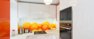
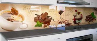
1. Beige set and apron with print
For this interior, we chose a two-color set, in which a delicate beige color predominates, and some of the lower cabinets are made of wood-like film. To make the backsplash more interesting without overcrowding the space, we used printed panels with coffee cups and brickwork elements that echoed the shade of the dark facades. It turned out stylish and original.
2. Kitchen with an apron that goes into cabinets
The use of wood imitation materials makes it possible to create interesting transitions and combinations. For example, here we decided to highlight the central part of the set and emphasize the contrasting facades, so for the apron we used a chipboard panel with imitation of natural wood. By the way, the horizontal stripes on the panel are not accidental - they visually expand the workspace.
3. Brick tiles
The color of this laconic kitchen set attracts attention; I wanted the sea-green facades to remain the accent. The rectangular gray tiles matched them perfectly. The set was complemented by a light-colored countertop with a low plinth to prevent dirt from getting into the gap between it and the tiles.
4. Kitchen with a tiled apron
The customers wanted to use small-format tiles for the kitchen backsplash, but they were confused by the large number of seams that would have to be constantly washed. We quickly found a solution - a panel with a print of small tiles. It looks good, and caring for such an apron is as easy as shelling pears.
Therefore, the conclusion suggests itself: a laminated chipboard panel as an apron is the optimal ratio of price and quality. Plus, it can be easily replaced over time.
White kitchen
Do you doubt what color apron will suit a white kitchen? Here you can safely answer - anyone. It all depends on what style you plan to stick to.
For example, an apron of various variations of gray would be perfect for a high-tech kitchen: wet asphalt, metallic, chrome, etc. Metal panels are an excellent choice.
You can also prefer a more classic option - mosaic tiles look no less good, adding color to the white kitchen, making it brighter and more comfortable.
A bright plastic apron is also appropriate - it will enliven the space and make it less monochrome. This technique looks good with dark countertops on a white set: three colors are almost a design classic.
You can opt for a black apron - it will emphasize the purity of the white set.
Bright tiles of three or four shades can dilute the white tones. By the way, it is not necessary to lay it horizontally - colorful diamonds also look stylish.
Another classic backsplash option for a white kitchen is red mosaic tiles with white grout.
For more apron options and not only for white kitchens, see this article.
Color perception in the kitchen
Color in our culture is not just a marker of mood. This is an element that embodies the main points of the chosen style and furnishings for the kitchen. And also a tool for managing the perception of space. Its volume and dynamics.
We perceive color as a symbol. Every culture has an accepted meaning for a particular shade, not always related to its actual physical effect on the brain.
For example, for a typical European, white is a symbol of lightness, beginning, purity, and powerful, purposeful potential. This is a “loud” color that puts a serious strain on the psyche. It is unpleasant and difficult to be in a completely white room. The effect is similar to complete soundproofing or loneliness. But everything will change if you add accents.
Gray-green kitchen with upholstered furniture
Emerald kitchen with glossy facades
Light pistachio kitchen with island
This is interesting! There are countries where white is not a solemn color, but a mourning one. Therefore, its perception in the interior will be different.
Another example: if the walls in an adult man’s apartment are bright pink, other people’s perception of the design will not always be positive. Moreover, the negative opinion is not based on the properties of color. And the stereotype is that “pink” is for girls.
Turquoise kitchen with white
Pink kitchen
Kitchens with rich and pastel pink facades
Blue-black brutal kitchen
Gray kitchen
A gray kitchen is by no means synonymous with boring. It can look bright and stylish, just choose the right colors. Red, pink, yellow, and blue tones of the apron are well suited for such a set.
In general, gray is a fairly democratic color. The main thing is to follow the basic rule - cold shade to cold, warm to warm.
Please note: in the following photos this principle is observed impeccably.
You can dilute the gray set with a patterned glass apron. Choose an abstract print with tones that match the bright elements of the interior - stove, decor. This way the composition will not look monochromatic.
A bright one-color apron will also look good. Choose the color that you like - any shade will look appropriate.
It is better to complement the gray and white design with rich accessories - otherwise the interior may turn out to be very pale.
Great idea: A dark gray matte apron, complemented by bright skinny stripes. It will dilute the gray color and add color to the kitchen.
Kitchen in a two-story loft
The character of such a room will be determined by the overall dynamics of the loft. Since the culinary area is not separated by walls, zoning occurs due to the number of floors, color schemes, and finishing materials.
Kitchen-living room in a two-story loft
Kitchen-living room in a two-story loft
Two-story lofts with kitchen-living rooms of white and red brick
Spacious gray kitchen in a two-story loft
Small kitchen in a two-story loft apartment
Large two-story loft with chandeliers
Stairs, love and kitchen in a two-story loft apartment
Brick loft with red refrigerator and bedroom on the second floor
Loft with spiral staircase and island in the kitchen
Black and blue loft with concrete wall
Cappuccino color
Do you like cappuccino-colored kitchens? For her, it is better to choose discreet, elegant shades. Try the tone-on-tone technique.
It looks very beautiful, especially with the right lighting. But be careful: it is better to avoid using it in small rooms.
Maybe you will like a backsplash made of “hog” tiles in several adjacent shades. But it’s better not to experiment with bright colors: coffee tones are quite delicate and any dominant color will simply “overwhelm” them.
What to do if your budget is limited?
If you find yourself in a situation where your budget is limited, or the renovation has already taken you beyond the planned limit, there are several solutions.
As an option, you can purchase a cheap set that has simple facades. All this should be complemented with neutral wallpaper and flooring. However, among other things, it is necessary to decorate the walls with more expensive tiles. Thus, we turn the apron into a kind of interior decoration.
Red kitchen
There will be no such difficulties when choosing an apron for a red kitchen: oddly enough, the color, which at first glance is demanding, allows for a lot of combinations. White, black, blue, yellow, shades of brown... Perhaps green and yellow would be a little inappropriate - however, only as the dominant tone.
The classic option is a black MDF apron. It will not suit a light kitchen, but it looks very appropriate in a bright one.
White and red tiles can also be a winning technique: the main thing is to put the tiles with several color accents, and not try to depict a chessboard.
The combination of black, gray and red tones is a technique recognized by many designers. Despite its prevalence, it has not lost its relevance and is still considered very beautiful.
A word to the apron
Which apron to choose for the kitchen if you need an expressive accent? If the kitchen itself is monochrome, the apron has every right not to be combined with anything at all.
Making the apron the main character in kitchen design is a classic technique that, like everything classic, does not lose its relevance, but adapts to fashion trends. Today, a backsplash can be distinguished by color, texture, or an unusual way of laying tiles. Among the favorites of recent seasons are metallized surfaces, bright “hog” tiles, “wicker” and narrow tiles laid vertically. Marble, terrazzo and Mediterranean ornaments remain relevant. But designers recommend abandoning photo printing.
Aprons on which flowers bloom, New York skyscrapers rise, butterflies flutter and dolphins frolic - this is no longer just a noticeable, but a flashy accent. Currently, such aprons are an endangered species, included in the list of interior anti-trends.
When you decide to highlight your apron with an interesting texture, remember the practical side of the issue. If you cook often, the textured texture of the tiles can significantly complicate the cleaning process. It is better to avoid textured tiles, at least next to the hob.
Lilac kitchen
For a sophisticated lilac kitchen, delicate shades are well suited: pink, blue, light gray, white.
You can also choose a darker version of the dominant shade. Dark purple mosaic tiles are the perfect complement to a purple set.
The combination of this color with dark gray also looks good, especially if you choose kitchen appliances to match. This option can be considered universal: it is quite discreet, but at the same time attracts attention.
Well-gloss lilac sets also go well with matte blue tiles. Thanks to the play of contrasts, an interesting effect is created and the kitchen seems larger and more voluminous. It looks especially stylish in combination with light countertops.
Which material to choose?
Ceramic tile
Ceramic tiles can provide a considerable number of design options. Minimalism and classic style in the interior quietly use ceramics as a material. Absolutely any size of tiles is also an integral advantage of such aprons.
The overall picture will be unique and extraordinary. The most common types of tiles used are square and horizontal shapes. It looks very harmonious and aesthetically pleasing.
Mosaic
There are various categories of mosaics for kitchen backsplashes. Models can be classified by format, cost and color. Mosaic refers to small tiles of various colors. You can form a kind of picture or drawing from it; abstract sets of color spots are also quite popular.
A huge advantage of this particular material is the ease of cleaning of this type of apron. If the stains are fresh, they can be removed using a sponge using a regular soap solution.
When food splashes dry out and burnt fat remains, as well as other denser layers, there are methods for removing dirt specifically for a mosaic apron, for example, using abrasive cleaners and steel wool. For decorative coatings, such methods of removing grease and dirt are not applicable.
Thanks to the small elements of mosaic paintings, the splashes remaining on the surface after cooking are made invisible. When these are contrasting colors of the mosaic, then these options are most convenient to hide dirt.
The presence of minor dirt will not spoil the overall appearance of the kitchen, even when cleaning is not taking place. The combination of practical and aesthetic components in this material is the most harmonious.
A mosaic pattern will bring novelty to the overall atmosphere or complement the kitchen with a beautiful still life. In a spacious kitchen, you can create any image from this tile plan.
Plastic
A good alternative for tiles in the kitchen backsplash is plastic. The advantage of this apron is the excellent ratio of the cost of the product and its quality. The simple method of arrangement in the work area and the relative cheapness of this material captivate potential buyers.
"Jaroslav Moravcik/Shutterstock.com"
The color rendition of such material is accurate, shades transition from one to another perfectly, and there are no stripes.
The presence of direct contact with the wall can be attributed to the advantages of plastic; there are no gaps. Over time, color characteristics do not change. The heat resistance is increased, up to 220 degrees C. Resistance to abrasion, scratches and household chemicals is characteristic of plastic.
Black and white kitchen
For a black and white kitchen, choose either these two colors or bright shades that will serve as a beautiful accent color. A red plastic apron will look good.
You can dilute the set with brown color - the unobtrusive addition of another tone will enliven the room and make the interior harmonious.
Turquoise kitchen
The trendy turquoise color for the kitchen this season is quite capricious. White, gray, beige and pinkish tones will suit it.
You can add bright colors, but in this case you need to select the shades very carefully - otherwise you risk getting a combination that hurts your eyes.
But pastel colors look much more interesting. They do not distract attention from the unusual color of the headset, gently emphasizing it.
Interesting ideas without being tied to a headset
Don't be afraid to use a combination of bright colors. Try to choose tiles of the same style, but in contrasting colors. The main thing is that they do not compete too much with each other. You can even choose different patterns - a bold, but very effective way to design an apron.
If you have a corner set, you can make a two-color apron. Simply highlight each wall with a different tone - a beautiful way to zone a room and make it a little more spacious.
If the furniture is made in black and white, the colors can be the brightest - don’t be afraid of unusual combinations.
For example, rich orange and yellow shades are well suited for a black and white modern set. If you want to add contrast, try blue and red.
Do you want a classic interior? Choose a fresco for the apron that matches the main color scheme of the kitchen. An elegant and stylish solution that will suit almost any furniture - the main thing is to choose an unobtrusive plot and the right shades. You can read more about kitchen frescoes here.
Use these examples for inspiration; no need to copy them. Just use a couple of tricks and create a unique backsplash design!
Rules of the color wheel when choosing shades for the kitchen
To choose the right shades, you can be a professional or enjoy design, painting, or other visual art. Or take the simple route and use color templates. One of the most convenient is a circle of shades.
Kitchen palette with a classic triad of colors
Color mixing color scheme
The first color wheel appeared in the 17th century. Its author was the famous physicist Isaac Newton. The essence of the spectral circle is that all the colors in it are combined through certain combinations.
The modern version of the circle was created by Johannes Itten already in the 19th century. This template is used today by illustrators, designers and other visual professionals.
The Itten circle represents colors of three orders: primary, secondary and tertiary. The main ones are in the center. These are blue, red and yellow. The second level of the circle includes shades and combinations formed from any two primary colors. Tertiary is obtained by combining secondary colors. Moreover, the colors are located in the same sequence as in a rainbow or spectrum.
In any color wheel, similar colors are nearby, and contrasting colors are farther apart. This arrangement allows you to use universal formulas for working with the template. It is not necessary to know any schemes - to get a harmonious combination of tones, you just need to apply the projection of any simple geometric figure.
Airy kitchen with orange, blue and white
Application of primary colors of the palette in the interior
Stylish kitchen-living room with terrace