Not even the most modern and thoughtful interior will be completely harmonious without wall decor. Beautiful renovation, expensive furniture, high-quality textiles, figurines - all this creates the basis of a living room. But if the walls remain bare, then even in the most beautiful interior there remains a feeling of emptiness and incompleteness. Therefore, in addition to furniture and decor, it is so important to select paintings for the living room in order to achieve maximum unity of style and harmony in the space of the room. We will tell you how to choose them and what to pay attention to in this article.
If you don’t know how to decorate the living room, then choose paintings.
Features of paintings for the living room
To choose the right painting for the living room, you don’t need to be an art critic or know too much about painting. It is enough just to have a minimal sense of taste and see whether a particular piece of art suits your interior. The rest is a matter of personal preference!
Now you can find an option for any style that will look organic in the interior of the room.
Here are the main features you need to pay attention to when choosing:
- The paintings in the room should not “scream” too much and stand out from the interior. If you have a room in soft cream tones, light plain wallpaper and furniture of the same color, and you hang a bright, colorful canvas on the wall, it will not only attract the eye, but also irritate and look like “from another opera.”
- The size of the canvas is important. For a large room with high ceilings and a spacious, minimalist interior style, a large painting is suitable, but if the room is small and cozy, or there is a lot of decor and details, for example, in the Provence style, then it is better to decorate the room with small pictures in cute frames.
- The frame is part of the canvas and it is also a decorative item. So the frame must clearly match the style of the interior.
- You should also correctly position the piece of art on the wall. Often they hang pictures on the wall in the hall or living room right above the sofa; this is almost always a good move. But you can also hang it above the fireplace, near the front door or on other walls where there is space. We will touch on this topic separately.
- The content of the picture is also very important. What is drawn there should evoke extremely positive emotions, lift your spirits and calm your nerves. According to psychologists, the image is very important for the psyche and even the health of the residents of the house, so avoid gloomy, aggressive or disturbing motifs and rough shades on the canvas.
The good thing about paintings is that they don’t take up free space.
That's it in short. And don’t be alarmed: you may think that everything is too complicated, but it’s not. We will touch on each point in detail, and after reading the article you will not have any questions left, and you will already make your choice.
How to choose a painting according to the color of the room?
Color plays a major role in the interior. Depending on the prevailing colors in the room, a person can experience different emotions, feel elated or irritated, show miracles of productivity, or vice versa. Each color has its own influence on a person’s psychosomatic state:
- Red - Violent energy, activity. Can be pleasantly exciting or unnecessarily annoying;
- Orange - Promotes communication and emancipation, can bring tension;
- Yellow - Promotes a cheerful mood, does not contribute to concentrated work;
- Green - The color of meditation, reflection, isolation;
- Blue - Tenderness, romance, calm;
- Blue - The best color for relaxation;
- Purple - Causes different emotions, from calm to anxiety;
- White - Evokes positive emotions. Ivory color soothes, bright white leads to rapid fatigue;
- Black - Narrows the space, easily combined with any other colors. May promote procrastination;
- Gray - Sets you in a calm and methodical mood;
- Brown - The color of stability and comfort.
When looking for color combinations, use the Itten circle. It represents a model of the interaction of shades with each other. Shades located in a circle on opposite sides look as bright as possible when combined. The closer the shades are on the circle, the less contrast they will look in the interior.
If you find it difficult to decide how to choose a painting for the interior of a living room or corridor by color, use the principles of color harmony:
- Contrasting harmony - the color of the painting is in the Itten circle opposite the dominant shade in the interior. The contrast color for green is purple
- Analogue harmony - when the painting is made in a color that, in Itten’s circle, is adjacent to the dominant color of the interior
- Separate-complementary color harmony - there are two colors in the painting, which in the Itten circle are located on the sides of the contrasting color. For red, the complementary colors are blue and green.
- Triadic harmony - when interior design is based on three colors located equidistantly in Itten’s circle, like the vertices of an “equilateral triangle”.
- Tetraid harmony - there are four colors in the picture, which are located equidistantly on the color wheel, at the vertices of the “square”.
If you carefully study the choice of color for paintings in interiors created by designers, it will become clear that professionals use the listed principles of color harmony when choosing decor.
Types of paintings in the living room interior
So, we already know that the picture is different from the picture. But what kind of painting should you buy and hang in your living room near the closet or above the sofa to make it beautiful and tasteful? Let's figure it out.
They will even help you hide any defects, unevenness or stains.
In general, any paintings are suitable for decorating a room: long and narrow, huge in luxurious frames, vintage photographs and stylish posters, motivational posters and world maps... It depends on your taste and personal preferences. The easiest way is to determine what style your interior is in and look at paintings in a related style. For example, if the interior is classic, then you need a luxurious painting, like an antique, in a chic heavy frame, with a classic subject. If minimalism is a simple abstraction or cubism, or maybe even a poster with diagrams or inscriptions. Loft? Definitely black and white photographs or motivational posters with inscriptions.
The paintings are presented in different price categories, which means that everyone can find something to their liking and not exceeding their budget.
Let's take a closer look at what paintings for living rooms are now in fashion and figure out how to choose them wisely.
Modular
These are very beautiful compositions that are made up of several parts. Imagine that you took a large painting and divided it into pieces, and these “pieces” were placed on the wall above the sofa. This modular composition looks very good!
A modular painting literally pushes the boundaries of what is permitted in design.
A modular painting can contain either one image, divided into fragments, or a selection of individual pictures depicted by the author, but they form a single ensemble and look very harmonious together, like flowers in a single bouquet. A modular ensemble can have two, three or even a dozen paintings; there are many options.
This option looks great in a living room decorated in a modern style.
For a standard living room, the best solution is to place three modular paintings; this is a win-win option. Placing such a composition will not require too much space, but it will look very stylish and visually expand the space.
Framed
A framed canvas can decorate the most luxurious and stylish room and literally transform it beyond recognition. If you have a luxurious living room in classic, baroque or neoclassical style, then frame the paintings in luxurious gilded frames in the form of rich stucco. Also select an appropriate subject – a reproduction of famous portrait painters or a beautiful landscape, for example.
An expensive baguette attracts the eye and focuses attention on the picture.
If the interior is simpler and more modern, the selection of picture frames should be more careful. Here you cannot place the painting in a heavy ornate frame, but without a frame it will be bare. If you have an English or Scandinavian style, a simple wooden frame will do, and for more modern loft or high-tech types, a thin and light metal frame.
Frames are usually used in portraits, landscapes, scenes, and other artistic styles.
Posters and photos
Contemporary art can reflect the excellent taste of the apartment resident and make the room very stylish and original. Fortunately, choosing a photograph, picture or poster is not a problem; there is a wide choice.
A great way to decorate your home with beautiful, original images at an affordable price.
But you need to hang posters and photographs wisely. The first and most important rule here is restraint. If there are too many posters, there will be a feeling of clutter, the appearance of the interior will be cheapened, and the room will look more like a teenage bedroom. They must be hung in frames - simple, discreet, behind glass, so that they look neat. Posters, photographs and placards are suitable for modern style, loft, minimalism and hi-tech style.
Bright contrasting colors and subjects, the absence of an expensive frame makes it suitable for art deco, minimalism and hi-tech styles.
What interior paintings are in fashion now?
Knowing all the main fashion trends in interior painting, you will be able to answer the question for yourself, and maybe even tell your friends and acquaintances which paintings are best to buy for your home. And even though the fashion for paintings changes, some of her pieces fall into the category of classics and become relevant for all times.
Also, do not forget that every artist brings something different to the world of painting, and interior paintings are no exception.
The following works are currently at the peak of popularity:
- abstract painting;
- graphics and black and white, monochrome paintings;
- paintings in the animalistic genre with birds and animals, most often exotic;
- various 3D paintings, using additional decorative materials, for example, texture paste;
- modular paintings consisting of both canvas and wooden surfaces;
- paintings using gold leaf, gilded paintings.
Now that you know the basic principles for choosing paintings for your home, it will be easier for you to choose your painting and make your apartment a little nicer, prettier and more comfortable.
What materials are the paintings for the hall made of?
The most expensive and elite option is a real oil painting on canvas by an artist. You can purchase such a work of art either in a gallery of classical or modern art, or on the boulevard, where artists paint and sell their canvases. The second option, by the way, is very good - you will get to know the creator, you will be able to bargain, communicate and buy a real work of art very inexpensively. Such paintings are “alive” and real, they always radiate pleasant energy.
In order to fit the painting well into the style of the room, you should decide on its color scheme and, of course, the theme.
The painting can be printed on canvas and placed in a frame. Modern printing techniques have gone far ahead in their development, so that it will be indistinguishable by eye from oil or watercolor. Inexpensive and very good option even for the most luxurious classic interior.
Also, the picture can be printed on glossy or matte paper, on fabric, on plastic or wooden canvas, even on metal. The options are endless, because printing decorative canvases, paintings and posters is an art!
The larger the picture, the brighter or darker the tones it is permissible to use.
Criteria for selecting paintings
It is necessary to select paintings taking into account their main characteristics:
- Size. The length and width of the image are of great importance in the visual perception of the space of the room.
- Color palette. A painting can become a living, accent element in the interior or, conversely, disrupt an overly bright environment.
- Plot. One of the most important characteristics. Paintings must be selected so that their content satisfies the aesthetic needs of the home owners, but at the same time supports the stylistic decision of the room’s design.
- Form. Square, round, oval or rectangular frames create a special geometry that either emphasizes the smooth lines of the setting or smoothes out complex configurations and overall angularity.
The compatibility of the painting with the finishing material of the wall on which it will be located is also taken into account. The frame is a different story. Depending on the material, color, texture and secondary decor, it can turn into a luxurious addition that will even slightly overshadow the image, or become a pale shadow of the picture, only outlining its boundaries.
To size
The size of the painting is linked to the dimensions of the object located below. If a bed, table, sofa or other large element is placed against the wall, then the image should have a width corresponding to at least half the length of the furniture. Otherwise, the picture will look lonely and inappropriate. The rest of the wall will finally “crush” the small decor. The only exception to the rule will be modular images, since when calculating their width, the distance between the components is not taken into account. Therefore, diptychs and triptychs can be related to the length of furniture in a ratio of 2:3. The height of the painting also matters. If the room has low ceilings, then use vertical images that stretch out the space.
A medium-sized painting (about 1 m in height) should be placed at a distance of 2 m from the intended viewing point. If the canvas is closer, the viewer will intuitively want to step back a couple of steps to appreciate the beauty of the plot. Accordingly, the distance should be equal to the double height of the picture.
By color scheme
The selection of shades is carried out in accordance with the color composition of the room. First you need to decide what role the designer assigns to this decor. If the painting becomes an accent, then its subject should be made in bright colors that will contrast with the decor. For example, in a blue and white room design, an image in yellow or red tones will stand out. When a painting needs to blend into the interior and support a color concept, its colors are selected based on the principle of analogy. For example, in a brown-beige design with hints of white, canvases made in walnut, sand, pale yellow tones with gold flecks are used. The ideal subject would be the setting sun over clear water ripples or an autumn landscape.
According to the plot
The plot must correspond to the functional purpose of the room. Appetizing, “delicious” still lifes or images of gastronomic delights are suitable for the kitchen: aromatic dishes with a crispy crust and smoky smoke, juicy fruits, fresh vegetables with droplets of moisture on the skin, juices in steamy jugs, sweet berries in wicker baskets with checkered napkins as a backing. . For the bedroom they choose soft, calm compositions that are associated with peace and relaxation: forest edges, reeds near river banks, seascapes, starry skies over a sleepy city. As an option, you can use reproductions of paintings by famous masters: Savrasov, Shishkin, Levitan. Do not confuse calm scenes with sad ones. In the living room the atmosphere is completely different. Groups and family members gather here; relaxation, as a rule, involves active games, watching TV, and noisy gatherings. The atmosphere of the hall is energetic, therefore the picture for it should have special dynamics. Panoramas of cities, images of the water element in all its glory, and adventure stories are suitable. For the hallway, neutral canvases are selected that will help guests form the right opinion about the owners of the apartment. Don't get carried away by surrealism or abstraction. Among the subjects, preference is given to portraits, flower arrangements, still lifes or natural landscapes. Since the hallway is the face of the apartment, avoid paintings that carry a negative charge, with scenes of violence, death, destruction or disasters.
By stylistic direction
Painting has many movements, most of which gave rise to design trends. Paintings made in the same style, romanticism, realism, empire style, academicism, sentimentalism, symbolism, and aestheticism are suitable for interior classics. These can be reproductions of famous paintings exhibited in museums and which have become part of the cultural heritage, or original works by unknown masters. For minimalism, high-tech, and modern trends, paintings in the style of avant-garde, surrealism, chinoiserie, underground, cubism, impressionism, and expressionism are suitable. For modernism, canvases are selected from the Art Nouveau movement or anachronism, neoclassicism. For Art Deco and Pop Art, subjects made in the same style of painting are suitable. Images painted according to Biedermeier principles are combined with Provence. For eclecticism or fusion, choose canvases in the art brut or rayon style. Futurism is combined with paintings that relate to fantasy and cosmism. Loft gives preference to street art, kitsch, and hyperrealism.
Framing pictures
The frame is selected first of all to the painting itself. Its compatibility with the interior fades into the background. The frame is the clothing of the canvas, in which it can look good or completely ridiculous. Traditionally, the frame is made from baguette. This is a classic version of a relief frame. The frame is divided into three types: flat, beveled inward/outward. It can have different colors, shapes and additional decor. Classic paintings are complemented by a gilded frame with numerous curlicues or carvings. For modern paintings, glass and metal frames are chosen. Alternatively, the image can be hung “without anything”. According to the above analogy, the picture will be “naked,” which is only suitable for bold interiors.
The only exceptions are diptychs, polyptychs and triptychs. The modularity of the paintings does not require framing, which in this case will be an unnecessary element that distracts attention.
Canvas and room dimensions
You have decided on the style, now you need to choose the dimensions of the canvas. And you can’t rush here, otherwise you can make a fatal mistake. Remember the iron rule: first we determine the size, then we go looking for a suitable picture. Otherwise, you can give in to impulse and make a big mistake.
If the living room is large and the wall is large and bare, then you should choose either a large rectangular picture in a frame, or a module of three narrow pictures, which will ultimately form a large rectangular elongated shape. With high ceilings, it is especially worthwhile to take up wall space with large, bold canvases. If the wall is one large and free, it is better to have one large canvas than a lot of little things.
The image should occupy a central place on the wall or in the composition, have a wide viewing angle, only then will it look decent.
If the ceilings are high enough, but there is not much space on the wall, choose narrow canvases stretched upward. They look very elegant, harmonize the dimensions of the room and make the room visually light and spacious. The same can be done with the help of wide paintings elongated to the sides - they will help make the room visually wider and brighten up low ceilings.
If the room is small and decorated in a cozy country style, Provence and the like, place a lot of small square pictures and light wooden frames. It is important that the frames are the same, and the pictures are from the same series, so that the stylistic unity is not disturbed.
Chaotic placement of paintings can bring an unexpected effect.
Variety of color palette
It is better to choose colors so that they are harmoniously woven into the overall space of the room. For example, if your room is bright, decorated in soothing pastel colors, then the picture should not be bright and flashy. But it shouldn’t merge with the wall, so there should still be an unobtrusive accent in the color scheme. For example, if the wall is beige, the painting may be in a soft lilac color (a lavender field or a plot with a bouquet of lilies).
You can choose different paintings for the hall, or even use your own photographs or drawings.
If the walls are bright, as in a minimalist style or in a modern interior, the paintings should also be bright, but combined in color scheme. Place black and white photographs on a red wall, it will be very stylish and bright. In general, black and white photographs will look great on a plain, bright wall of any shade.
Photographs or paintings drawn with ink or pencil look good in a monochrome interior.
If you have a loft and dark walls, the picture can be bright and rich, even multi-colored and rainbow. Play with the contrasts and see for yourself. By the way, a trick: choose the picture you want to hang on the wall and find either it or something in the same color scheme on the Internet. Print on A4 sheet on a color printer and attach to the wall. You will clearly see how the color scheme combines and whether it looks good in your interior.
How to combine with the chosen interior style
The painting primarily serves a decorative function. It must correspond to the concept of the surrounding interior. A large image of a suspension bridge over the river would look appropriate in a modern interior with floor-to-ceiling windows. Light watercolors are perfect for Provence and Art Deco styles. Abstract images look great in the context of minimalism. Portraits, depending on the technique of execution, are appropriate in any interior. To understand whether this painting is appropriate in the interior, it is necessary to take into account the color scheme of the image, the theme, the size of the canvas, and compatibility with existing decorative items.
Style directions of paintings
In addition to the size, color scheme and frames, you should carefully choose which direction the painting will go. Each interior style is suited to one or another direction in painting. Let's look specifically at the main options.
Minimalism
If your living room is designed in a minimalist style, then there can be one painting - quite large in size, hanging in the center of the empty main wall or above the sofa. This could be cubism from classical painting, something in the style of Kazimir Malevich (who, by the way, besides “Black Square” has many similar unusual images with bright and large geometric shapes). Abstractionism is ideal for minimalism in the interior, but something very restrained, in two or three colors without gradients, for example, a bright spot on a white background.
If you choose minimalism, then you will like bright abstractions or stylish modular options.
Photographs (necessarily black and white and also in the minimalist style, simple and without small details), as well as simple posters and banners with clear, short inscriptions and quotes, are perfect for minimalism.
Classic style
But here it’s the other way around! Classic is luxury. This means you need a huge painting in a luxurious gold frame, ornate and elaborate. The painting may contain a large-scale panoramic landscape - the sea with ships, a field or forest, palace scenes. A classic portrait of a royal family or a poet, for example, will look very beautiful. In a word, reproductions of classical artists are just that.
In order for the image to fit into the interior in a classic or modern style, it is also worth choosing a suitable frame.
Loft
Black and white or color photographs in frames are suitable for a loft-style living room, but they must be beautifully placed on the wall so that the composition looks harmonious. You can frame them with a white garland or light bulbs, which always look great in a loft style against the backdrop of brick walls.
Colored paintings will attract attention and become a bright and original interior decoration.
Posters, geographical maps and portraits in the cubist style are also ideal for a loft. And even better - paintings and posters in the pop art style, for example, reproductions of the famous artist Andy Warhol.
Scandinavian style
A Scandinavian-style living room should “breathe” and be spacious, airy, and bright. The painting in such a room should be simple and unobtrusive, for example, a modular composition with delicate flowers. Tapestries with images of birds, animals, plants, bouquets, and leaves are suitable. Everything should be simple and modest, elegant and without pretentiousness. Landscapes are also suitable, also simple and charming, in light, delicate colors.
A living room with a light interior and wooden furniture will be decorated with paintings with images of animals or birds.
How to hang pictures correctly
A beautiful and appropriate painting in the interior may lose its attractiveness if it is hung too high, or placed next to an even more dominant painting. We’ll tell you below how to place paintings in the interior as profitably as possible.
Regarding furniture
Most often, paintings are hung above sofas, beds, above floor shelving and next to closets. Make sure that the shadow of the furniture does not fall on the image. The minimum distance from the painting to the furniture is about 25 cm. To visually determine how advantageously the paintings are located, make mock-ups of them from paper and cardboard, and glue them to the planned locations of the paintings with tape.
Rules for placing a group of paintings
Do not hang larger canvases above smaller ones, as this will upset the balance in the composition. The texture of the drawing in the paintings in the group should be similar, or better yet, the same. You should carefully consider the combination of paintings with different colors and the overall style of the interior.
Symmetry between paintings
In a classic and modern interior, it is customary to arrange several paintings symmetrically - in compliance with a certain pattern, the distance between the central points of the images. The designer decides how exactly to apply symmetry in the placement of decor.
The principles of asymmetry are applicable when composing a composition from several paintings. However, the general rule remains - the paintings in the composition are limited in location by the sides of an imaginary rhombus, square, rectangle or circle.
Pictures of the same size
When you need to place several paintings of the same size in a room, you can solve this problem in several ways:
- A row where the paintings are equidistant from each other
- A series of paintings - suitable for placing images with similar subjects
- Placement in different parts of the room, but at the same distance from the floor
Selecting the central object
To draw more attention to a particular large-sized painting, surround it with a suite of smaller paintings in a similar color scheme.
Around a circular object
When decorating a round decorative item using paintings, it is recommended to arrange the canvases in a triad or tetrad. You can also place two equal-sized canvases diagonally from a round object.
Pictures on the shelf
A popular technique for decorating the interior of a living room or bedroom is several shelves with paintings and photographs. It is not necessary to keep the frames the same size - paintings of different formats, square and rectangular, vertical and horizontal, can be located next to each other.
Paintings along the stairs
The most difficult option for placing interior decor. The canvases should be visible not only on the stairs, but also from below. You can select several paintings of the same size and place them parallel to the line of the stairs. This is a classic. If you want to experiment, place two compositions of paintings below and above on the wall near the stairs. It is better not to use small-sized canvases for stairs.
Placing paintings in the living room
If you want to hang a picture in the living room, then first decide exactly where it will hang. The most common and successful solution is to hang the canvas above the sofa. As a rule, the sofa is the center of the interior in the living room, so there should not be a bare dull wall above it.
Be sure to consider the size of the room, as well as the combination of canvases and furniture.
Above the fireplace or low shelf you can hang a modular composition of three to five pictures or photographs. If there is a narrow bare strip on the wall, for example, near a door, then three small pictures can be placed on it, one above the other. But make sure it's not too crowded.
You can hang a picture on each wall if space allows. It is very important that there is enough free space around the picture on each side so that it does not feel cramped. But there should not be empty, bare space in the room.
How to hang it correctly
When determining the location of images in a room, you need to remember that they not only decorate the room, but can also serve as a tool for solving small problems. For example, a darkened wall will become much fresher if you hang a picture in light colors on it. If there is a need to zone a room (for example, for a studio apartment), this problem can be solved with the help of images hung on the walls. A boring living room will become much brighter and more interesting if you decorate it with an unusual painting. If there are any shortcomings in the interior of the room, the emphasis placed on a bright canvas will help distract attention from them.
Thanks to the unusual placement of the canvases, you can add a special style to any, even the most unattractive design solution. For example, it would be good to place images above a sofa or nightstand at an angle. It is fashionable and interesting to completely cover one of the walls with paintings from floor to ceiling, creating the so-called art - wall .
Gallery
Different types of images
Large image by class=”aligncenter” width=”700″ height=”512″[/img] Black and white selection Photos, paintings, posters
Which painting is better to choose for the living room?
The painting in the living room should not only be well chosen in style, size and color scheme, it should carry a positive meaning. According to psychologists, it is very important what exactly is depicted on the canvas. After all, all residents will have this image constantly before their eyes, and the subconscious will continuously read this information.
When choosing reproductions of famous paintings, pay attention to the quality and attention to detail.
If you dream of a large family, comfort and a calm home life, choose a picture with an appropriate image - where a large happy family is sitting at a large table, the sun is shining on the veranda, and the table is richly set. Do you dream of traveling? Hang up a world map or a picture of roads.
But avoid dark and disturbing subjects. A landscape depicting a terrible storm and a ship about to sink should hang in a museum, not in your room. Dark, gloomy shades and scenes that carry anxiety, loneliness, despondency - they have no place in your home.
Why hang pictures
Interior decoration with paintings has been known since ancient times. An image on the wall can fill the observer with feelings, create a certain atmosphere in the room and add zest to the design of the room.
Tradition
There are several traditions that have proven themselves in interior design:
- Several small paintings in the hallway are a sign of the owner’s taste;
- The painting above the sofa is a traditional counterweight to the television panel;
- A painting above or opposite the kitchen table adds variety to the interior and awakens the appetite;
- A modular painting or one large canvas in the living room creates a comfortable atmosphere.
Education
The subjects of interior paintings always reflect the interests and level of education of the owner. For a person who understands art, it is quite natural to place his favorite paintings or reproductions of great artists in his apartment. If the owner is interested in cars or loves flowers, the corresponding subjects of the paintings will be attractive to him.
Communication
Drinking tea against the background of a painting with views of Paris or talking about art next to a photograph of a famous film actress is much more pleasant than looking at empty walls.
Status
A room decorated with bright and interesting paintings tells a lot about its owners. If you want to demonstrate your taste and originality, use modular paintings.
Feelings
The image in the painting conveys emotions. Impressionist paintings carry a complex cultural message; a painting with butterflies or flowers gives lightness and positivity. Pictures with mountain views make you think about travel. An image is more than just a trace of paint on a canvas. That is why designers actively use interior paintings to create a certain sensual mood in the room.
Useful tips for selecting paintings
In addition to all these rules dictated by fashion, style, designers and psychologists, your inner perception is very important. Use a few useful tricks to ensure you make a good choice:
- Look at the place where the canvas will hang and imagine it in every detail. Your imagination will tell you what is “asking” to go there.
- Buy paintings for a finished room. If you are just planning or continuing to renovate, do not rush. Even if you want to plan everything in advance, leave the choice of wall decorations for the moment when everything is ready. Believe me, this is the only way you can make the right choice.
- Print the picture on paper, do not be lazy to print the image in real size. You'll spend a little extra money, but you're guaranteed not to throw it away. Print out an example of the painting and try it on the wall to see how it will look. Better yet, secure it with pins and let it hang for a couple of days to see if you get tired of this color scheme and plot already on the second day.
- Price is not the main thing. Moreover, it does not matter at all, unless you are an art critic and collectors and art connoisseurs come to visit you. If not, then it doesn’t matter at all whether the canvas was bought in a gallery for a hundred thousand, or in the transition from an artist for just a hundred.
If you want to hang only one picture, then some bright image placed in the center will do.
Well, the main thing is your intuition. If your heart beats joyfully and your mood lifts at the sight of this picture, forget everything that designers and strict rules say. After all, the main thing is that you like it!
How to choose a painting: advice from designers
If the interior is built around a painting, designers recommend first determining the location of the painting in the room, and only then thinking about the arrangement of furniture and other furnishings. When a painting is purchased for an existing interior, it is important to observe several points:
- Texture of the drawing;
- Dimensions of the painting;
- Color spectrum;
- Dominance.
Before hanging the picture permanently, secure it with adhesive tape and evaluate how well it looks. The tape can always be removed, but nail holes will not add beauty to the design.
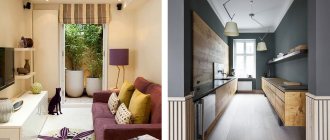
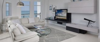
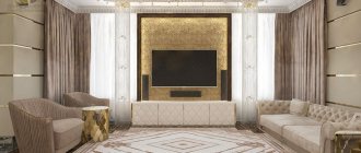
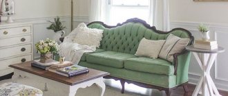
Beautiful examples of paintings in the living room interior
And finally, to get inspired and use your creative imagination as much as possible, look at the photographs and examples of paintings in the living room. You will be able to clearly see how paintings look in different styles, how colors and shades are combined with each other, what modular compositions are and how posters, posters and photographs look.
For those who know how to create beauty with their own hands, you can hang a beautiful handmade drawing for everyone to see.
Choose paintings for yourself using our rules and secrets and remembering to listen to your intuition. And your choice will be right!