Photo: ideas.homechart.ru To beautifully decorate the interior, you need to think through a harmonious combination of the colors of the walls and furniture. Such an important detail can fill a room with light, visually expand, narrow or lengthen the space, create a cozy atmosphere, and place the necessary accents. Following simple rules and tips on how to choose wallpaper for furniture will make your design truly unique and unique!
Types of wallpaper
There are several basic wallpaper options. Information about their characteristics, properties and range will help you make a choice in favor of the necessary material.
Vinyl wallpapers
This is one of the most popular wall covering variations. The basis of the composition is special paper or non-woven material coated with polyvinyl chloride. The advantages of this choice include reasonable price and wide range of colors. The disadvantages are airtightness.
Non-woven wallpaper
Many experts consider them the best choice for any room. Such wallpapers are characterized by high moisture resistance, breathability and environmental friendliness. The disadvantages include a small selection of patterns and colors, which, however, is not a problem for classic, Scandinavian, minimalist and constructive styles, which are famous for their laconicism and consistency.
Liquid wallpaper
They are purchased in powder form, which is diluted with water when applied. An excellent solution for creative people. You can experiment with shades and fix the desired one with a protective varnish. This will help prevent the paint from washing off.
Paper wallpaper
Environmental friendliness, air permeability, and a reasonable price are the main positive criteria for paper wallpaper. Negative aspects include the lack of moisture resistance and rapid fading.
Fabric wallpaper
A spectacular colorful coating that will easily fit into the design of any room. The only downside can be considered the lack of moisture resistance, which is especially important for the kitchen and bathroom.
How to design a transition when combining
No transition
The simplest and most common method is the absence of a transition. Wallpaper sheets are glued end to end. It must be remembered that for the best result you need to prepare and level the surface. This method works well for an accent wall.
Moldings
A beautiful and elegant way to decorate. Visually it looks like a painting or panel. The main tone is chosen to be a calm shade, the second part can have either a simple geometric or an unusual shape and is trimmed along the edge with moldings.
Wallpaper border
The border is placed along the upper edge or along the central part. It will add zest to the interior. Looks harmonious in the living room, bedroom and children's room.
Choosing the color of wallpaper for furniture
The main rule for creating a bright color scheme in a room is the harmony of shades or their contrast. In the first case, the space will look light, delicate and gentle, in the second - extravagant, bright and original. We have compiled a small list of interesting tips on choosing colors for different furniture:
1. Beige, white, lemon and pistachio (light green) wallpapers are suitable for dark furniture; 2. The following colors will be ideally combined with white furniture: pink, turquoise, coffee, green, blue and yellow. Wallpaper with a golden pattern or geometric pattern can also serve as a beautiful background; 3. For furniture in black, you need to choose a burgundy, gray, beige or silver finish; 4. Gray furniture can be easily shaded with blue, green, pink, white and yellow tones; 5. The correct design for brown furniture is beige, olive and white wallpaper; 6. Suitable colors for beige furniture: green, light red, blue and white.
Do not forget also about the rule of placing accents. This means that the overall decor will look much more sophisticated if the furniture and walls do not blend together, but are not equally colorful.
For example, modest furniture will look great against the background of bright walls, and simple plain wallpaper will look great against the background of extravagant furniture.
How to choose wallpaper for the living room: 85 ideas (photos)
Rules and recommendations
When deciding to renovate a room by combining wallpaper, you should take into account the area, location, purpose and proportions of the room.
- When choosing the main tone, you need to start from the area. In a small room, it is inappropriate to use a dark color palette; a light pastel palette looks more harmonious, which will visually increase the area of the room.
- In a spacious room, a combination of dark colors and voluminous patterns is acceptable.
- Location plays an important role. In a room with windows facing north, it is better to use a warm palette, this will compensate for the lack of sunlight.
- On the south side, opposite, cool shades look more harmonious; they will give a breath of fresh air.
- In an apartment with high ceilings, you should not combine wallpaper with vertical patterns.
- You can adjust the height of the ceilings using horizontal stripes and three-dimensional images. The same rule works in the opposite direction; for small rooms, light, plain wallpaper and a small, discreet pattern are suitable.
Secrets of choosing wallpaper for furniture
It is very important to be able to use the little tricks of specialists that will help make all your interior dreams come true. You can mention the following secrets for choosing the color/tone of wallpaper for furniture:
— Wallpaper can serve as a backdrop for beautiful furniture, but should not get lost against its background; — A surface with a motley pattern can distract from old or unremarkable furniture; — If you cannot find the desired wallpaper color in the proposed range, you should buy paintable wallpaper and create your own unique shade yourself;
— To highlight stylish furniture, you need to give preference to beige and yellow wallpaper; — Additional light sources (LED lamps) will help surfaces look more saturated or, on the contrary, muted (optional); — Light and “airy” wallpaper will skillfully remove the boundaries between furniture and space; — Furniture with gold accents looks luxurious against a background of cream or sand color, wood - against a white background, metal - against a light blue background.
Combining wallpaper in the kitchen: 100 photo ideas
Design tips
In conclusion, let's look at some design tips:
- It is recommended to decide on the color scheme for the room in advance, and the purchase of furniture and wallpaper should be done in accordance with the chosen plan. You should not deviate from the given scheme: at best, you will get very bold eclecticism, and at worst, tasteless kitsch.
- When choosing shades for the walls, also take into account the color of the ceiling and floor, and it is recommended to select furniture to match the color of the floor. In the case of a light floor, do not use dark shades for the walls, as you will end up with an uncomfortable room. The same rule applies to furniture.
Balance in the interior color combination video
Selecting wallpaper for furniture in different rooms
It's no secret that colors can influence a person's emotional state and mood. Each room has its own harmonious range of shades.
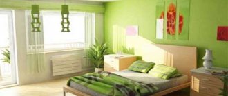
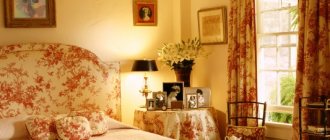
Wallpaper for bedroom furniture
Bedroom design needs to be taken into account. If the furniture, its arrangement and color palette are made in the avant-garde, art deco, modern or minimalist style, then light-colored wallpaper will be an excellent choice, which will serve as a wonderful element of relaxation.
In the case of original (unusual shapes) or natural (stone or wood) furniture, you should use neutral wallpaper with colorful inserts in the form of mosaics or geometric shapes. This contrast will create a creative and inspiring atmosphere.
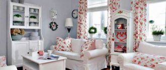
Wallpaper for furniture in the living room
The hall most often contains bulky furniture. You can dilute it with combined wallpaper, which can make one part of the room more calm and cozy, and the other rich and juicy.
If the furniture in the living room is made in light shades, you can choose a beige wall covering with bright inserts or colorful wallpaper with light inclusions. If it's a classic style, it's better to stick to neutral tones.
Wallpaper for furniture in a children's room
A room for small children most often contains furniture of interesting designs, unusual beds and bright shelves. This is an ideal place for photo wallpapers that will complement the atmosphere of joy, childhood and emotions.
A calm child will be comfortable in a bright room (beige, peach, lemon wallpaper), and an active child will be comfortable in a colorful one (photo wallpaper with cartoon characters).
To prevent the space from seeming too busy and cluttered, you can make one wall (which is behind the bed) neutral, and the rest brighter.
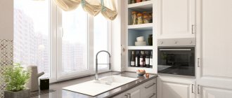
Wallpaper for furniture in the kitchen
Nowadays, rarely does anyone buy separate furniture for the kitchen. Built-in projects are becoming more and more popular. They range from dark gray to light yellow.
In this case, it is worth remembering that wallpaper can look organic if the color is chosen one or two shades lighter than dark furniture and one or two shades brighter than light furniture. You can also make furniture and walls in the same tone. It looks practical and beautiful in the kitchen.
Wallpaper for bathroom furniture
Do not forget that wallpaper should not only harmoniously emphasize the aesthetics of the room, but also meet such important criteria as moisture resistance and breathability. The ideal solution for a bathroom with any furniture is pastel colors. They are always relevant, especially in the bedroom and bathroom.
Wallpaper for furniture in the hallway
Here it would be appropriate to use not too light and not too dark tones. Dark tones of wallpaper in tandem with dark furniture will immerse the space in a gloomy atmosphere, and white surfaces will be subject to contamination.
The ideal choice for the hallway is combined wallpaper colors, patterns, ornaments and simple functional furniture without additional decoration.
Wallpaper for the hallway: 80 photos and beautiful solutions
Nuances of human psychology
When choosing shades, it is recommended to take into account the psychology of human color perception:
- Some colors come under strict supervision - red, deep orange, bright yellow, purple, deep blue. These colors are quite aggressive, so a person in the room can quickly get a headache and worsen their mood.
- Green, blue and turquoise shades are your saviors in difficult times. After all, they are suitable for almost any room, since they remind a person of the natural beauty of nature. If you are in doubt about the choice of color, use green, blue and turquoise shades.
- Cool shades create a calm, even a little sleepy mood. Therefore, it is recommended to select them for kitchens, bedrooms, and bathrooms. Warm shades have the opposite properties - they create light tension and fun. Therefore, use them to decorate the hallway, living room, and guest room.