An apron in the kitchen is a multifunctional tool. It performs several tasks that affect the overall appearance of the kitchen. After all, the apron area is the most noticeable; it is the first thing that catches your eye when you take a quick look at the kitchen. And thanks to the fact that it is small, its cool design will not affect the financial part of the issue. The design of the apron in a modern interpretation is made with tiles or glass. They have their advantages and disadvantages, which we will look at in this article. We will also provide photographic examples.
Rules for choosing the color of an apron for the kitchen
A kitchen apron is a protective and decorative covering of the wall above the work surface, located between the lower and upper cabinets of the set. When choosing a color for it, we are guided by some principles:
- The color and texture should resonate with other interior elements;
- Warm colors are appropriate for the work area, since too bright ones strain the eyes;
- To add richness to the color, choose a glossy surface;
- When choosing patterns, avoid voluminous prints, as they look too heavy in a small kitchen, and unattractive in a large kitchen.
On a note! The countertop of the kitchen set is also part of the work area, so you need to choose the right material, texture, and color for it to obtain a complete interior in which all functional areas are clearly visible.
Terrazzo on a neutral background
This unusual tile with colorful splashes is gaining popularity again. When choosing terrazzo for an apron, be careful: it is important not to overload the appearance of the kitchen, because the motley surface actively creates visual noise. It is ideal if the facades are monochromatic and the work area is free of unnecessary objects.
Usually inclusions are distinguished by natural shades, so order facades that will echo the colored spots and have a natural color.
What should an apron go with in the kitchen?
You need to choose the color of the apron for the kitchen after determining the color scheme of the interior. There are several common combination methods:
- The simplest option is an apron under the tabletop. In this case, the combination can be not only in color, but also in material. The result is a single, harmonious coating;
- The combination of an apron with the floor is an excellent option for a kitchen decorated in a minimalist style. To get a holistic design, you can make a tabletop in a similar color;
- A light kitchen set and a similar apron visually enlarge the space, making it lighter and airier. A monochromatic design can look impersonal, so it is recommended to have a contrasting tabletop or base cabinets. A light apron can also be combined with a dark set, experimenting with textures, for example, installing glossy cabinets and making a matte wall in the work area, or vice versa;
- You can use a partial combination with a kitchen set. To do this, highlight part of the apron in the same color as the cabinets, for example, the area near the hob, and the rest of the wall remains neutral. The color of the kitchen set can also be similar in mosaic tiles;
- A combination based on the opposite principle will help diversify the interior - dark and light, matte and glossy, with or without a pattern. For example, a kitchen set in a monochrome design with a bright yellow work area serving as a bright spot in the kitchen. To make the decor look harmonious, add yellow details - dishes, lamps, chairs;
- Combination with furniture. For example, a white kitchen set with a red apron was selected. Bright colors can be found on chairs, table legs, decorative panels, and sofa colors. In a modern kitchen interior, designers choose complex shades - dusty rose, coffee-milk, azure-gray;
- An apron that matches the walls looks great in a kitchen-living room, when you want to focus on the guest area rather than the working kitchen space. In this case, it is not finished with tiles, but, for example, with a glass panel or painted with special waterproof paint;
- In a two-color kitchen design, the color of the apron is chosen as an average between two colors or multi-colored with a combination of them.
The shade of the wall in the work area may not be oriented to anything. For example, for a neutral, monochromatic interior, you can choose an apron of absolutely any color.
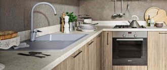
Choosing material for an apron
There are several variations in the choice of material for an apron:
- Tiling
- Glass apron
- In the color of the tabletop and from the same material
- Mosaic tiles
- Plastic apron
- Phototile
The most common and high-quality ones are tiles, glass, and the option to match the color of the countertop. From a practical point of view, they meet all the requirements, and in terms of appearance, choosing the appropriate option is not difficult; there are a huge number of them on the market. And an apron to match the color of the countertop is generally ordered immediately with the kitchen, since the color is immediately selected in the salon and installed together with the kitchen. In this case, you don’t even have to bother, the kitchen installers will do everything.
Phototile is a variation of glass, but it looks worse. And plastic catches the eye with its cheap texture and can completely ruin the overall impression of the kitchen interior.
Now let's look at each point in more detail.
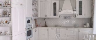
White kitchen
Any wall color in the work area goes well with a white kitchen, most often based on style. For example, gray shades are suitable for high-tech style: wet asphalt, metal, chrome.
The most popular apron colors for a light kitchen:
- Under the influence of the Scandinavian style, completely white interiors have become popular. The apron is usually finished with light tiles, and the countertop or floor acts as a contrast;
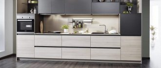
- A win-win option is a combination of white and wood, especially if the wall in the work area is made one with the countertop. It is not necessary to use natural material; you can take plastic or tiles with a suitable color. The kitchen interior in this combination looks natural and elegant;
- A black wall in the work area is a stylish, brutal option. In combination with a similar countertop, the kitchen set looks complete. A mirrored work surface with lighting looks impressive in a black and white kitchen with a dark apron;
- The color combination of white with graphite or gray adds charm to the kitchen atmosphere. It is easy to choose colors for the rest of the interior elements with these colors. The wall in the work area can be either solid or tiled;
- A white kitchen with a marble splashback looks noble and natural and is appropriate for all styles. A light marbled wall panel will go well with white cabinets, but you can also play with contrasts by making a black work area and a glossy kitchen unit;
- Brown color comes in different shades - honey, caramel, chocolate, brick, all of them go well with a white kitchen set. In a small kitchen, preference is given to light colors. If you want to install a dark apron, combine it with a white floor so as not to darken the space. To finish the working area, use tiles or panels;
- A more classic option is a mosaic apron, which adds color to the white kitchen, making it cozier and brighter;
- A multi-colored wall in the work area enlivens the kitchen design, making it less monochrome. This technique looks good with dark countertops against the background of a light kitchen set. It can be bright tiles of 2-3 different shades of the same color;
- The white-green color combination has a positive effect on the human psyche, inspiring and calming. In this case, the apron can be of any green shade - pistachio, olive, emerald, lime;
- A beige apron is an excellent option for a classic white interior, it visually expands the space and goes well with other colors. Used to create coziness in a large or small kitchen. To implement the idea, you can use large beige tiles;
- Another classic option is red mosaic tiles with white grout. Rich shades of burgundy - cherry, pomegranate - go beautifully with a glossy kitchen set;
- A turquoise apron is great for a small kitchen, as it visually enlarges the space, making it airy. Cold tones - bluish, heavenly - go well with a white kitchen set;
- A yellow apron is suitable for a white kitchen with windows facing north. For modern design, choose mustard, honey, straw, olive-yellow shades.
Requirements for a kitchen apron
Many people are accustomed to decorating their backsplash with ordinary ceramic tiles. If there are no upper shelves or cabinets and you want to cover the wall to the ceiling, these products can also be used. But there are other materials that can look more harmonious in a room. There are many modern ways to decorate kitchen walls. It is important to remember that the material for the kitchen must have a number of characteristics. Among them it is worth highlighting the following:
- Resistant to moisture. The wall above the kitchen is exposed to moisture. It is exposed to steam when cooking, splashing water when washing hands or dishes. The material should repel and not absorb water. Thus, it does not deform and will last a long time. If it leaks moisture, mold and mildew can form underneath. This may be dangerous to your health. Thus, moisture resistance is one of the most important characteristics that a kitchen carpet should have.
- Resistance to high temperatures and temperature changes. This is the second most important parameter. If the temperature resistance is insufficient, the surface around the slab will quickly deform and lose its attractive appearance.
- Fire safety. This is an important feature that ensures the safety of the finish.
- Environmental friendliness. The material should not release toxic substances even when heated.
- Easy to maintain. The wall above the kitchen worktop may be subject to splashes of food and water. Fatty fumes are dripping from it. All this can quickly lead to contamination of the coating. Therefore, the material should be easy to clean and resistant to aggressive household chemicals.
- Resistance to mechanical damage. The finish should not have dents or cracks from accidental impacts. It must be scratch resistant.
- Durability. The finish should last more than one year. The service life of the cladding largely depends on the properties of the material, such as resistance to moisture, heat, etc.
Zone dimensions
The standard height of the apron is 50-60 cm, depending on the height of the household and the type of tile used. If tiles are used, the standard is 30+30+0.1 cm, since 30 cm is the height of the tiles plus the seam between them. Although these days this rule is not strict, and tile sizes are numerous.
If the cornices are not built-in, they are placed at a distance of 70-80 cm from each other, which means that the apron will be higher. This is important to consider if you are going to make a glass splashback because then it will be a little more expensive to make or you will have to do something to the wall between the edge of the glass and the hood.
When calculating the height, leave 2-3 centimeters of overhang at the top so that the backsplash extends beyond the cabinets.
The work surface should run along the entire perimeter of the kitchen, and not be limited to islands behind the sink and stove. Although water and dirt are more likely to get behind the sink and stove, other areas are still unsafe. This is not a place where you can save money.
If your sink is in the corner of the kitchen, choose a backsplash and a perpendicular wall - the areas around the sink are always the dirtiest.
Design and color
The color of the splashback itself is important for kitchen design, but not for practicality. There are many types of stains in the kitchen, so no matter what color backsplash you choose, there will be stains that will contrast.
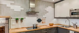
Therefore, the most important thing in an apron is texture. The texture cannot be uniform, as any stain will be immediately noticeable. Conversely, on contrasting and heterogeneous textures, small spots are not visible at all. It is optimal to imitate various natural materials: concrete, marble, wood, stone. Or any pattern, and in 2021 patterns have become fashionable and are often used in Scandinavian-style kitchens.
Light tiles are much more practical than dark ones, since most stains are wet, and salt stains remain after the water has dried. While light-colored tiles are a good option, the grout color for your backsplash should not be white. Darker shades of gray are best in terms of appearance and practicality (article on gray kitchens). White tiles with dark gray grout look very good:
If you want something bright, check out the earlier photos of the curtains in the kitchen and separately with the patio doors. Leather and textiles are the two best accents that should go hand in hand.
If you are going for a monochrome kitchen, remember that you will always have a lot of kitchen utensils that are not always easy to find in black and white. A good idea is to combine a monochrome kitchen with shades of green, such as light green. This natural combination is always on trend, and best of all, the salad comes with a lot of kitchen utensils, such as cutting boards, oven mitts, hob, etc. There is an interesting combination: a white kitchen with a wooden countertop and a glass splashback with a picture of grass underneath. Complete borrowing of colors from nature.
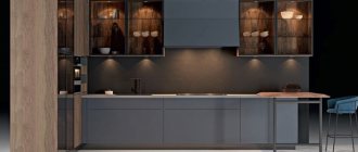
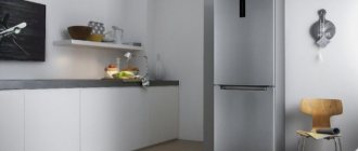
Gray kitchen
A gray kitchen can look bright and stylish if you choose the right backsplash color. In this case, the main rule must be observed: cold shade to cold, warm to warm:
- A gray kitchen set with a graphite apron and countertop looks better if you choose facades that are a couple of tones lighter than the walls in the work area;
- The white color of the apron goes well with the light gray kitchen set, adding freshness and lightness to the atmosphere. It is better to complement this color combination with rich accessories so that the interior does not turn out to be too pale;
- With gray kitchen cabinets, a wooden apron with the same countertop looks beautiful, forming a harmonious work area;
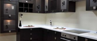
- Black is a universal color for decorating a wall in a work area; in combination with a graphite kitchen set, it looks unusual but stylish. It is better to choose strict lines and different textured materials;
- An apron of any dark color pairs beautifully with a gray kitchen set, if you use the contrast of matte and glossy. These can be deep, complex shades, for example, dark gray with a blue tint;
- For a gray kitchen, you can choose a green apron of any shade - malachite, emerald, lime;
- The blue and gray color combination is a good combination for a kitchen of any size, adding sophistication and elegance;
- A marble apron can be darker or lighter than the kitchen set;
- For the wall in the work area, you can choose any bright color you like - red, yellow, pink - all go well with graphite kitchen furniture;
- You can dilute the gloom of the gray kitchen cabinets with the help of a glass panel in the work area with an abstract print with colors that match the bright interior details - the stove, decorative elements.
Azure gray and light wood
If you dream of a non-trivial kitchen, but pastel shades are close to you, pay attention to the combination of a wood-colored apron (light ash or beech) and azure-gray facades. Combinations of azure color are full of light charm and soft exoticism. It harmonizes perfectly with the apron, the warm shade of which adds coziness to the kitchen.
This complex color has not yet become boring: it is just gaining its popularity.
Beige kitchen
Beige is a universal color, so choosing the right combination of kitchen set and apron will not be difficult:
- White and beige is a classic color combination that is difficult to overload the kitchen with. The natural combination of a white apron and a beige kitchen set visually enlarges the space, making it lighter and lighter;
- The color combination of sand kitchen cabinets and a black wall in the work area looks more beautiful in a matte finish. By adding white color, the kitchen will sparkle with new colors;
- For a beige kitchen set, a light green shade of the apron is suitable. With proper lighting, you get a cozy interior;
- The marble panel combined with the wheat shade of the cabinets looks expensive and elegant. Marble with beige or gold veins diversifies the kitchen set;
- Brown is a relative of beige, so it complements it perfectly. The kitchen set can be caramel or biscuit in color.
For a cappuccino-colored kitchen set, choose discreet, elegant colors for the apron, for example, use a tone-on-tone combination. It’s better not to experiment with bright ones, as any dominant color will overwhelm the delicate coffee color. Typically, a cappuccino-colored interior is decorated in a classic and restrained style without an abundance of decorative elements and with maximum simplicity.
Cool gray and dusty pink
The unusual combination of a gray set and smoky pink tiles looks gentle and at the same time devoid of frivolity. The kitchen interior resembles a dawn over the city, it exudes calm and comfort. The combination will be appreciated by creative individuals who strive for individuality in their surroundings.
The kitchen will look more spacious and lighter if you do not use upper cabinets. To create smooth transitions, use grout that matches the color of the tile.
Red kitchen
The seemingly demanding red color allows for many color combinations. You should not use shades that are similar in tone - pink, coral, burgundy. You need to choose the right contrasting color:
- The classic option is a black apron, which looks very nice against the backdrop of a bright kitchen set. You should not add additional decorative elements to the interior; you should limit yourself to straight lines and strict forms;
- White and red tiles are also a winning technique: the main thing is to use only a few red accents when laying, and not lay out the tiles in a checkerboard pattern;
- A gray wall panel is suitable for a classic kitchen if you use soft shades - tomato, pearlescent red. A glossy wall covering in the work area will perfectly complement the matte cabinets in the kitchen;
- When choosing a dark apron for a red kitchen set, they prefer glass panels with images, for example, of a city at night, flowers, or wine glasses.
Gray gloss and pearl
Do you want to enjoy the nobility of shades and textures in your own kitchen every day, and at the same time show your guests your ideal taste? Give preference to French gray with warm echoes: with it, classic facades will look both modern and unobtrusive.
A companion for glossy facades will be mother-of-pearl mosaic on the apron. A light glow passing over its surface will add sophistication to the atmosphere.
Lilac
Refined colors - pink, sky, ash, white - go well with a delicate lilac kitchen.
You can also choose a darker shade - the purple kitchen set will perfectly complement the black mosaic tiles on the wall in the work area.
The combination of lilac kitchen cabinets with a dark gray work area looks beautiful, especially if you install household appliances to match. This is a universal, discreet option that does not attract unnecessary attention.
A lilac kitchen set goes well with a blue apron. The contrasting game creates an interesting effect, and the kitchen seems more spacious and voluminous. The lilac-blue color combination looks more beautiful with a light countertop.
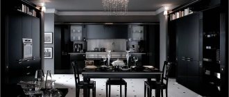
What interior style would a black apron suit?
There are many styles that a black kitchen apron pairs perfectly with:
- classic style;
- Gothic - looks impressive in large rooms;
- Baroque - can be combined with a patterned set;
- retro - it is better to choose textured materials with inscriptions and patterns;
- modern - contrasting color combinations;
- Art Deco - only for ceramic tiles;
- hi-tech - for metal and glossy surfaces.
A black and white apron for the kitchen would be an elegant solution: the contrasting combination will create a feeling of calm. It’s very beautiful when one color smoothly transitions into another.
If the apron is black, then all other items should be made in white, beige, peach, soft pink, blue or lilac.
The design creates a cozy atmosphere in the room
Brown kitchen
The aristocratic color of the wood goes well with both light and dark colors:
- A brown set with a beige apron is a contrasting combination that gives the kitchen an interesting look. To get an elegant, discreet interior, you can choose different shades of these two colors;
- For light brown kitchen cabinets, a gray backsplash in warm shades, such as ash, is suitable. In addition to the work area, graphite can be used for walls and furniture;
- If you want to make a green apron, they prefer dusty shades - pistachio, olive. For a light brown kitchen set, you can choose brighter colors, for example, lime;
- A soft blue backsplash goes well with rich chocolate kitchen cabinets.
Creamy and cocoa-tinged
If you are against rich colors and want to create a timeless interior, opt for “edible” shades that are ideal for a traditional-style kitchen. Matte light facades in the color of baked milk go perfectly with glossy rectangular tiles in cocoa color.
An apron, several tones darker than the set, will highlight the furniture favorably. Minor dirt will not be noticeable on it.
Blue kitchen
The most common apron colors for a blue kitchen:
- The wall above the work area, imitating wood, goes well with an azure or cornflower blue shade. In this case, the kitchen set can be either dark or light;
- Blue and white color combination is good for a well-lit and spacious kitchen. The wall above the work area can be decorated with plain tiles in the form of diamonds or a herringbone pattern.
Designing an apron from tabletop material
Here we mean MDF or chipboard material. In terms of price and quality, this is the best option. This material is a panel 6-10 mm thick and 3 meters long. On one side it is covered with plastic, which is also applied to the tabletop itself. It is specially designed for such loads and is a practical solution. Let's look at the features of this material.
- Installation is carried out by the people who install the kitchen. In this case, you can do without leveling the walls.
- If necessary, such a panel can be easily removed.
- It is easy and simple to care for the panels.
- It is possible to choose the same color as on the countertop.
- Low cost compared to tiles and glass.
Black kitchen
A black kitchen set goes well with any color, the choice of which depends on the style, size of the kitchen and the desires of the owners:
- A light wooden splashback looks great against dark kitchen cabinets. The best option is matte wood and matte kitchen furniture;
- Black marble pairs beautifully with dark kitchen cabinets. To obtain a modern design, additional elements are added in the form of flower pots and beautiful vases. The color combination is suitable only for spacious kitchens; for small ones it is better to choose white marble and more light details;
- The clear backlit work area wall panel will match any kitchen cabinets and can be installed over finished trim.
Comparison of different materials
The material from which the kitchen apron is made is selected depending on what the customer considers to be the key parameters
- practicality and ease of care
- moisture resistance
- high temperature resistance
- self-assembly and disassembly
- durability
- appearance
- cost of materials and installation
The cheapest option is to line the kitchen working wall with plastic, MDF or laminate. Mosaic, stone and Italian ceramics are the most expensive options.
Glass, metal or mirrors are creative options, but you must be prepared to keep them clean. To make a kitchen screen both practical and beautiful, finishes are often combined.
An interesting solution is to cover the stone or pebble apron around the stove and sink with glass panels. Another option is a combination of ceramics in active cooking areas and MDF above the dining area.
Orange kitchen
A bright orange kitchen is an accent in itself, therefore, when choosing the color of the apron, they give preference to neutral tones that do not attract attention. The following techniques will work well here - matching the color of the walls and countertops:
- The use of a black wall above the work area will appeal to lovers of bright contrasts, as the color combination may seem unusual and extravagant. You can dilute the black with drawings;
- A kitchen set with an orange splashback looks fresh and bright. With the addition of images in the form of fruits or berries, the kitchen will sparkle with new colors. The main thing is not to overdo it with flashy colors in the interior;
- White color can be chosen in any case. A light apron goes well with an orange set without upper cabinets.
Installation of a kitchen apron
The decision on the method of laying the coating depends on the chosen material:
- In the case of coatings such as stone, decorative formwork or mosaic structures, you will need not only the help of a specialist. In this case, leveling and plastering the walls will be a mandatory part of the repair work.
- Plastic panels, MDF and some types of tiles do not require pre-treatment.
In other cases, the amount of preparatory work depends on the quality of the wall cladding, possible structural defects and whether the apron has a complex pattern.
The apron over the hob is an extremely important part of the kitchen interior. The decorative surface performs not only a practical, but also an aesthetic function, emphasizing style.
Green kitchen
Light and muted dark shades go well with a green kitchen:
- The combination with a white apron will fill the atmosphere with natural energy, especially if you choose a tabletop of a similar color;
- The green work area is suitable for those who love natural tones that give freshness and comfort - grassy, emerald, malachite. Delicate shades are appropriate for Provence and classic styles;
- A green set with a black apron is a rather bold option. It is better to choose light colors and a glossy finish so as not to end up with a gloomy environment.
Muted coral and white ash
Pure colors - red, blue, green - are rarely used in modern kitchens. A complex “rich” palette is in fashion, which does not get boring for a long time. The more basic colors there are in a shade, the more complex it is, and it is not immediately possible to identify it.
The dusty coral color presented on the kitchen facades creates a warm atmosphere. An apron made of laminated chipboard with imitation of bleached wood makes the kitchen lighter and prevents it from looking boring.
Use these examples of beautiful and practical kitchens for inspiration.
Brown wall decoration
As a rule, rich brown is not welcome here; preference is given to white, beige with all its shades, cream and milky.
- The use of wood patterns looks good; the gray-brown kitchen looks very stylish and comfortable.
- For a furniture set of any color, brown walls will be an excellent background, the main thing is to choose the right main shade.
- Also, do not lose sight of the fact that it is much easier to care for brown walls.
Lighting
The darker the color scheme of the interior, the more thoughtful the artificial lighting should be. The shadow from an incorrectly installed lamp or from a lack of lamps will make the kitchen gloomy and visually narrow the space. To prevent this from happening, even at the stage of a major overhaul, consider a kitchen lighting scheme.
It is important to provide general lighting and lighting in each area - working, dining, relaxation area (if the kitchen is combined with the living room).
General diffused lighting can be represented by one chandelier or several spotlights.
You can hang a pendant lamp above the dining table or install a sconce if the table is against the wall.
When are dark colors contraindicated?
A small kitchen area is not a contraindication for dark shades, contrary to popular belief. But a small window can really play its fatal role. Please note that dark kitchens look most impressive in rooms with large windows. But this does not mean that such shades should be abandoned altogether. Use them as complementary and accent pieces.
If there is not enough sunlight in the kitchen, dilute the interior with light shades. The less light, the more light there should be in the overall proportion.
Features of visual perception
The brown palette is chosen by purposeful people; in addition, all generations, from older to younger, view it favorably. This is not surprising when you consider that there are more than three hundred thousand shades in the brown spectrum.
The influence of any of them on a person’s mood is always positive - color gives a feeling of peace and comfort, since it is always associated with nature and home.
The style of the kitchen in dark colors fits most organically into spacious rooms with windows facing south. The peculiarity of the dark range is that with the help of its shades you can combine all the elements into a single whole, creating elegant luxury.
As for the light palette, the undoubted benefit of its use can be seen when decorating small kitchens. The only drawback, in particular, of beige shades is their excessive demand, due to which the neutral line has already become boring.
A beige-brown kitchen can be enlivened with bright accents and varied textures.