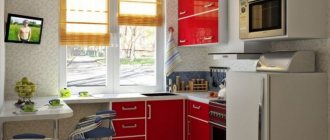
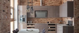
In the 80s and 90s of the last century, houses with a kitchen area of 8 square meters grew one after another. m. Yes, there are even smaller options, but still, even eight squares is considered a small space to cook on, have a meal, and invite friends.
A difficult situation is saved by a competent layout of the room, which allows you to create a comfortable and cozy design for such a kitchen. By the way, there is a myth that they are found only in Khrushchev buildings. This is not entirely true, since they are found in both “Leningrad” and “Stalin” buildings (especially in corner entrances), and even in modern panel houses.
We can say that the problem of good design for a kitchen of 8 square meters is relevant for all of Russia - let’s find out how to make it. And at the same time, let's look at photographs of real interiors.
We are starting renovations
Before you start the repair itself, or at least planning it, you need to take into account several nuances - which determine how much it will all cost:
- functionality of the future premises . Perhaps the dishes will only be prepared in it - more often than not, they will eat it right there. But is it necessary to create a work area? Are you planning to receive guests? The most important thing in renovating a kitchen is to understand what it will actually be used for;
- design . It is better to imagine the design of the future kitchen before drawing up the plan. To do this, you can even invite a designer, he will suggest the best solutions: for example, demolish a wall, move a niche, use a bar counter. Perhaps there will be talk about unifying the space;
- quantity of household appliances . If a man lives alone, a microwave and a hob will most likely be enough for him. If the kitchen is intended for a large family, then you will have to look for space for an oven, dishwasher, and possibly also a washing machine.
The next step is choosing the kitchen layout. In this case, it is important to avoid common mistakes in order to get the most comfortable space as a result:
- For a square kitchen, an L- or U-shaped layout is better. It will ideally highlight the beautiful shape of the room and create a lot of work space. You might think about combining the kitchen with a living room or balcony, where one of the supports of the letter P will act as a space divider;
- For a room with a rectangular elongated shape, a linear or parallel arrangement of the headset is perfect.
At this stage, it is important not to forget about designing a convenient working triangle, namely the refrigerator, sink and stove - it is better to place them close to each other so that the housewife does not have to make extra circles while cooking.
What should you not do?
Even during design, you can avoid many mistakes that in the future would bring great discomfort to the owner. What should not be done in a kitchen with an area of 8 square meters?
- Choose oversized pieces of furniture , for example, a set or appliances. It is better to prefer compact or even built-in models - this will consume much less usable space.
- Choose beautiful or cheap finishes . There is nothing wrong with beauty or low cost of materials, but it is necessary to focus primarily on quality, since the kitchen is a room with a very unstable atmosphere.
- Hanging curtains on the floor - long fabric lying on the floor also takes up useful space. It is better to choose short curtains or Roman blinds - this will allow more light to enter the room, which means it will visually look larger.
- Forgetting the hood is one of the most important mistakes, because in this case, all the kitchen aromas will spread throughout the entire house or apartment. A small room area of only 8 m2 allows you to save money and not take the most powerful models of equipment. But we must not forget about her.
Full embedding
At the stage of creating a kitchen unit project, you should consider the type of built-in option. It is necessary to measure the dimensions of the equipment, and take them into account when drawing up the design of the headset. Full integration means that the equipment is hidden behind furniture facades.
This technique is typical for models with a standard side hatch. In the photo of the washing machine in the kitchen you can see different options for fully integrating the equipment.
Choosing a style
Another point that you need to pay attention to even before the start of the renovation itself is the future style of the room.
Style always involves certain colors, materials and textures, so its choice should be taken care of from the very beginning. A kitchen of 8 square meters is considered small, which also imposes its own restrictions on style - for example, it is better not to use rococo or baroque in such a room.
It is the style that will help make the kitchen not only convenient and comfortable, but also beautiful. Let's see how different a kitchen with an area of 8 square meters can be.
Minimalism
This design direction is chosen by connoisseurs of order and cleanliness. The main principles of design are simplicity and functionality, that is, all furniture should have simple and strict forms with a minimum of details, but at the same time it should be useful.
The color range is not wide. Usually it is: white, gray, black + wood. Such combinations, coupled with built-in appliances and a laconic design, will make even a small kitchen spacious, free and comfortable.
Photo of a kitchen interior in a minimalist style with built-in appliances - oven and refrigerator.
Classic
A classic interior is always rich in detail. This can be bad for a small kitchen, as the space will visually become even smaller. To prevent this effect, it is better to prefer light colors and light furnishings.
It is better to abandon forging, stucco, and carving on facades in favor of a more restrained classic. Appliances stylized to resemble a classic interior will perfectly complement the interior. Otherwise it will have to be built in.
Photo of the interior of a classic kitchen with a stylized oven, a sink by the window and a TV.
Ecostyle
Such an interior will suit people who are tired of the bustle of the city and want to recreate an atmosphere of comfort in their apartment. Furniture and decoration are made in natural colors.
White, beige colors and their shades - for example, pearl or cream - will look great. Only the most necessary pieces of furniture are left in the arrangement.
Modern
If comfort and functionality are equally important, then you should take a closer look at modern. The set is made in light and monochrome colors, gloss is required. In furniture, maintaining geometry is important - right angles, clear lines.
Modern
Just from the name of the style we can conclude that it combines the latest innovations in technology and design. There are also other names for this direction: “contemporary” or “contempo”.
The latest trend in modern style is the desire for duality. That is, now there is not one main color in the kitchen, but two. Even the set is hung at two different levels.
Due to such diversity, you can achieve an absolutely unique interior in any, even the smallest, kitchen. Another trend is modular furniture with rounded edges.
Unusual interior of an eight-meter kitchen. Particular attention should be paid to door handles and the hood-air duct.
Loft
Loft is a lover of large spaces and a huge amount of light. A kitchen with an area of 8 square meters is small enough for a loft, so it is worth adopting only some features of the interior design, and not implementing it completely.
For example, the finishing of one wall can be left careless - like clean concrete or brickwork. Another option in this type of renovation is to add granite panels and aluminum parts to the interior. Be sure to use a lot of wood, for example, for the dining table and photo frames on the wall.
To avoid a visual reduction in space, it is better to avoid large pieces of furniture and not overuse the decor.
One of the symbols of the loft is the emphasis on communications, including the ventilation duct.
High tech
Externally, this style is similar to the cabin of a spaceship from films and TV series. And the filling too, because high-tech allows only the most modern and advanced technology.
It is desirable that it be built-in and combine several functions, for example: oven and dishwasher, oven and microwave, and so on. Such solutions take up half the space, which is very beneficial for owners of kitchens with an area of 8 square meters. m.
Not only the equipment, but even the furniture is designed to the latest standards. The set includes closers, secret cabinets, exit elements, transformers - the storage area turns out to be as functional and spacious as possible.
High-tech, like minimalism, does not like unnecessary details, so it reduces them to a minimum, and the kitchen is spacious, but at the same time functional and comfortable.
Deciding on the color
Of course, the chosen style also imposes restrictions on the color of the kitchen. For example, it is impossible to find a classic set in fuchsia color. But the small area also somewhat limits the color choice. For example, it is better to avoid the abundance of dark wood, which is what the classics are famous for.
Let's look at the main colors that can be used as main colors in a small kitchen of 8 square meters. meters.
White
The simplest, but at the same time the most logical solution for the kitchen in question.
First of all, this color makes the space visually larger. Secondly, the kitchen will always seem perfectly clean. In addition, white perfectly reflects light, which once again suggests that the space will seem larger.
To avoid the feeling of a hospital, just add indoor flowers to the room. Maybe even fake ones.
Grey
Gray can now be called a real design trend. It is used everywhere - from the bedroom to the bathroom and even the kitchen.
The great advantage of gray is its variety of shades - from almost white to wet asphalt. Thanks to this, it will look great in any style - be it loft or classic.
In a gray kitchen, much attention should be paid to accessories, such as door handles. They should go well with the color of the facade and equipment.
White + wood
Any shade of wood against a white background looks simply amazing and gives the kitchen an unimaginable coziness. The tree can be:
- dark;
- light;
- and even yellow.
In any case, against a white background it will look as textured as possible. If you don’t want to use wooden surfaces, then you can choose any other material with a wood pattern.
Colored facades
Colored facades are gradually going out of fashion and heading into the past. But, nevertheless, their use is still possible, for example, against the background of a neutral finish. Most often, this move is used in modern styles or eclecticism.
Black kitchen
A black set is indeed a very bold solution for a kitchen with an area of 8 square meters. It is necessary to choose some kind of white design for it.
A combination of black and gray will look great. This design will make the room more closed and intimate, creating the effect of complete privacy.
The main thing is not to overload the interior with decor and unnecessary elements, so that the result does not come out “heavy”.
Let's look at the layout
Let's look at the options for popular kitchen layouts of 8 square meters.
Corner
Most often there are two types: left or right corner. In this case, headsets are often used under the ceiling.
In the left corner.
In the right corner.
Rectangular
This is a classic and simple option. Everything is easy to arrange here.
Square
Convenient layout, in which the room looks spacious and uncluttered.
Narrow
In this case, it is necessary to think through everything to the smallest detail. Every available space in space is used.
Let's move on to finishing
The finish in the kitchen is tested daily by changes in temperature and humidity, occasional falls of pans, knives and mugs, as well as spilled liquids. Sometimes hot. And the finishing must survive all these tests without losing its presentable appearance.
Here, too, it is worth focusing on the chosen style of premises, and also not forgetting about functionality.
Some will also focus on fashion: the latest finishing trend is the use of natural wood, but this option is not always applicable for the kitchen. Let's look at the most popular and best materials.
Floor
If you believe fashion trends, then the best choice for a kitchen floor will be natural wooden boards or, at a minimum, a high-quality imitation of laminate.
But the air in the kitchen is humid, and things often spill, so such floors must be either very carefully monitored or abandoned.
Tiles and porcelain tiles are still holding their own - they will definitely withstand temperature changes and the fall of a frying pan. And caring for them is much easier.
But tile is a cold material, so it’s worth further thinking about the “warm floor” system.
There is also a new product on the coatings market - self-leveling polymer floors. They are also easy to care for, are not afraid of falling dishes and boiling water, and you can choose the image to suit your taste. But the technology is still too new, and not everyone likes the appearance of the result.
Walls
Modern trends in wall decoration come down to restraint. The variety of colors and materials are losing relevance. Instead, professionals suggest making one or more walls an accent—decorating them with contrasting tones compared to a neutral background.
The next solution will also look unusual - to decorate the apron and the wall from the same material, for example, MDF boards that look like wood or the same tiles.
The most popular print on tiles in 2022 is geometry and hexagonal shape. Three-dimensional patterns are also gaining popularity, but for the kitchen this is an impractical option - it is too difficult to clean. The most popular materials for wall decoration remain wallpaper, plaster and paint.
Ceiling
The design of the ceiling depends on the interior of the entire room. For example, a classic style requires a smooth and light coating, but in modern designs you can even create different levels by adding complex lighting.
But we must understand that such a visually heavy structure can lower the ceilings and visually reduce the already small space of an eight-meter kitchen.
Wood on the ceiling will only be relevant in country or Provence style - if the height of the walls allows, then you can attach beams. This will create the impression of a real wooden house.
We buy and arrange furniture
The main kitchen furniture is, of course, the set. It should be comfortable, roomy and beautiful.
Most often, the arrangement goes up to the ceiling - this opens up new opportunities for storing kitchen utensils. In this case, built-in models of equipment are also selected - they will not only save space, but also make the interior harmonious.
How to fit everything in?
It is difficult to think through the interior down to the smallest detail, but it is even more difficult to fit everything you need into a kitchen of 8 square meters. After all, for most people, the kitchen is not just a place for cooking, but also a dining area where it is necessary to place a dining group.
Finding a place for all the furniture while creating a beautiful and comfortable kitchen is a difficult task, but it can be done. The main thing is to follow the advice of experienced designers:
- Choose a corner layout. Still, it is the L-shaped arrangement of furniture that can be called universal and suitable for any room. But there is one secret here - it’s better to make a set that stands against a short wall narrow. This will not affect functionality in any way, but will add additional usable space.
- The geyser can be hung above the lower cabinets of the set. If you want to maximize the space, you will have to give up the upper cabinets.
- If there is space left between the set and the wall, then a corner rack will fit perfectly there - a huge space for storing kitchen utensils.
It is worth thinking about choosing a kitchen table. Now there are a huge number of models on the market:
- transformer - useful if there are only 2-3 people in the family. The folded version is suitable for daily use, and for get-togethers with friends the table can always be unfolded;
- on casters with drawers - this is not sliding furniture, but it is movable. Such a table can be easily moved to the side even for a fragile housewife, so at least there is enough space in the kitchen for the duration of cooking. And in the drawers of such a table you can store everything for serving or other useful little things;
- round table with sofa - suitable for lovers of comfort. Typical kitchen nooks are still in fashion and popular, but they take up too much space. At least somehow rounded shapes will help to smooth out this effect - it always looks cozy, and besides, space is not wasted on corners that are rarely used. To save space, you should give preference to those sofas that provide storage space;
- folding - most of the time this table is a board mounted on the wall, but at the right moments it folds back and becomes a real dining area. Suitable for very small families, but great for saving space;
- classic for 4 or more people - of course, in some cases you cannot do without the standard option. For example, if there are 4 or more people in the family. Yes, it takes up a lot of space, but proper kitchen layout will help smooth out this effect;
- without a table is a very interesting option for the brave. The dining area can be arranged on the windowsill, on the bar counter or even on the sofa. You just have to admit your weakness of eating in front of the TV. But it is also suitable for more classic solutions - for example, if the table is placed in the living area and all meals take place there.
Interesting read: How to make a bar counter in the kitchen or living room yourself
Deciding on household appliances and plumbing fixtures
A small kitchen should have everything you need for cooking. However, it is important to leave space for a work area. You need to start with a sink - choose a small one - about 50 by 40 centimeters. Large or double copies in a kitchen of 8 square meters. m. to nothing.
There are some tips on how to choose the right household appliances:
- It is advisable to prefer built-in models, as they save space; moreover, the unity of all surfaces will simplify cleaning;
- You should choose smaller appliances - for example, a dishwasher 45 cm wide and an oven 45 cm high. This is quite enough for a family of 2-4 people if there are only 1-2 meals at home;
- If there are only 1-2 people living, then you can take a closer look at the reduced volume of the refrigerator. There are units with a capacity of 120 liters, which can easily fit even under the countertop - at the same time saving on electricity;
- if cooking occurs infrequently or in small portions, then you can limit yourself to a hob with 2-3 burners;
- a hood is definitely necessary - for a kitchen of 8 square meters. m. and a ceiling height of 3 meters, a power of 300 W is enough. If the ceilings are lower, then less power is required.
To always be able to calculate the power of the hood for a specific shape, you just need to remember the formula: 12*ceiling height (m)*kitchen area (m). This will be the minimum value that should be adhered to.
Where to put household appliances?
In order to correctly arrange household appliances, you don’t have to use your imagination, but should only be guided by the instructions and common sense.
For example, a sink, washing machine and dishwasher require connection to the water supply and sewerage system, which means it is more convenient to place them next to the supply line, so as not to additionally build up the pipes, creating extra seams that can burst. Usually they are placed along one wall - common to the kitchen and bathroom.
The refrigerator is usually located in the opposite corner near the window. Why? This way the harmony is not disturbed, and the refrigerator does not block sunlight.
Moreover, you can put the same high pencil case next to it and fit some built-in equipment there. In this case, it turns out that all the tall furniture is collected in one place. G - harmony.
But do not forget that the refrigerator should be kept away from heating devices, and ideally it should not be exposed to sunlight.
Built-in refrigerator.
Built-in technology
You will have to buy kitchen appliances in a Stalinist kitchen of the minimum size and build them in whenever possible. It is better to place the dishwasher in the space under the sink, choose a tall and narrow refrigerator, and a narrower stove. A gas hob will be a good solution in a small kitchen when solving functional problems.
Furniture of reduced dimensions can be built into the set and save the necessary space.
A hob instead of a full-fledged stove frees up space for additional drawers.
Decor and textiles
It is better to abandon the typical decor in a small kitchen of 8 squares, so as not to visually reduce the area. Instead, you can choose unique household little things that will decorate the kitchen as much as the rest of the decor - for example, an unusual faucet.
Open shelves have become a trend over the past few years. But in a small kitchen, such an idea must be approached with caution, since there is a risk of creating a cluttered effect by filling the space with a large number of small items.
If you want to be on trend, then you can hang just a couple of shelves and place beautiful dishes or food products there, for example, cereals in beautiful containers.
If we talk about textiles, then, as mentioned earlier, it is worth abandoning long curtains in favor of Roman or Japanese curtains.
Too bright and voluminous items should be avoided. It is better to look for a modern material rather than a purely natural one - such specimens are more practical and repel water and dust.
Photo of the kitchen interior 8 sq. m. with a balcony and two types of curtains - classic curtains and Roman ones. Pay attention to the combination of the base, the trio of lamps, the colors and the painting - the decor is thought out perfectly!
Lighting
Lighting in any room plays a huge role, and there’s no need to talk about a kitchen of 8 square meters. Designers have long abandoned the use of only one chandelier in the center of the ceiling. Now the trend is a combination of several types of lighting:
- chandelier - now it is not in the center of the kitchen, but above the kitchen table, at the same time playing the role of zoning and making the room more comfortable;
- wall sconces will help highlight individual zones, and at the same time expand the kitchen area. but these can be spotlights, and even LED strips - it’s worth choosing a lighting fixture to match the style of the room.
Photo gallery
A few more photos of new products showing kitchens in real apartments.
Sources_https://CozyBlog.ru/interery/kuhnya/dizajn-8-kv-m.html _https://desmyhome.ru/kuhnja/interer-kuhni-8-kv-mv-sovremennom-stile-100-foto-udachnogo -dizajna/ _https://dizainkyhni.com/dizajn-kuhni/dizajn-kuxni-8-kv-metrov.html _https://lafoy.ru/dizayn-kuhni-8-kvm-75-foto-280 _https:/ /m-strana.ru/design/osobennosti-dizayna-kukhni-na-8-kv-m/ _https://www.dizainvfoto.ru/interer/kuxnya/osobennosti-dizajna-kuxni-8-kv-m.html _https://kyhni.guru/kuxnya-8-kv-m/ _https://design-homes.ru/komnaty/kukhnya-i-stolovaya/dizajn-kukhni-8-kv-m
Kitchen Design Ideas
Much has been said about the interior of the eight-meter kitchen. But sometimes it’s worth going beyond your own kitchen and trying to imagine a completely different, rather than typical, layout.
The following examples of an unusual kitchen design with an area of 8 square meters will help with this.
Kitchen with access to the balcony
If a small kitchen with an area of 8 square meters is adjacent to a balcony or loggia, then it is better to attach them or at least move some of the furniture there - a refrigerator or a dishwasher. The window sill left over from a demolished window can become an additional work area.
Of course, the balcony itself should be well insulated before joining the kitchen. After this, it can turn into an excellent dining or even relaxation area for gatherings with friends.
Merging with the living room
If a balcony is not available, then the kitchen can be combined with the living room. The main thing is to make sure that the load-bearing walls are not damaged. The result will be excellent - increased space and the ability to implement almost any design ideas.
This solution is especially suitable for families with children, since you can cook and at the same time monitor the younger generation and their safety.
In the kitchen-living room you can use a large amount of decor and flowers, but you should not clutter the space with large flower pots.
Bar counter
If the family is small and consists of two or three people, then in the kitchen you can get by with an ordinary bar counter. This solution is most popular among young couples and singles, since children and older people may find it difficult to climb onto high chairs.
The bar counter has many advantages:
- stylishly zones the space;
- easy to install;
- Doesn't take up much space.
Since the counter significantly saves space, you can install a sofa in an 8-meter kitchen and solve the problem of having an extra bed.
Article on the topic: Sleeping place in the kitchen. Stylish cozy corner next to delicious food
The bar counter can also be in the combined kitchen-living room. In this case, most often, like the island, it has a zoning role in space.
Design tricks for adding visual volume to a room
With proper design, a kitchen of 8 square meters. perceived as a spacious room. Laying laminate (tiles) diagonally will help to stretch out a narrow room. You should not combine several types, colors or textures of coating, otherwise there will be a shortage of meters. It is better to use plain materials with a glossy sheen.
Visually enlarge your kitchen Source creativedesignkitchens.com.au
Proper artificial lighting will hide the lack of square meters in the kitchen of 8 m. Designers recommend installing appliances in each functional part. A chandelier and sconce are mounted near the dining table, spotlights around the perimeter of the ceiling and adjustable ones in the work area.
Light in a small kitchen Source akuhnja.com
Mirrors and glossy furniture facades will help visually increase the space. Instead of curtains in an 8 m kitchen, simple Roman curtains, roller blinds or blinds are used. Draperies do not take up space, transmit natural light well and help correct lighting from the street.
Draperies for windows Source remontbp.com
New for 2022
When viewing modern design projects for 2022 and 2022, you can notice some patterns and trends. The main one is the rejection of unnecessary household items and decor. Let's list other trends:
- Scandinavian kitchen in white. The Scandinavian style associates itself with nature, so only calm tones and simple silhouettes will be in place. You can add a few bright accents, but the atmosphere in the kitchen should be soothing. The white brick finish will be especially chic. If you need to add flowers to the interior, then it is better to think about vertical gardening on a free wall - this will turn the kitchen into a real paradise.
- Mediterranean kitchen without wall cabinets. Kitchens without top drawers have been trending for several years now, but the Mediterranean style is rarely seen in Russian apartments. That’s why such an unusual trend has arisen, allowing you to decorate your kitchen in a stylish and unusual way. To prevent the lack of a wall unit from becoming a problem, it is necessary to lengthen the row of floor boxes. This solution will make the kitchen more spacious and brighter.
- Eco-trends. The whole world is puzzled by the state of the environment, which is even reflected in design trends. Natural materials are in fashion - brick, wood, and indoor flowers are used instead of decoration.
- Beautiful dishes. Another popular type of kitchen decor is beautiful dishes. And these don't have to be plates. The scope for imagination is enormous - oil bottles, fruit vases or bread baskets. Beauty and practicality are combined here too.
About the color scheme
The secret to the successful design of any mini-kitchen is simple - you need to decorate most of it in some light color, preferably white. And to avoid the similarity of a light kitchen with a hospital ward, it is enough to combine “contrasting” textures with each other (say, brick with glossy tiles) or complement the interior with a small number of color accents.
- By the way, light surfaces are much more practical than dark ones, and even clutter against such a background is less irritating to the eye.
