Choosing a color scheme is one of the most important stages in creating an interior. Color will affect your perception of the room and your attitude towards it, and your mood while you are in it. Color can also help adjust the shape of a space, expand or narrow it, raise ceilings, or make large furniture “invisible.” Let's talk about what colors can be combined with each other in the interior.
What colors go together in the interior?
I talked about the basic rules for using color when creating an interior in the first part of this article: I recommend starting there in order to at least understand the terms. Now let's talk about types of color harmonies - useful schemes for choosing colors that complement each other.
It is important to say here that any colors can be combined with each other in one space, but the greater the divergence from standard schemes, the more effort will have to be made to achieve harmony. The same scheme can look completely different depending on the choice of shades and amount of color, so why complicate your life?
Balancing the gamma
How to achieve harmony between colors? This is even more difficult than choosing a gamma. Designers use various tools for this purpose, for example, a color palette. We just wrote about what a palette is and how to create one yourself: “Interior color schemes: we create and use.” Ready-made color combinations can be found on the Internet.
The second option is to create a collage: it will help you figure out the percentage of colors in your interior. In any graphic editor, you can take samples of wall paint, flooring (as well as furniture and decor) and place them side by side. Having put everything together, it is easy to understand which color is unnecessary and what should be added for balance.
I sketched the collage in the first image below from IKEA furniture and decor for my upcoming renovation, so that in the future it would be convenient to select the color of the floor and walls. The second and third images are collages of my already completed bathroom. They show how I chose the tiles: thanks to the collage, it became clear that darker and larger ones look better.
On topic: Yellow in the interior: bringing spring closer
Monochrome harmony
The simplest approach is to choose one color and use it to its fullest. Of course, in different shades (mixed with white, black or gray) and in combination with achromatic colors. Note that if you have white walls and ceiling, a light wood floor and, for example, a blue sofa, this is no longer monochrome harmony. Light wood is a bleached yellow or yellow-orange color. But if the sofa is brown, obtained by darkening yellow, the room will be monochrome.
This harmony has a high risk of being boring, so it is used mainly in hallways and corridors or small rooms such as a toilet, bathroom, laundry room. It can also be found in very minimalist interiors. However, if you use many shades, it can get quite interesting.
In the kitchen, such harmony can be diluted with bright interior items or dishes from Queenbohemia.
Caption for the pictureDesired mood and color preferences
Each of us has colors that we prefer. It's a pity, but not all of them are suitable for the basis of the interior. For example, if you love purple, you shouldn’t make purple walls: you will quickly get tired, and the color will begin to weigh you down psychologically. You can always opt for light walls and a purple chair or carpet.
It's no secret that psychologists advise choosing calm, light and cool shades for the bedroom, and warm colors that awaken the appetite for the kitchen. There is no need to memorize these rules: think about what kind of atmosphere you would like to create in the room, and the basis of the color scheme will come by itself, based on associations. Designer and decorator Olga Roset calls this an intuitive approach. You will learn a lot of useful things from the story about her lecture: “Color in the interior: from a scientific approach to an intuitive one.”
Polar Harmony
This harmony is made up of two colors that are opposite each other on the color wheel. These colors are also called contrasting colors. It is believed that the combination of contrasting colors is perceived best by our eyes; we find it very harmonious. However, it is important to apply this harmony according to certain rules. Of the two colors, one should dominate; it can be used in a wide range of shades - from the lightest to almost black, including the brightest and purest color. The second color will be complementary: take a limited spectrum (light or dark shades) and apply them in doses.
what colors go together in the interior
There is an important rule here: be sure to use shades of a mixture of colors to build a connection between them. For example, in the polar harmony of blue and orange, mix these colors in different proportions. When mixed, for example, in a 1 to 1 ratio, you will get a dark brown color that you would not achieve by simply darkening the orange.
Mixing polar colors
In all the photos below there is a polar harmony of blue and orange.
Color nuances in different rooms
Hallway
A corridor is a room, as a rule, without natural sources of light and with limited space, so it should be in light or pastel shades. Contrasting design of such an interior is a completely undesirable option. Here it is better to use white, beige, sand or peach: those that have nothing to do with obvious cold.
Interior design of a hallway in an antique style in complex light colors
Living room
The hall is usually the largest room in a house or apartment. Therefore, here the choice of color nuances is much wider, if not comprehensive. It can be decorated in strict, bright, or very rich colors, but without extreme fanaticism, if, again, this is not a special design project. The living room comes with achromatic combinations, favorable for many classical styles, as well as with contrasting combinations based on relatively sharp transitions.
Advice! If you really like acidic colors, such as bright lemon, rich lime or pungent orange, then you can offer to reproduce them in a single form without any support at all: as the color of an extraordinary sofa and armchair. Let there be an exotic spot with a non-standard character.
Interior design of a living room in an unusual Georgian style in white and brown tones
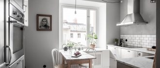
Kitchen
There are so many shades of kitchens: flashy, achromatic, and pastel. The variety of artistic projects in the modern world dictates its own rules. It’s difficult to say which nuanced color combinations will be most appropriate for this room, because the most important thing here is not the purpose of the room, but its individual characteristics: size, isolation from the living room, bedroom, etc. You can experiment in the kitchen.
The interior design of a modern kitchen in the style of white minimalism is correctly emphasized by a bright pink countertop
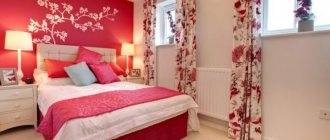
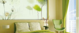
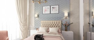
Bedroom
Since this zone is, first of all, not for the active phase of life, but for the passive one, it would be better to choose not too contrasting colors in the interior. It is most practical to decorate the bedroom in calm colors without flashy elements. Both cold and warm colors will be appropriate, you just need to take into account such details as: cardinal direction, climatic conditions and size.
Note! In bedrooms facing the north and north-west, it is more appropriate to use a warm palette, and in bedrooms facing the south or south-east, it is more appropriate to use a cold palette.
Bedroom interior design with frescoes in gray and pastel colors is finely thought out by graphic designers
Children's
Everyone knows that young children need to develop. Therefore, it would be a good option for them to fill the room with bright colors, but not too pungent, so that the kids do not get overtired. You can make a nuanced composition of light green, blue, and pink flowers. Adult children, on the contrary, need to focus on educational activities; for them, a combination in the room with brown, beige, cream or milk would be a good option.
The interior design of a children's bedroom for a growing girl is made in pastel colors
Harmony of close colors (related)
For related harmony, select 4 colors that are next to each other on the color wheel. The only exception is the segment from yellow to red-violet; here it is permissible to take all these 5 colors. Give each of the close colors its role: one will be dominant, the other will be secondary, and the remaining two will be complementary.
Just as in polar harmony, the dominant color can be used in the full spectrum from light to dark, the secondary color can be used excluding bright and pure shades and is noticeably less in quantity, and additional ones are very limited. For example, in the harmony indicated below, for example, yellow may dominate, while green may be secondary. Then, for example, we will see yellow-green as a very light light green, and yellow-orange as dark brown.
Psychology of color, or how it affects us?
Studies have shown that color affects a person’s mood through his subconscious. Perception is influenced by such factors as the state of health, age, social status of a person and his character.
Colors and colors
For women
Women are more sensitive to the perception of color and shades. There is no clear distinction between “male” and “female” colors, since each person is individual. Despite this, there are tones that women prefer more:
- blue, it has a calming effect and is loved by both women and men;
- green, associated with nature and the feminine, symbolizes health and tranquility;
- turquoise, this shade is one of the most favorite among women;
- purple – it is a representative of the “feminine” color, emphasizing the mystery and mystery of a woman;
- pink tones are associated with women, but this is not a preference, but a pleasant rule;
- Lilac color is also considered “feminine”, it evokes a feeling of romanticism and nostalgia.
Women and interior colors
With age, color preferences change; women love pink more, but give less preference to green than in their youth.
For men
It has been found that men perceive approximately 30% fewer shades compared to women. Often women are indignant that men cannot appreciate their efforts when choosing a color, but this is due to physiology, since for them pumpkin and peach colors may not be different from each other.
Men's perception of color
Most men prefer blue and its different shades. Some scientists believe that they symbolize it with clean water and clear skies. In addition to blue, men love green, but unlike women, they prefer cooler tones. Traditionally they like black, but most men cannot stand purple and pink.
For children
Newborn babies see everything in black and white and only after 2 months they begin to distinguish other colors. At the age of 2-5 years, they can already distinguish the entire visible spectrum.
Children are attracted to everything bright, so they love pink, red, yellow tones, such preferences persist until the age of 10, after which the child may already like the blue tone and all its shades. Girls prefer pink and purple, while boys prefer blue and its shades.
Classic triad
The triad is the most complex color scheme, but also the most frequently used: such interiors are both balanced and interesting to perceive. For a triad, three colors are taken, located equidistant from each other on the color wheel, as if at the corners of an equilateral triangle. The same approach: colors are arranged according to importance, one always dominates, the rest are used sparingly.
As for mixing colors with each other, this is an important point in the triad, but there are two approaches:
Option 1.
Use shades of a mixture of dominant and secondary and shades of a mixture of dominant and tertiary, but do not mix the additional colors themselves.
Option 2.
Mix additional colors into one color and then mix it with the dominant one. This mixed color can be lightened and darkened, diluted with gray, like the main and secondary colors.
You can choose color harmony without fussing with paints using this program.
Below we have collected examples of how you can combine colors with each other. It doesn’t matter what shade is your favorite in the interior - yellow, green, orange, purple - you can choose a good combination for any room.
How to choose interior colors
“The pursuit of fashion trends can be left behind and all provocative color schemes can be preferred to pastel colors in interior decoration”
Start by finding a basic color that is pleasant to you personally, and then select companions to match it. You should not make rainbow color combinations. It is quite enough to choose one or two, but ideally suitable companions. The main color should be made the background color, that is, all global surfaces in the room should be painted in it.
An interior is considered optimally solved if 75% of the finish is given to the main color, 20% is given to additional shades, and the remaining 5% is distributed among color accents.
75% of the finish is given to the main color
The house should be a place of increased comfort, where you would like to return, because everything there is arranged exactly as you dreamed of it. This means that the pursuit of fashion trends can be left behind and all provocative color schemes can be preferred to pastel colors in interior decoration. It won’t be difficult to create a contrasting environment. It will be enough to add colorful accessories and bright furniture.
Colorful accessories will add contrast to the atmosphere
If color is involved in the interior in spatial zoning, then you need to take care of the smooth transitions of shades from one to another, otherwise there will never be a harmonious atmosphere in the room. It will never be possible to imagine it as a single whole. The interior will be as if chopped with an ax.
Red and purple shades
Blue and cyan color
Green in combination with other colors
Photos: kdzjj.com, homester.com.ua, homestolove.com, tidsrominterior.no, livingroomideas.eu, decorfacil.com, pinterest.com, roomble.com
Add to favorites16
- Tags
- design lessons
- color
design lessons, color