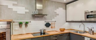
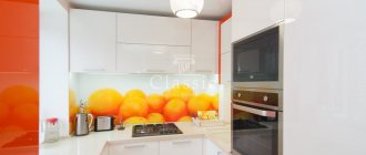
The traditional material for making furniture is wood. Accordingly, the most popular colors include natural shades of different types of wood. Of course, this is a very wide choice, since not only different species, but also trees of different ages differ from each other in color and pattern.
However, in modern styles, where uniformity of shade is valued, colored kitchens will be more appropriate. Let's consider the optimal solutions for decorating such a kitchen.
How to choose the color of a kitchen set
The kitchen is a special place in the house: here we spend cozy family evenings, gather guests, cook and read the morning newspaper. That’s why it’s so important to make this room a reflection of your own character and style. This requires not only thinking through the design and lighting, but also understanding what color furniture to choose, because the kitchen set sets the mood for the entire interior. Agree, there is a difference between a massive kitchen made of natural wood and monochrome black glossy facades.
Today, the question of which colors are best for a kitchen is especially acute. Since there are many solution options, and in order not to get confused with the choice, find out how to choose the right color for the kitchen facades.
What to look for when choosing
When choosing a kitchen set, you need to start from the parameters of a particular room. I would like to visually expand the size of a small kitchen using color and make the interior spacious and bright. Therefore, it is better to avoid shades that will weigh down the space.
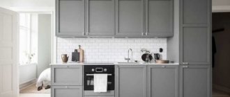
The spacious room allows you to use the whole range of colors for the kitchen set. But despite this, it is necessary to choose an ensemble so that the furniture does not reduce the space of the kitchen. For example, a massive set made in black will not only “eat up” the space, but will also look like a big dark spot. If you do not want to achieve such an effect, then it is better to replace black with graphite.
An elongated rectangular room can be zoned using the right color. For example, a plain light set in the same color as the wall will expand the space, visually bringing it closer to a square.
Features of choosing by kitchen area
The color scheme of a room largely depends on its size. But does this mean that in a large area we can give free rein to our imagination, and a compact kitchen must be white?
Color solutions for small kitchens
A small room is not a death sentence. Despite the fact that it is necessary to think through every detail, you can fit absolutely any color into the interior. Don't be afraid of dark shades. The only limitation is that they should not be dominant, especially on the ceiling, otherwise we will get the “closed box” effect. Gray, chocolate and black tones are recommended for use on the floor and in the lower part of the set.
Recently, designers like to combine light wood with blue, pink and mint shades. They do not overload the space and benefit from the combination of natural materials with delicate tones.
The photo shows a small kitchen with a gray bottom, yellow countertop and splashback. A rich color for a small kitchen is a great way to distract attention from its size.
Snow-white interiors with colored inserts remain traditional. If you use beige in combination with white, the kitchen will look softer; besides, pastel colors are practical, versatile and never go out of style. And colored accessories can always be replaced if desired.
The photo shows a compact kitchen with loft elements: white brick and pipes painted gold.
Color options for large kitchens
The main difference in the color design of a spacious kitchen is the ability to use dark colors as the main ones. Designers still love “delicious” brown shades - coffee, chocolate, caramel, trying to avoid the boring red shade. A deep-colored kitchen (indigo, anthracite) in combination with rich yellow elements looks interesting. By the way, black gloss is no longer relevant in modern interiors: it is more correct to choose matte facades in muted graphite shades.
In the photo, the emerald color of the walls creates the impression of a stylish, expensive and respectable kitchen.
No less popular are light interiors with bright or dark contrasting accents. Gray color in kitchen design is suitable for those who find it difficult to work with the palette: it will serve as an excellent background for your favorite additional shade.
In many countries, white is still the leading color. In spacious kitchens, both glossy and matte facades are used. To add warmth to the interior, designers advise adding wooden elements: countertops, dishes, furniture. However, this advice applies to connoisseurs of the Scandinavian style, but for lovers of the classics it is more appropriate to add gold, stucco and details in muted pastel colors to the decor.
The photo shows dark turquoise facades with glass inserts that make the cabinets visually lighter.
Color combination in the kitchen interior
When choosing a headset, consider the room in which you are going to install it. The color of the walls in the room plays a big role here, because it will determine how you can combine colors in the interior of the kitchen. And there may be several options:
- When the color of the set is chosen to match the walls, for example, pastel shades of the walls will echo the delicate shades of the kitchen.
- The furniture will contrast with the room. Often such a photo can be seen in catalogs: a yellow monochromatic kitchen against a background of gray graphite walls. A bold and bright combination.
- An option that is especially popular now is painting the walls to match the color of the kitchen. Relevant for studios, it removes the emphasis from the set, dissolving kitchen utensils into the volume of the room. Matte paint is used in dark and cool shades, if space allows.
Influence of cardinal directions
Another important point to remember is natural lighting in the kitchen. If the space is constantly or most of the day illuminated by the sun, then this allows you to choose a much larger palette of colors and shades. The color of a kitchen on the sunny side can be done in both cold and warm shades. The natural colors of the wood will also be highlighted nobly and create coziness.
A more difficult question is what color to choose for a north-facing kitchen. Since the sun will only occasionally peek into the room, the space should be made lighter and more saturated. It doesn’t matter whether you choose a cold or warm shade for the kitchen, the main thing is that it is light. If you prefer wood, then use linden or oak, but not walnut or cherry. Also try to include reflective surfaces in the set and choose glossy facades.
The combination of colors in the kitchen set
If a set made in one color seems something ordinary, here is a suitable solution - a combination of several colors of facades. Knowing the main options for combining colors in kitchen furniture, you can choose the perfect combination.
First of all, pay attention to kitchens in which the upper and lower cabinets are made in different colors and shades. These can be either contrasting combinations, for example, a white top and red bottom, or less contrasting ones, with a difference of a couple of tones.
Two-color kitchens will help delimit the space: they will visually increase the distance to the ceiling.
When the facades are painted in different colors in a checkerboard or other order, this is a combined version of the kitchen. This way you can highlight the cooking area and place accents to your advantage.
That is, by playing with color and its shades, you can not only create a stylish, unique kitchen interior, but also visually transform the space. It is beneficial to emphasize all the advantages and hide the shortcomings.
Color and texture
The shade, of course, depends on the structure of the material. The complex texture gives depth to the color, enriches it with the play of light and shadow, but at the same time reduces the intensity of the tone. Shine on a structured surface literally destroys a pale or complex color. Dark, on the contrary, becomes more expressive.
Bright intense colors - green, crimson, blue - do not go well with the texture of wood (for plastic, for example, they are ideal). The wood structure shining through a layer of bright paint gives the impression of sloppiness. If the layer is dense enough and hides the design, then nothing remains of the aesthetic merits of the tree.
Therefore, colored facades are made of MDF or chipboard, covered with melamine or acrylic film. Products made from MDF with a glued plastic panel are the most durable. It is the artificial polymer coating that allows you to obtain the brightest and perfectly uniform color. The photo shows corner kitchens with a turquoise facade.
The photo shows how orange goes well with the texture of wood
. If the kitchen furniture is chosen in an intense color, then the rest of the decoration of the room - wallpaper, ceiling, curtains - should be a neutral, well-matched shade. Most often it is white, but wallpaper of a paler color than on the facade is also allowed.
Fashionable kitchen colors in 2022
Another way to make it easier to choose the right shade of a set is to find out what kitchen color is currently in fashion. In kitchen furniture, as elsewhere, there are trends that determine its relevance.
Today, spacious studio apartments or Euro-two-room apartments are preferred. In this regard, the color scheme of a modern kitchen should combine or complement the interiors of the living room and the rest of the living space. The influence of fashion is also reflected in the household appliances used.
The glossy black glass-ceramic panel goes well with light-colored surfaces, so the fashionable color of the kitchen set will be the one that harmonizes well with the appliances.
Another trend is multimateriality, that is, the kitchen should be made simultaneously from several materials or imitate them.
For example, combine glass and concrete or steel and wood.
The predominance of chrome gives the kitchen an industrial style, and natural shades give it an eco-friendly feel. This is perhaps the most fashionable solution.
Kitchen apron: wide choice
An opportunity to enliven a small kitchen is provided by an apron of unusual colors, located near the sink and along the work surfaces. It can be the same tone as the vertical or horizontal surfaces of the kitchen furniture. Or it may be different, bringing originality to the design of the room.
The choice of palette for the apron is quite large, each tone has its own advantages:
- black adds style and is often combined with a white set;
- brown - goes well with almost the entire palette, adds coziness;
- gray – universal, noble, can be presented as an imitation of marble or granite chips;
- white is a classic, ideal for any decor.
White is often combined with a black set
What kitchen color is the most practical?
Customers' opinions on the practical color of a kitchen set are unanimous and, at the same time, divided. The similarity lies in the monochrome, but they differ in the choice of white and black colors. If classics predominate in interior design and materials, then kitchens are chosen to look like wood. It always looks organic and can be used with other materials. At the same time, it is durable and does not lose its relevance over time.
The near-Scandinavian style with a predominance of light, cold tones enjoys unshakable authority in Russia. Just look at the photos of the interiors of Swedish houses. Beige, white, gray, desaturated blue in various shades - these colors are in harmony with each other and at the same time are interchangeable. They are flexible in terms of decoration and can be easily complemented with other colors and shades. Practicality lies in this replaceability and complementarity.
Small kitchen: there will be no easy ways in design
Arranging a small room is always a difficult task. We need to combine practicality and home comfort at the same time.
Dark set: pros and cons
The choice of a dark furniture set in this case is rarely justified. Dark is noble and effective, but will act overwhelming, depriving the space of comfort and visually making it smaller.
Stylish kitchen design
Kitchen combined with living room
If the living room and kitchen are combined, then the style and design of these rooms, which differ in functionality, should be common. At the same time, visual separation is allowed by the use of different materials, types of finishes, and shades.
Overcoming limitations
The smaller your kitchen, the fewer options you have for implementing design techniques.
The best choice for a modest-sized room would be a pastel palette with a predominance of cold tones.
Classic version
Lacquered surfaces will help to visually add free space:
- furniture facades;
- glossy stretch ceiling;
- Kitchen backsplash tiles with a glossy sheen.
Advice In cases where the design requires the introduction of dark colors into the interior, you can use a combination of several tones. White and black combinations, graphite with a milky tone can show themselves well. This will give originality to the interior and add sophistication to it.
White room color with bright elements
Popular kitchen colors
Not a single kitchen style or color becomes completely unpopular. As before, some prefer wooden classics, laconic high-tech or eclecticism if a single style is not affordable.
The most popular kitchen colors remain contrasting shades in warm colors. Dark wood cladding, light beige countertops that match the color of the walls.
The second most popular is the Scandinavian laconic style. Kitchens made in white or warm shades of wood. They are loved for their simplicity and grace. This range is perfect for decoration and will not take a lot of attention. Therefore, when choosing a kitchen, many often focus on the natural color of wood.
Style and colors
Features of interior styles suggest which color scheme to choose for the kitchen:
- Sanguine people will feel comfortable in light green, yellow and orange colors. These are active people, prone to action and mobility.
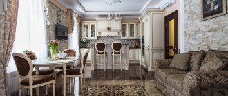
- Classic does not allow combining contrasting shades. Here it is customary to use different shades of brown. A classic wooden kitchen in natural wood tones looks expensive and luxurious.
- Loft includes shades of natural wood, brick or raw concrete.
- Provence loves muted beige shades, combined with delicate versions of bright colors.
- Neoclassicism is pastel colors and soft halftones.
- Romantic styles such as country and Provence love natural tones. It is allowed to complement the design with rich accents in small details.
- Modernism combines not only light colors, but also rich ones.
- Minimalism implies restraint in colors. The most common combination is black and white and their shades.
- Scandinavian style is made in light and calm background colors with accent details.
- High-tech is white, silver, black and gray shades. But the main feature is the presence of metal components. Bright details are present in a single copy.
