Home Portfolio Apartments Design project for a one-room apartment of 46 sq. m. m
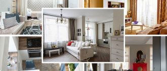
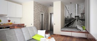
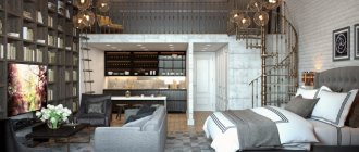
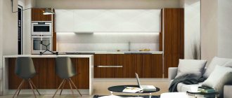
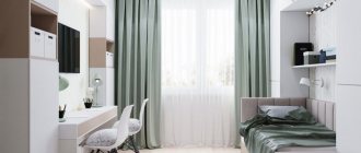
Design project of a one-room apartment of 46 sq. m satisfied all the requirements of the young Customer - a female student. The result was a spacious and bright room, made in milky, beige and coffee tones with a studio part of the hallway-kitchen-living room and a separate bedroom and loggia. On the A8 studio blog you can read about the design details, clarify the details and names of furnishings and finishing materials that interest you.
Get 3 interior layout options for free
Option 1 - moving the kitchen to a dark part of the room
If in one apartment you need to place both a living room and a separate room for the bedroom, then moving the kitchen away from the window to an unlit area of the room is a reasonable solution. After all, you don’t spend all your time in the kitchen, you only need it for preparing and eating food. But a living room in the illuminated part with a sofa by the window and a separate bedroom is a completely desirable option for a young family. But in this case, you will have to think about what to do with the gas pipeline if your house is one of those, since the proposed option is designed for the use of an electric or induction stove.
The gas pipe running through your apartment will either have to be sewn up or left and disguised (for example, painted to match the color of the walls).
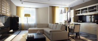
So, in this room there are two separate rooms - a kitchen-living-dining room and a bedroom (the bathroom does not count). As you can see, despite the fact that the kitchen set was moved from the window to the opposite part of the room, daylight still penetrates here. The dining area is successfully located at the “junction” of two zones - the kitchen and the living room, uniting them.
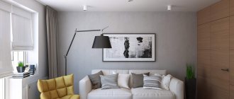
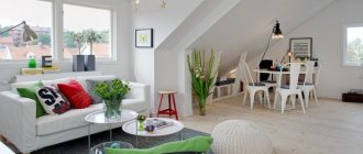
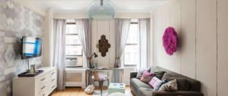
In general, the apartment uses light shades and a minimum of furniture. Neutral wall colors, straight shapes and discreet textiles are the main features of Scandinavian minimalism, as are small islands of greenery in the form of large indoor plants.
By the way, you can get to the kitchen not only through the living room, but also directly from the hallway, which is very convenient.
The bedroom supports the entire style of the rest of the apartment - there is a minimum of furniture and soft textiles. Blackout curtains will protect you from sunlight in the morning.
Well, from the bedroom we can easily access the spacious dressing room. By the way, all Scandinavian interiors do not really like to use wardrobes that are familiar to us. Most often these are “wired” wardrobes or separate rooms.
But the bathroom is very spacious for Scandinavian interiors. And even despite the lack of a bathtub, it looks quite functional due to the placement of a washing machine and dryer.
Repair features
When starting an apartment renovation, you should first determine the budget that will be allocated for the work. Based on this amount, the designer develops project options. Money Saving Ideas:
- Style. If you want to design in a neoclassical version, because you liked the chairs from the photo of the project, buy furniture, but make it an accent piece. An apartment decorated in full accordance with the style will cost more to renovate. If you choose a budget loft, you will be able to reach a consensus.
- Decoration Materials. If you choose decorative plaster as a base, you will have to spend 500 rubles per square meter of finished wall. Painting with a matte base looks no worse, but will be cheaper. To implement both the first and second options, you will need to level the walls.
- Apartment interior. You should choose furniture depending on the size of your budget. In the photo with design options, kitchens, sofas and parts from expensive chain companies of European quality are used. You can save money by choosing cheap, similar models from lesser-known companies.
- Details. The designer offers a variety of decorations that add coziness to the home. Paintings, panels, vases, napkins and colored pillows look impressive, but cost from one thousand for one item. If you make some of them yourself, you can save up to 50 thousand rubles in total.
You may be interested in: Peculiarities of collecting penalties from the developer under the DDU
An advantageous layout will also help you save money. If the apartment has a spacious hallway or dressing room, choose the option of a separate storage area, and one large closet is in any case cheaper than several small ones.
Option 2 - butterfly apartment layout
A butterfly apartment is a central part consisting of an entrance hall and a bathroom and two rooms (or more) located on both sides of the entrance (reminiscent of butterfly wings). Most often, these are either one-room apartments (the kitchen and rooms are the wings), or three-room apartments, where on both sides there are not one, but two rooms and a kitchen.
In this project, on both sides of the entrance and bathroom there is a bedroom and a kitchen-living room.
As in all Scandinavian apartments, light and neutral shades of gray, white and wooden textures predominate here. The kitchen-living room has two windows, which is a definite plus - one has a kitchen work surface, and the second is a light source for a large recreation area.
Also, each zone has its own lighting for the dark.
The recreation area is not luxurious and a riot of colors - everything here is modest and neutral. And to sit down and read in the evening, you don’t need anything else except a comfortable sofa...
The refrigerator and one of the work surfaces, as well as storage space, were placed opposite the window, in a niche. This made it possible to use an empty wall, making the most of the space.
In the bedroom we decided to use a dark green shade, leaving the floor, ceiling and textiles light. Also, the absence of furniture creates a feeling of freedom and unclutteredness, so dark in this case is more than appropriate.
The window in the bathroom is one of the advantages of this apartment. Square white tiles are another sign of Scandinavian minimalism. Instead of a bath, there is a shower (this solution is quite popular among the Swedes).
Electrical wiring and switches
When you know where all the furniture, household appliances and light sources are located, it's time to plan the location of sockets and switches.
The rule here is that it is better to overdo it than to underdo it. A couple of extra or rarely used outlets won't stress you out like misplaced extension cords.
Properly placing switches even in a one-room apartment is not so easy. First, you need to divide all the light sources into groups, think about which of them will be turned on with one switch. Afterwards, you need to arrange the switches themselves, taking into account that it is always better when they are collected in one place, and not scattered in different corners of the room.
Immediately think about pass-through switches. Pass-through switches are installed at the wiring stage, then nothing can be changed. Standard places are the checkpoint at the beginning and end of the corridor, at the entrance to the room and near the bed or sofa. In these places, checkpoints are always appropriate; others depend on the features of your layout.
Don’t even try to keep a diagram of sockets and switches in your head; be sure to draw it on paper. This is the only way to systematize the information for yourself and then convey it to the finishers.
Option 3 - spacious room with two windows
Two windows in a room are rare, even in corner apartments. But, as it may seem initially, this particular apartment is not a corner one (it’s just a large room that is a protrusion on the facade of the building).
This apartment is lucky: both light sources define different zones. They decided to place a spacious reading chair at one window, and the second was used as a dining area. In addition, there is also access to the balcony.
There are two work areas in the kitchen - one is the main one with a sink, refrigerator and stove, the second is located on the kitchen island, which also serves as a table for eating.
In Scandinavian countries, balconies are usually used as recreation areas. Here, too, two cozy armchairs and a table were placed.
Of course, the bedroom with a small area was a little less fortunate than the main room, but even in this case the owners decided not to give up, but made a huge bed covering the entire width of the room.
Style solutions
If you are planning to create a studio apartment, then it would be appropriate to use exclusively modern style solutions. The fact is that such housing is considered an advanced option, which 50 years ago could not be found. The first person to create this style was an American designer whose house had no walls at all.
Since then, designers have adopted the idea of getting rid of partitions and thereby expanding the space. Among the stylistic solutions that can be used when decorating an apartment of 33 square meters. meters, an excellent choice would be minimalism, hi-tech or loft. In addition, with the right approach, you can decorate the room in the Art Nouveau style.
Option 4 - a spacious 45-meter apartment with a non-standard shape
The shape of this apartment is not entirely standard - it is elongated and trapezoidal with access to three sides of the house.
Please note: in the parent's bedroom, a place for a baby cot has been fenced off: this allows privacy if necessary and does not interfere with the baby's sleep.
As in many Scandinavian apartments, here the balcony serves as a place to relax.
The large area of the main room made it possible to separate a full-fledged work surface in the kitchen.
Despite the fact that when entering the apartment, we run straight into the kitchen area, this does not cause discomfort.
A small elongated window serves as a source of natural light in the dining area. Here, above the table on the other wall, there is another window on top.
The parent's bedroom has a large bed and light colors. The niche that served as a wardrobe was given over to a crib; it fits in perfectly here. And spacious wardrobes were placed opposite the bed.
The favorite light colors of the residents of Scandinavian apartment buildings are also in the bathroom. There are also small-format white tiles, a small window and all the necessary plumbing fixtures.
Which design and color scheme to choose
Once the layout of the apartment is thought out, you can begin the design process. Apartment design, as every modern person understands, is better to choose a minimalist one.
In a small space it is not possible to place too many unnecessary details. But in order to add coziness to the apartment and avoid cold minimalism, we will add a little art deco style.
As for the color scheme, warm, light colors will look best. The color lilac will be used in this apartment. The walls are light purple coated. The furniture is mostly white, and the kitchen set is emphasized by a glossy finish.
In the bedroom, the color is a mixed gray-purple, some parts will be a little lighter, others darker. You can choose any colors you want, the main thing is to combine them correctly.
And light colors are more suitable; they will help expand the missing space. This option for renovating an apartment should be fully thought out.
Option 5 - layout of an apartment of 45 meters with a large balcony
In this bright apartment, it was decided to create a spacious kitchen-living room and allocate a small space for the bedroom. A partition was erected to separate the two zones, but they decided to abandon the doors - this way the space looks more holistic.
We decided to choose yellow as a bright accent: a clock, a sunny blanket on the sofa and small splashes on the pillows. The rest of the color scheme follows Scandinavian minimalism - neutral greys, whites and wooden surfaces.
Despite the small area, the bedroom area does not seem so cramped. All thanks to the natural light from the window, white wardrobe fronts and white walls.
The bathroom has all the necessary plumbing and appliances. As in the rest of our reviewed apartments, here instead of a bath there is a shower. But we managed to install both a washing machine and a dryer.
Hallway decoration
The first room that greets us is the hallway. It should be light here. This can be achieved by painting the walls in a light tone and placing bright spotlights. Also, in the hall you need a mirror and a wardrobe for outerwear. It is ideal if the walls and furniture are made in the same color, which will create a feeling of a single whole. Then the closet will not be conspicuous, and a mirror reflecting light surfaces will slightly expand the space.
As a finishing material for walls, you can choose either paint, thick wallpaper, petramix, or wall panels. It is important that the finish is easy to clean from dust. As an alternative to a closet, you can use wall hangers and shelves, as shown in the photo. This technique will allow you not to hide limited space.
Option 6 - layout of a 46-meter apartment with a single space
In this apartment, the owners did not resort to using any partitions between the living room and bedroom. Perhaps this apartment is intended for one tenant or meeting young people.
A special feature of the layout is the kitchen area, hidden behind a low partition. The dining group was conveniently located by the window.
Overall, despite the shared space, the apartment looks spacious and bright. This feeling is created thanks to neutral pastel colors and discreet textiles.
The kitchen is a functional space that fits absolutely everything you need - appliances, storage space, and a work area.
Another nuance in the decoration of this apartment is the natural wood on the floor. Residents of Scandinavian countries are very fond of using natural wood, both in decoration and in furniture. They also value houses with history: they would rather leave a slightly shabby parquet floor than replace it with laminate.
Notice how the ambience in the dining area changes as the evening progresses. And such coziness is created with the help of a lamp with warm light, imitating an Edison lamp. A couple of candles, soft pillows and wicker cutlery coasters - and you can start a romantic dinner...
The hallway was also not cluttered with a lot of furniture, so it looks spacious and bright.
Furniture selection
The main direction of project design now is minimalism. Thanks to the practicality of the interiors, the compactness of the furniture and the versatility of textures, this style is suitable for any apartment. For example, in a 46 sq. m studio, light shades will visually enlarge the room and create a feeling of unity in the layout. In a Euro two-room apartment, this solution also looks harmonious - there is no overdoing with colors or cluttering of furniture. In addition, the minimum number of parts does not clutter the space, reduces cleaning time and does not accumulate dust.
However, not everyone likes minimalism, so the issue of choosing a style for such apartment owners is acute. The following directions are suitable:
- loft - a simple and roughly decorated interior in dark colors;
- contemporary - a clear division of zones using contrasting colors;
- Scandinavian – simple style in light colors;
- modern is a direction with smooth lines and contrasting details.
A designer who specializes in interior design professionally will help you choose other areas based on photos of finished layouts. However, the listed styles are now at the peak of popularity.
You may be interested in: How to choose a video intercom for an apartment
Apartment layout 45 meters with a throwback to the last century
This cozy apartment, like all the previous ones, is located in Sweden, but the owners preferred the style not of modern Scandinavian, but with a bias towards the last century. Even at first glance, this setting reminds us of the Soviet past: wooden parquet on the floor, aged household and interior items, a cozy rocking chair in front of the window, paintings in gilded baguettes...
As for the layout, both a recreation area and a bedroom were combined in one room, separating the bed with a low cabinet.
An aged (or antique) chest of drawers made of natural wood gives a special charm to the interior.
Parquet, by the way, is also natural.
Pay attention to the furniture: the bookcase and shelving also resemble “grandmother’s” props, but they look appropriate in this room. The nightstand near the bed stands out a little from the overall tone, but remember how we lived in the last century - no one thought about the design and compatibility of furniture, they used what they had and could afford to buy (or inherited). Most often these were miscellaneous household items and furniture.
The kitchen is a separate room that contains everything a modern housewife needs: household appliances, a work area and a eating area. By the way, the dining group was placed by the window.
But the owners use the hall for more than just its intended purpose. A workspace with a desk and an elegant secretary cabinet is hidden here.
Pay attention to the decoration of the walls: it was in the last century that they used the so-called “beating” - they retreated a certain distance from the ceiling and only then painted or glued wallpaper.
How to determine the amount of work required?
So, we have discussed how not to be deceived by attractive advertising offers for practically free and very high-quality repairs, but we have digressed a little from the main topic. What will determine the cost of repairs? To accurately determine the cost of repairs, the first thing you will need to do is fill out a small questionnaire consisting of three small points.
- 1. At the first stage, we determine whether the apartment is located in a secondary building or in a new building. We also look at whether dismantling work is required, or whether the premises are ready for renovation.
- 2. The second indicator that will affect the range of work carried out and, accordingly, the cost of repairs is how global the repairs are planned. There are two main types: cosmetic or major repairs.
- 3. In the third step, you will need to decide what class of repairs are needed. For example, based on our experience, we divided the repair classes as follows: - comfort class; - standard class;
For clarity and ease of determining the class and type of repair, we have prepared the table presented below. The asterisks indicate the option that we will consider in this article.
To analyze the cost of repairs by their components, I propose to take a real two-room apartment with an area of 77 m2, located in a monolithic new building. Customers chose Standard class repairs.
Option 8 - spacious apartment 46 meters with a sliding partition
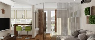
This bright apartment with an area of 46 square meters has a very regular shape, which is quite easy to work with. One spacious room with several windows is divided into 2 zones - sleeping and living room. The bedroom is separated at night by a sliding partition, which is very convenient: when you need privacy or to close your resting place from prying eyes. The rest of the time it is a single space.
But in the interior of the kitchen, the owners decided to move away from the usual white and gray facades, replacing them with lamination with a warm wood texture.
Since there is no natural light in the kitchen, the height of the opening leading to the kitchen was increased to the ceiling, and doors were abandoned altogether.
A drop of sunlight entered the bathroom, settling on the wall as a bright yellow stripe. Unlike many previous Scandinavian interiors, there is a bathtub instead of a shower.
We hope that you liked our selection of Scandinavian apartments, especially if you have not yet found a solution on how to plan an apartment of 46 meters in order to divide it into the necessary zones.
Good luck with your renovation!
Current styles
A cozy apartment is distinguished not only by well-zoned and functional space, but also by the general style of the entire room. A small footage should not affect the beauty of the interior; correctly chosen design will help.
Scandinavian style
It attracts people with its ease, simplicity and naturalness. The materials used are mainly natural - wood, stone, linen, cotton. The furniture is simple and functional. The main colors of this style are white, beige, light gray, and bluish.
This does not mean that you need to give up bright colors; they act as accents. Contrasting colors are used in textiles: rugs, pillows, woven rugs. Accessories can also be in rich colors, the main thing is that there should not be a lot of them.
An abundance of light requires the use of light curtains or blinds. The walls are usually decorated with plaster or painted in one tone. The floor is covered with parquet or laminate, imitating natural light wood. This style is characterized by the installation of multi-level lighting.
High tech
This style perfectly reflects the main principle of a small apartment - functionality. Furniture and decorative elements are dominated by straight, clear lines. All storage spaces are installed as discreetly as possible. The decoration uses clean, laconic colors.
High-tech is characterized by the use of sliding partitions. They are made of glass and do not visually conceal the space. A large number of mirror surfaces, chrome elements and metal are also welcome.
The decor is minimal, mostly black and white paintings and photographs. Modern household appliances are not hidden behind kitchen facades, but act as an independent design element. A good solution would be to install a large number of multi-level spotlights: floor and wall lamps, backlighting.
Due to its brevity and the use of industrial materials, an interior made in high-tech style can turn out to be very cold and uncomfortable. For this reason, it is worth diluting this design a little by adding elements from the pop art or avant-garde style.
Minimalism
This style is considered the most successful when decorating small apartments. Its distinctive feature is the use of laconic and functional furniture, light, soothing colors, and a minimum of finishing.
Materials for this design should be as natural as possible. Wooden flooring is used on the floor, and the walls are covered with plaster or plain wallpaper.
The entire space, as well as the furniture, must be designed in clear geometric shapes: rectangle, square, oval. Glass and mirror partitions are welcome.
It is a mistake to think that when designing a 1-room apartment you need to abandon such cozy, warm and homely styles as Provence, classic and ethno. It’s just that when decorating the interior, you should reduce the number of decorative details, choose calm tones as the main color scheme and use transformable furniture that suits the general atmosphere of the room.
The choice of pastel, light colors can be considered universal. Individual functional areas should be highlighted with bright accents. This can be achieved by painting part of the wall, or adding colored textiles. But do not forget that an abundance of blankets and decorative pillows can overload the interior.
If the kitchen units are built into a separate niche, choosing bright glossy facades will be an interesting and original solution
In the case of a standard arrangement, it is better not to focus attention on it and buy furniture in discreet shades. You can add color to the food preparation area by purchasing bright dishes and napkins for cutlery.
When decorating a corridor, it is not recommended to use wallpaper with a frequent, repeating pattern. Due to the fact that the space is narrow, such wall decor will dazzle the eyes.
In the design of a one-room apartment, color accents can act as one of the ways to zone the space.
